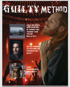
Cover Girl Magazine Mockup
This is Called Cracked Texture. I started by finding a model then I looked for the cracked paint texture. I brought the cracked paint into the document with the model. Then I resized the paint layer and positioned it over her face. I went to warp and warped the paint layer to where it looked like it wraps around her face. I set the layer to multiply. Then I adjusted the levels and hue/saturation then merged the adjustment layers together.
I converted the layer to a smart object. Then I went to the camera raw filter and adjusted the detail amount and the effects. And Then I merged visible layers again but this time I went to lens correction and adjusted the vignette amount. Then I created a gradient map. It represents texture because the cracks create a texture on the woman’s face as if her face was peeling. Then I applied it to a mockup.
Andy Warhol Style Picture
For this project, I decided to do an Andy Warhol-style picture. So I grabbed a good image from my stock collection. And I started by converting the image to a smart object. I changed the image size and cut the model out of the background using a layer mask. Next, I made a new layer and filled it with white. I desaturated the image to make it black and white I made all of the layers smart objects. And I went to the filter gallery. And added a halftone pattern on the image I went to filter and smart sharpen. Then I changed the input white level to brighten the image And changed the model layer to linear burn. Then I made a new layer and began painting in color. This represents color because it has color and blue and yellow are primary colors.
Peace Poster
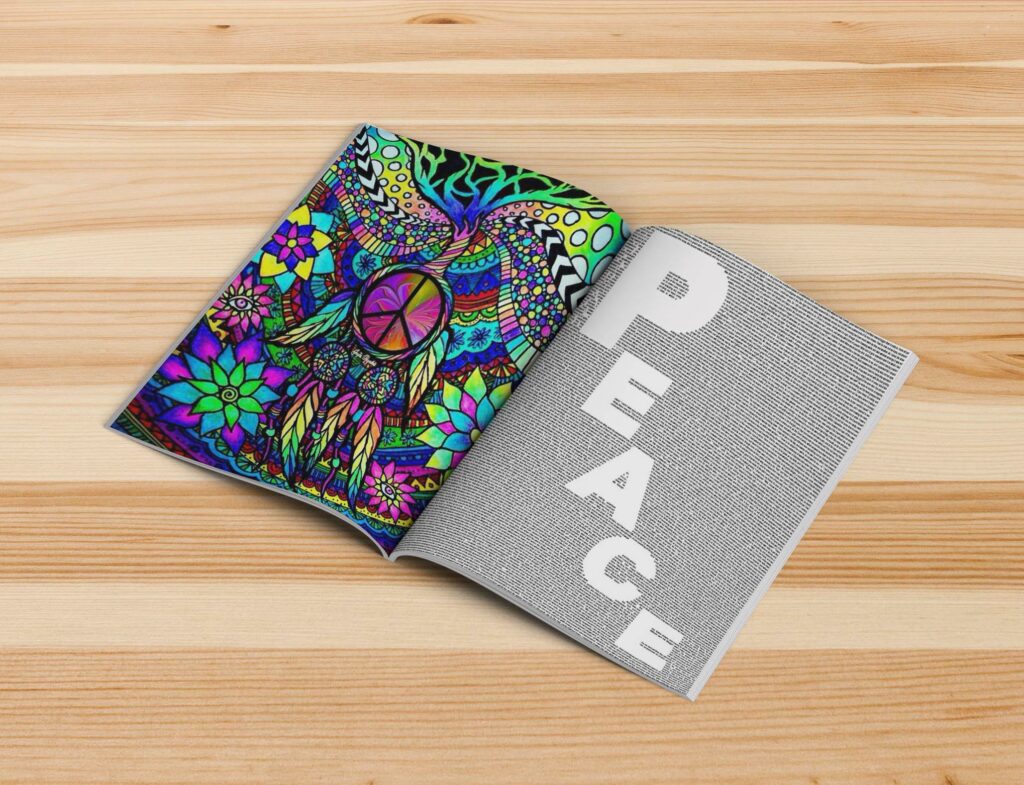
I used photoshop I started by finding this model then. I cut the background out. And desaturated the image. Then I went to the filter gallery and chose cutout. And I made 5 layers and adjusted the levels. Then I added the colors which are the same colors as used in the tutorial. Then I made a background and border then added text.
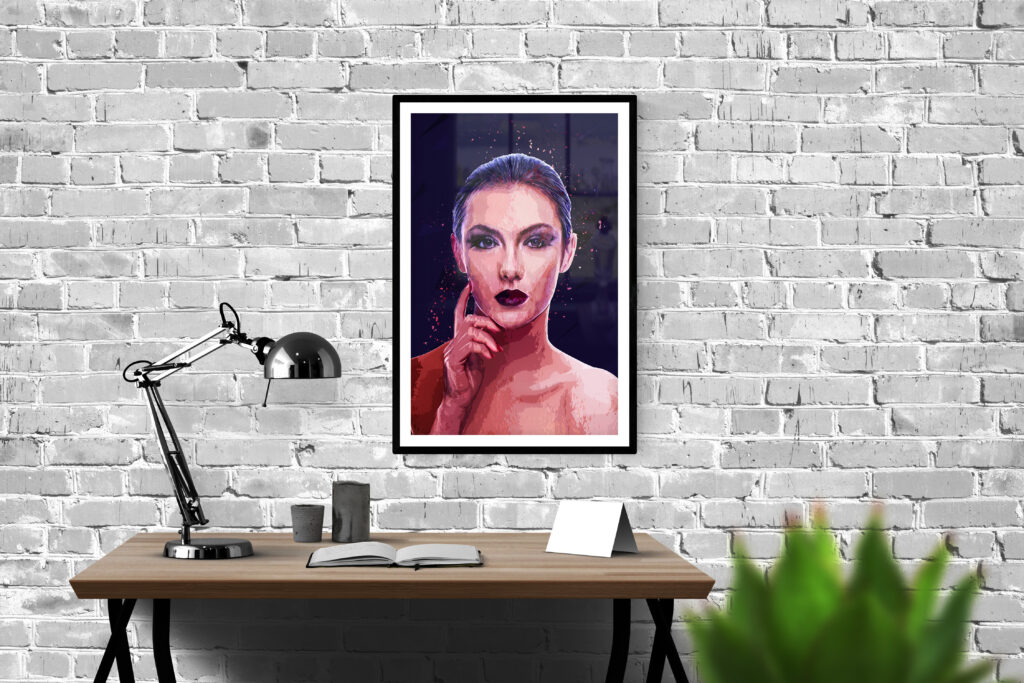
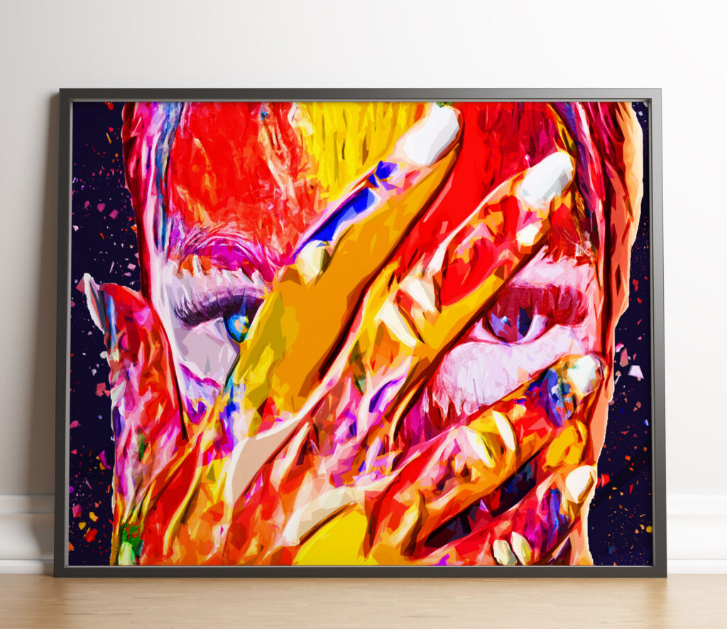
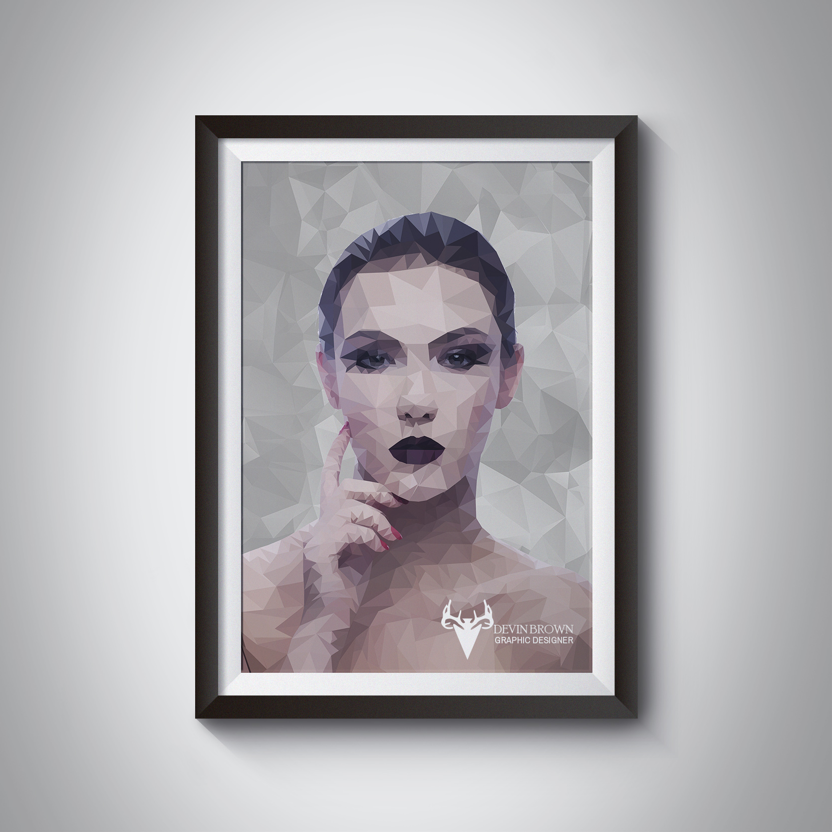
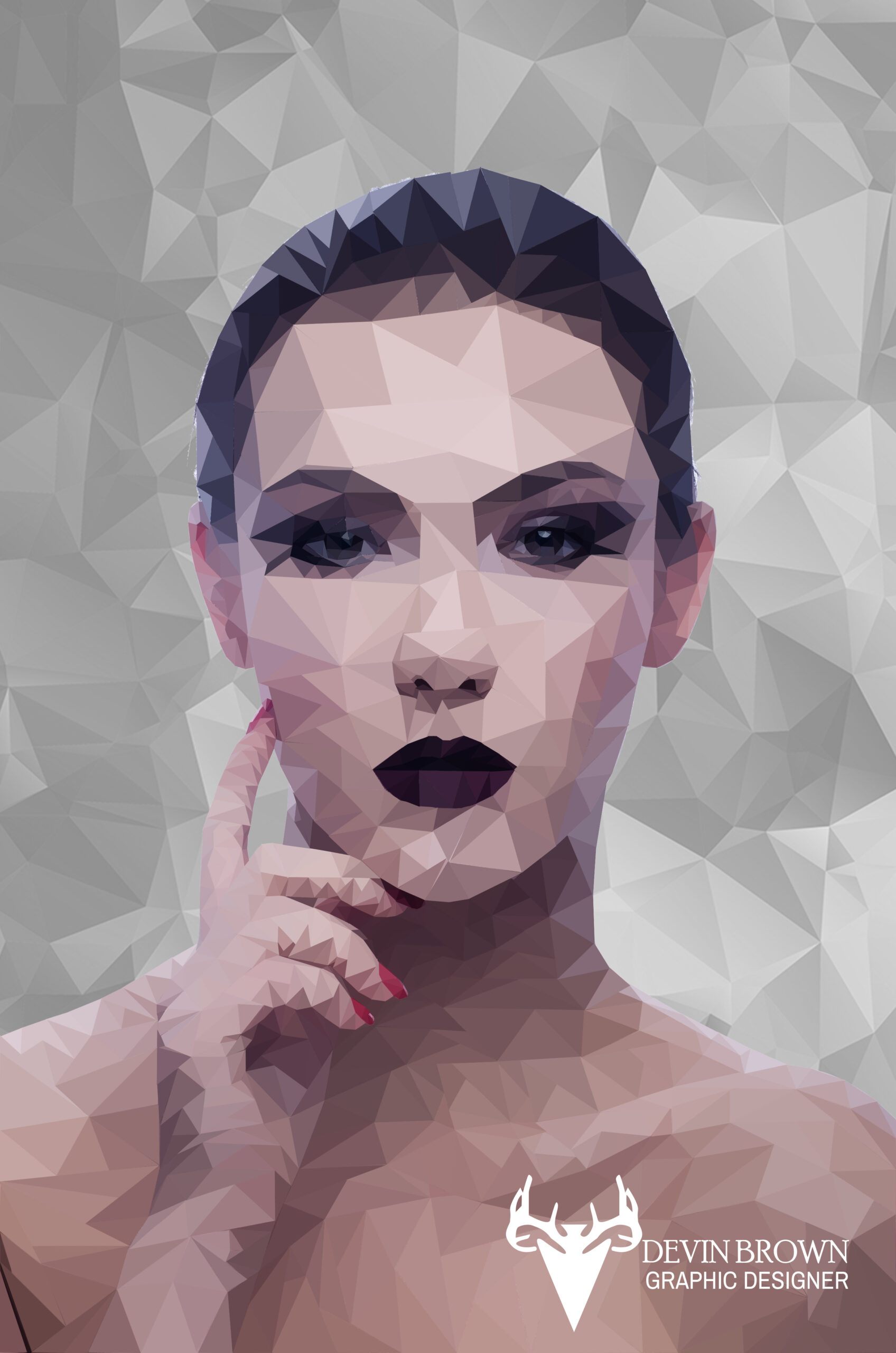
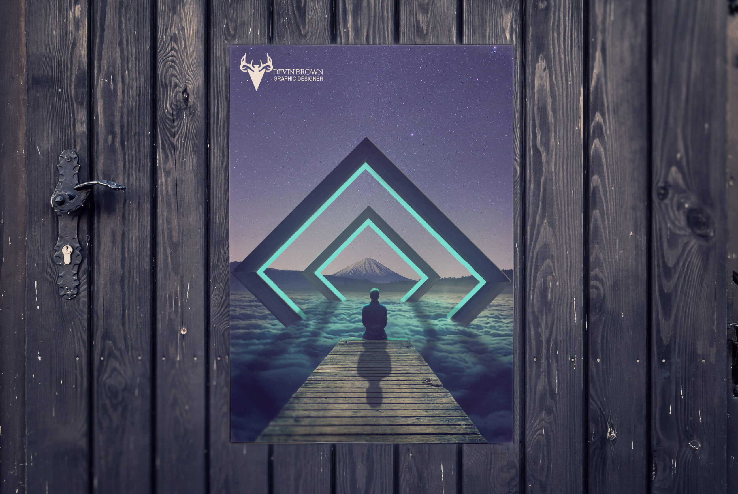
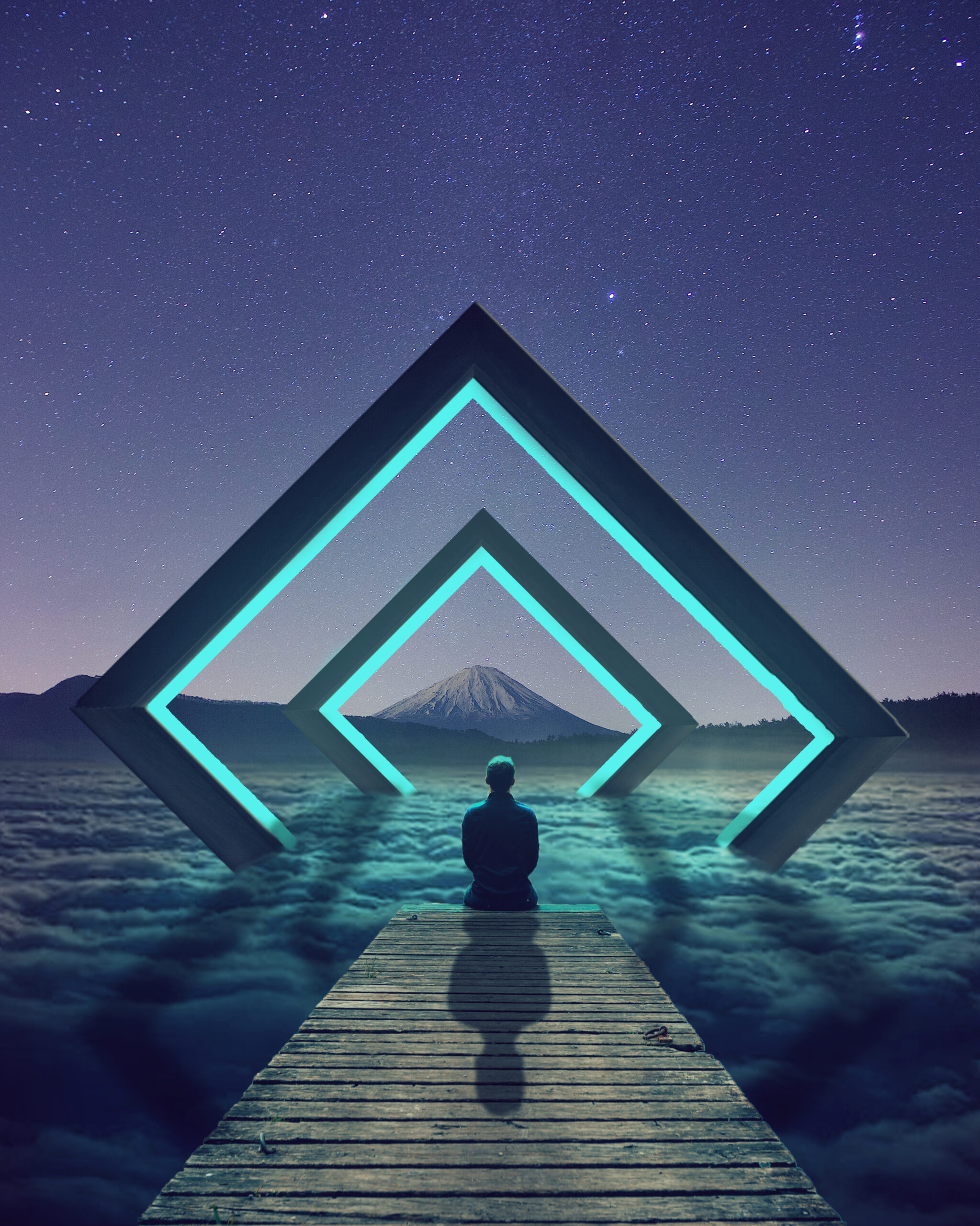
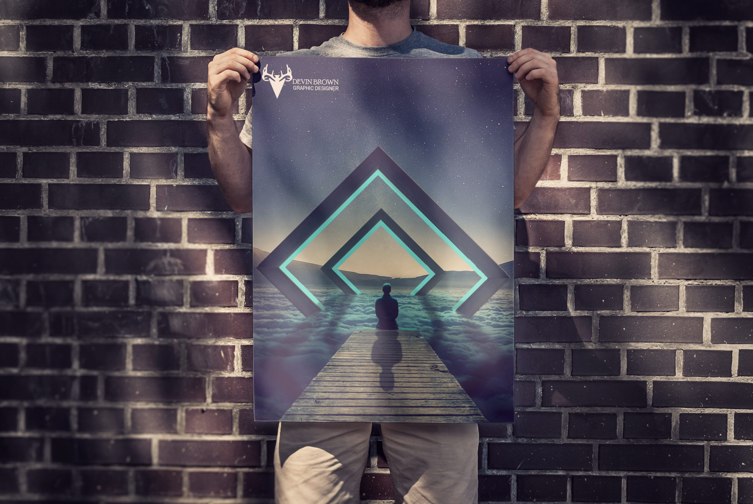
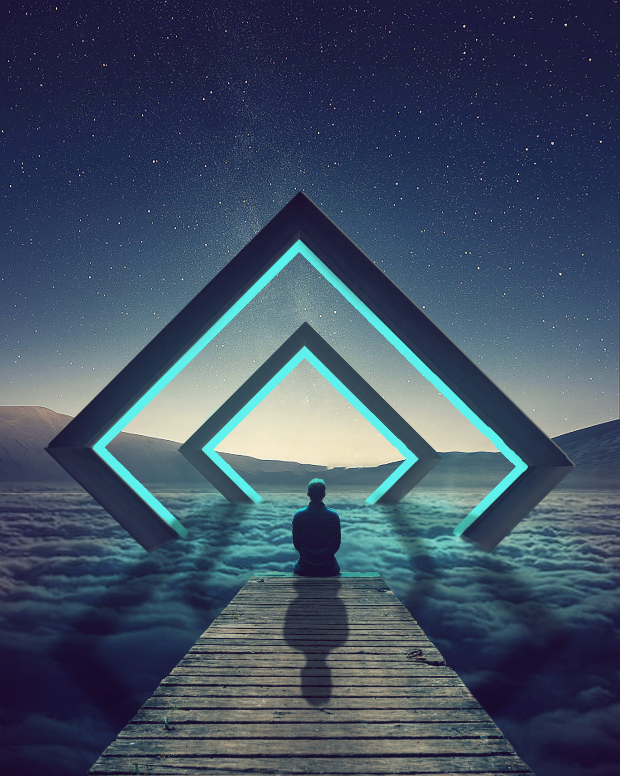
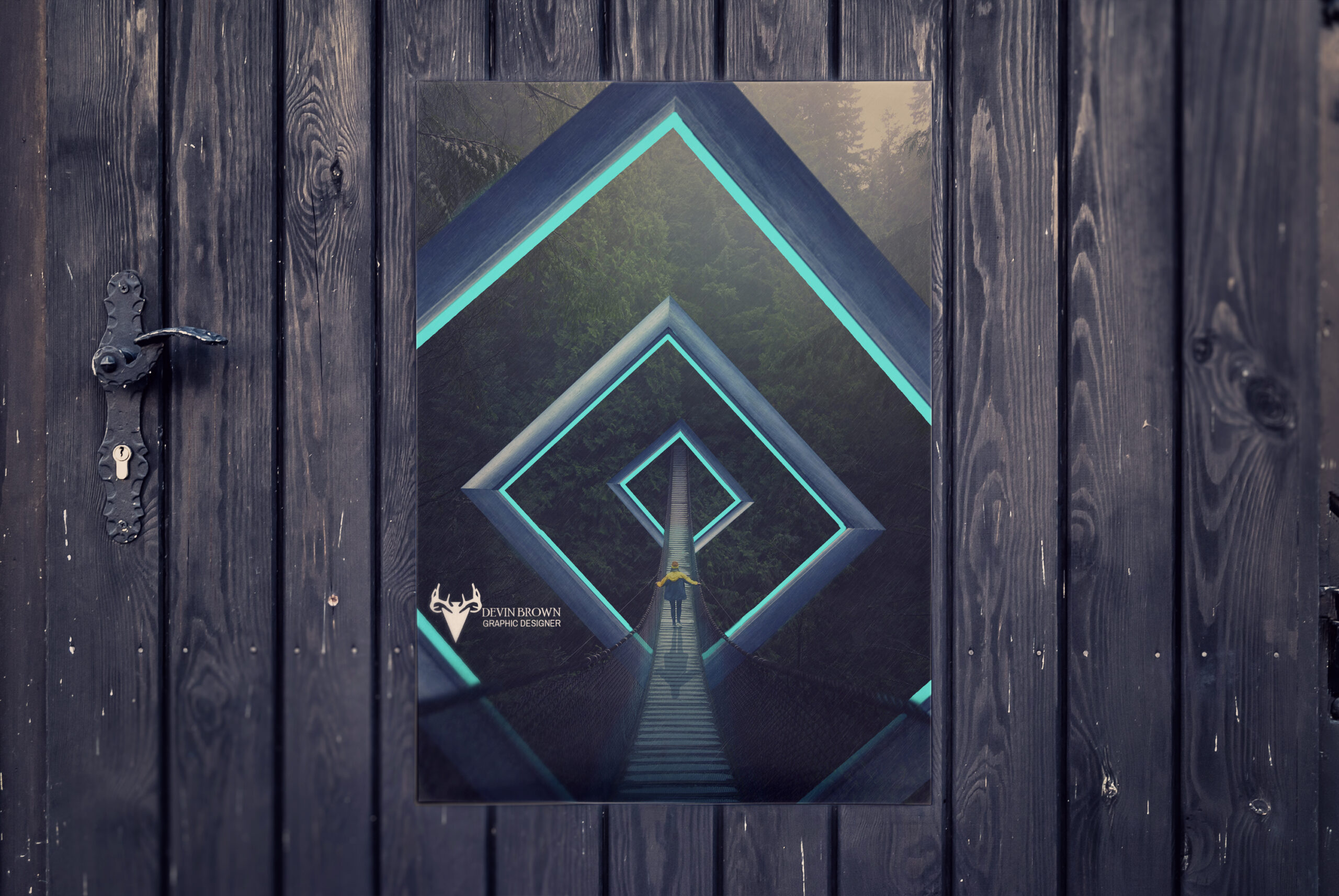
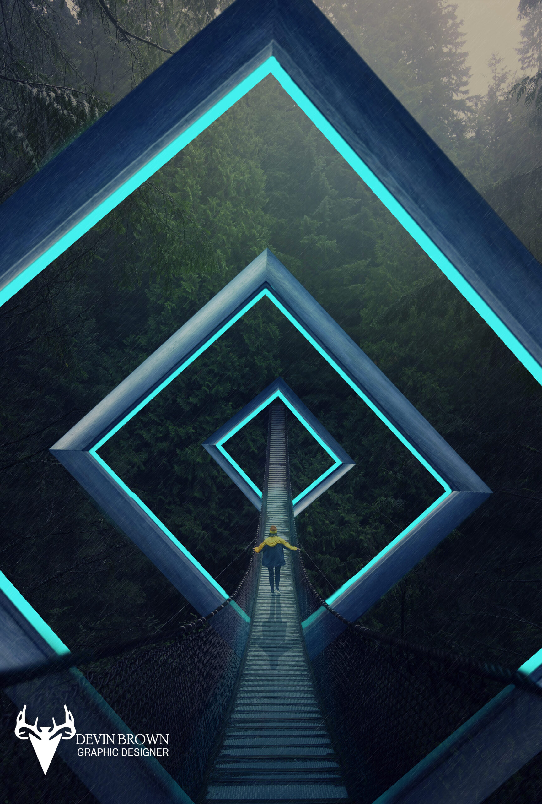
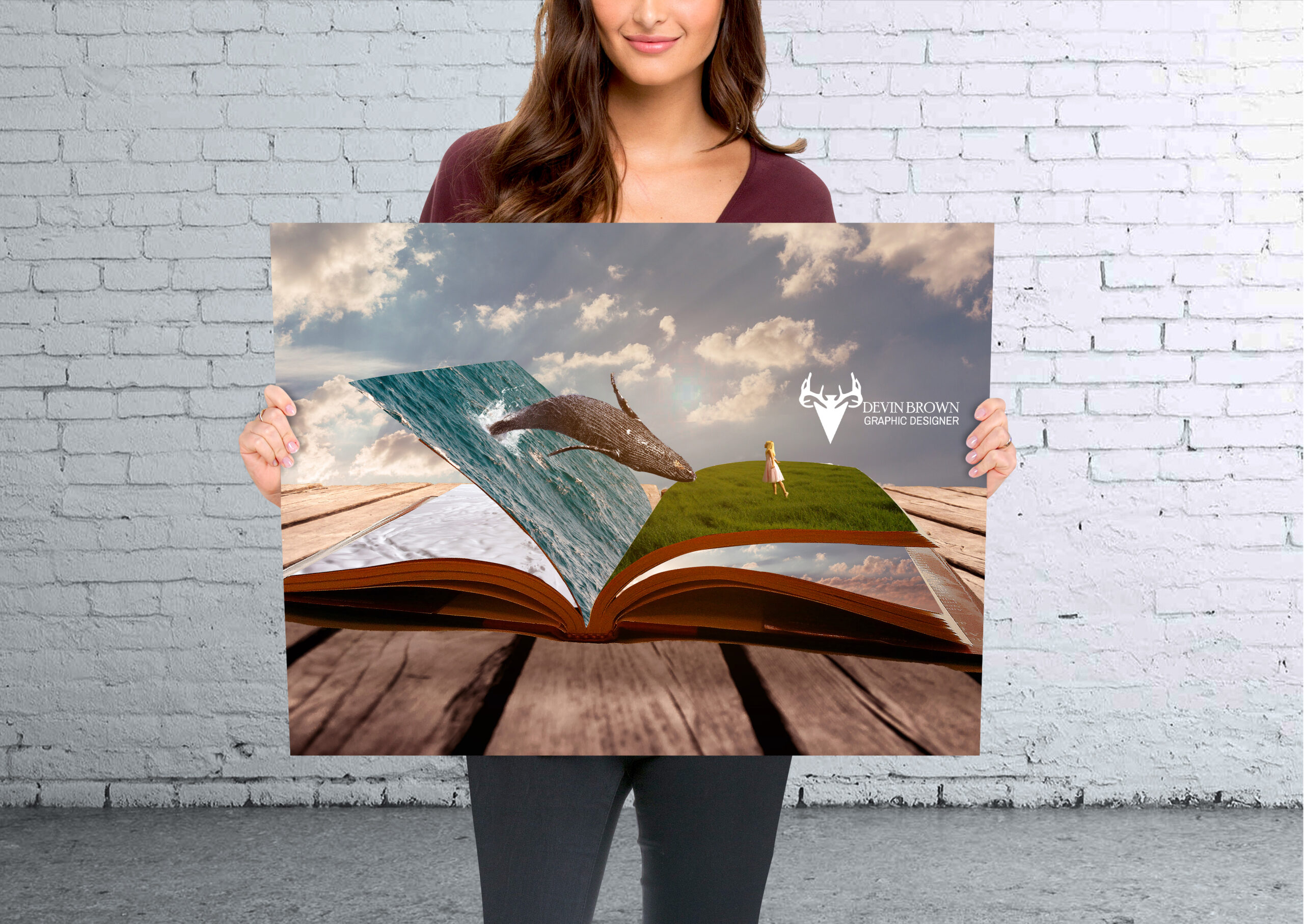
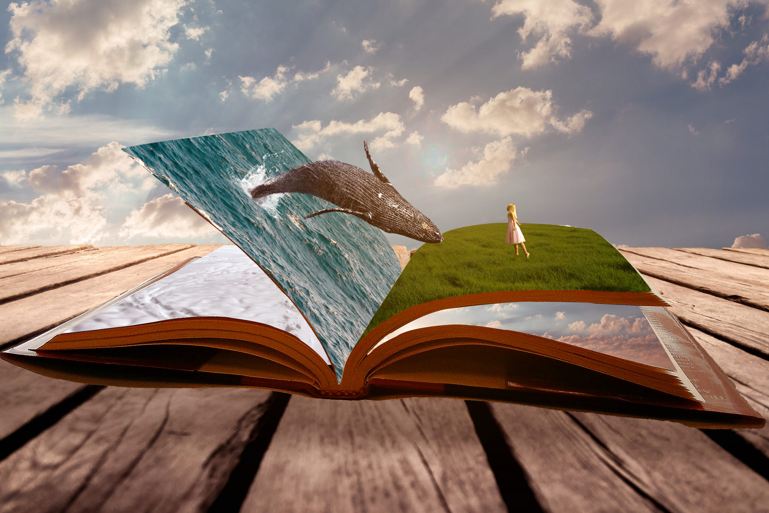
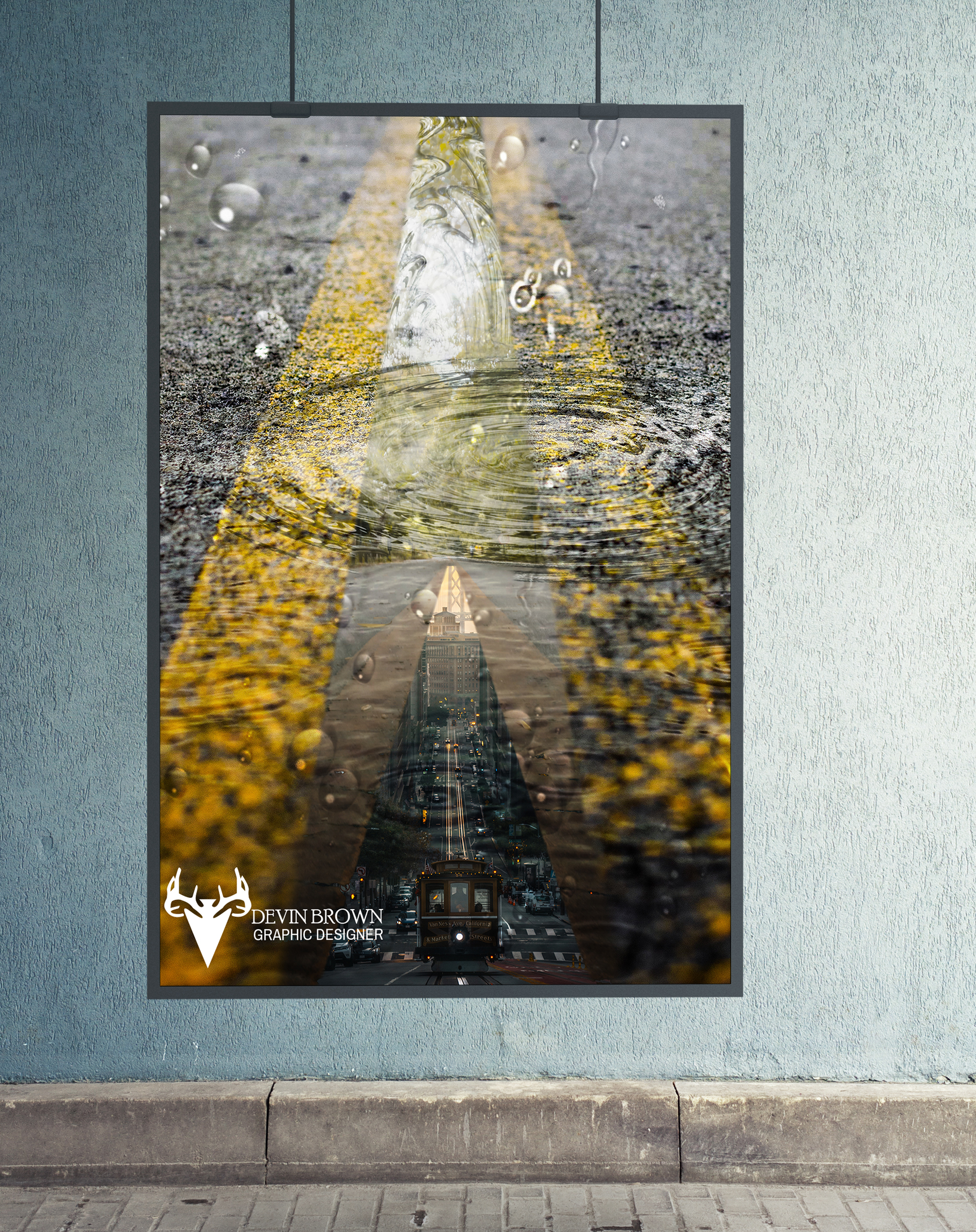
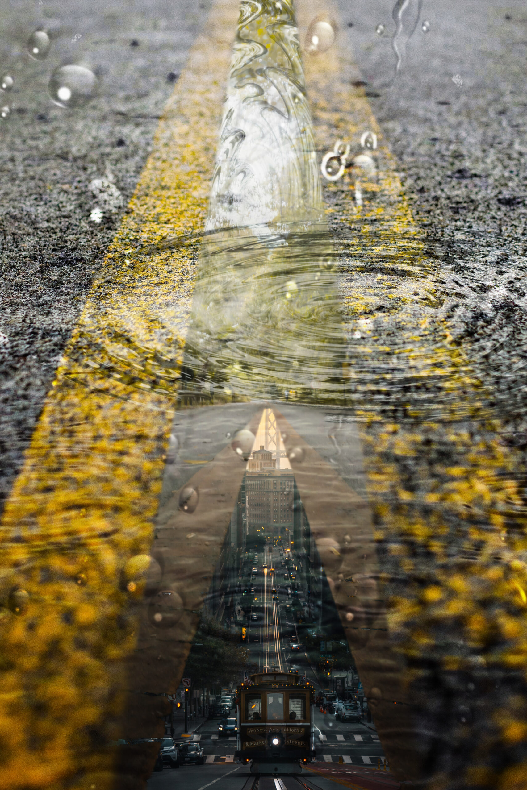
Low Poly
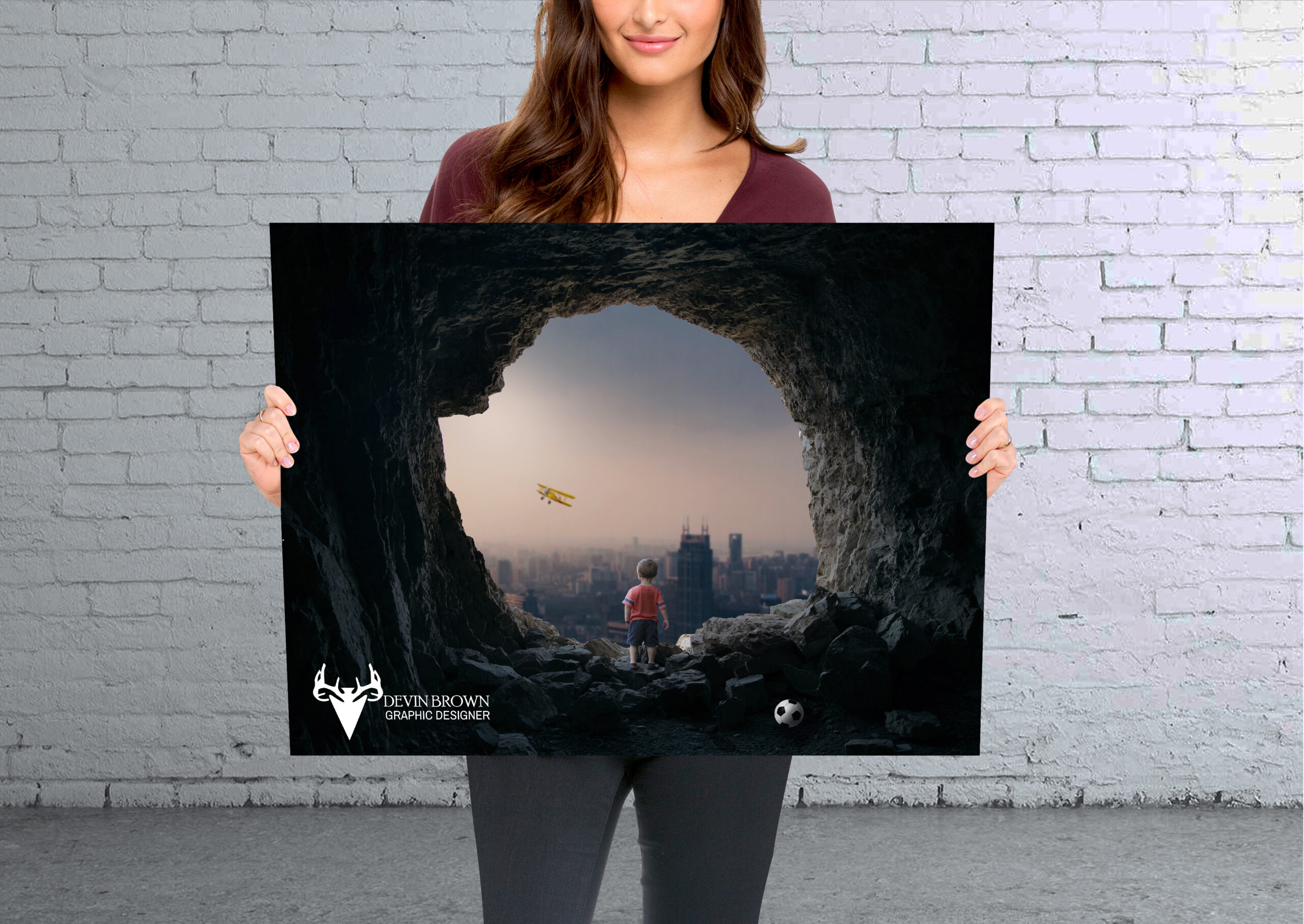
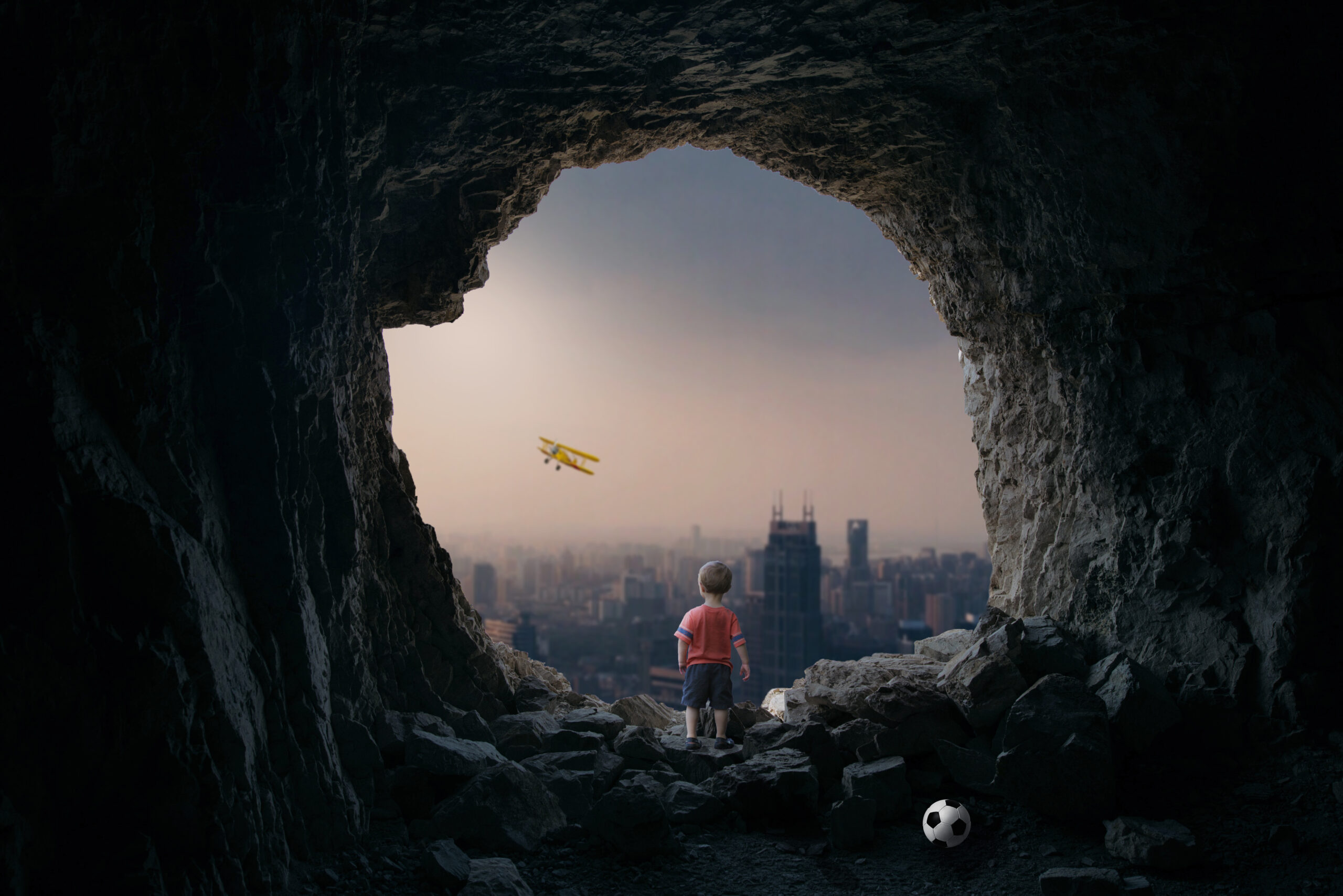
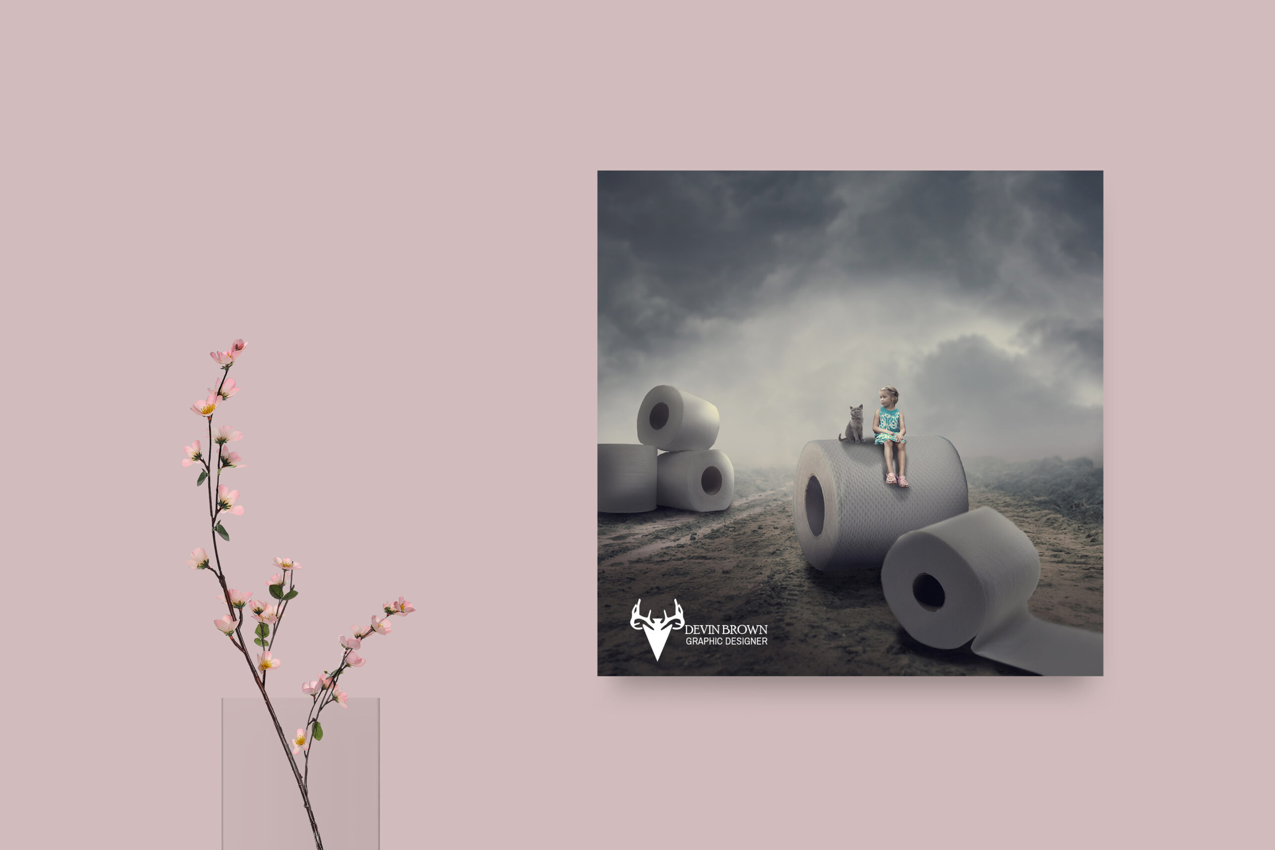
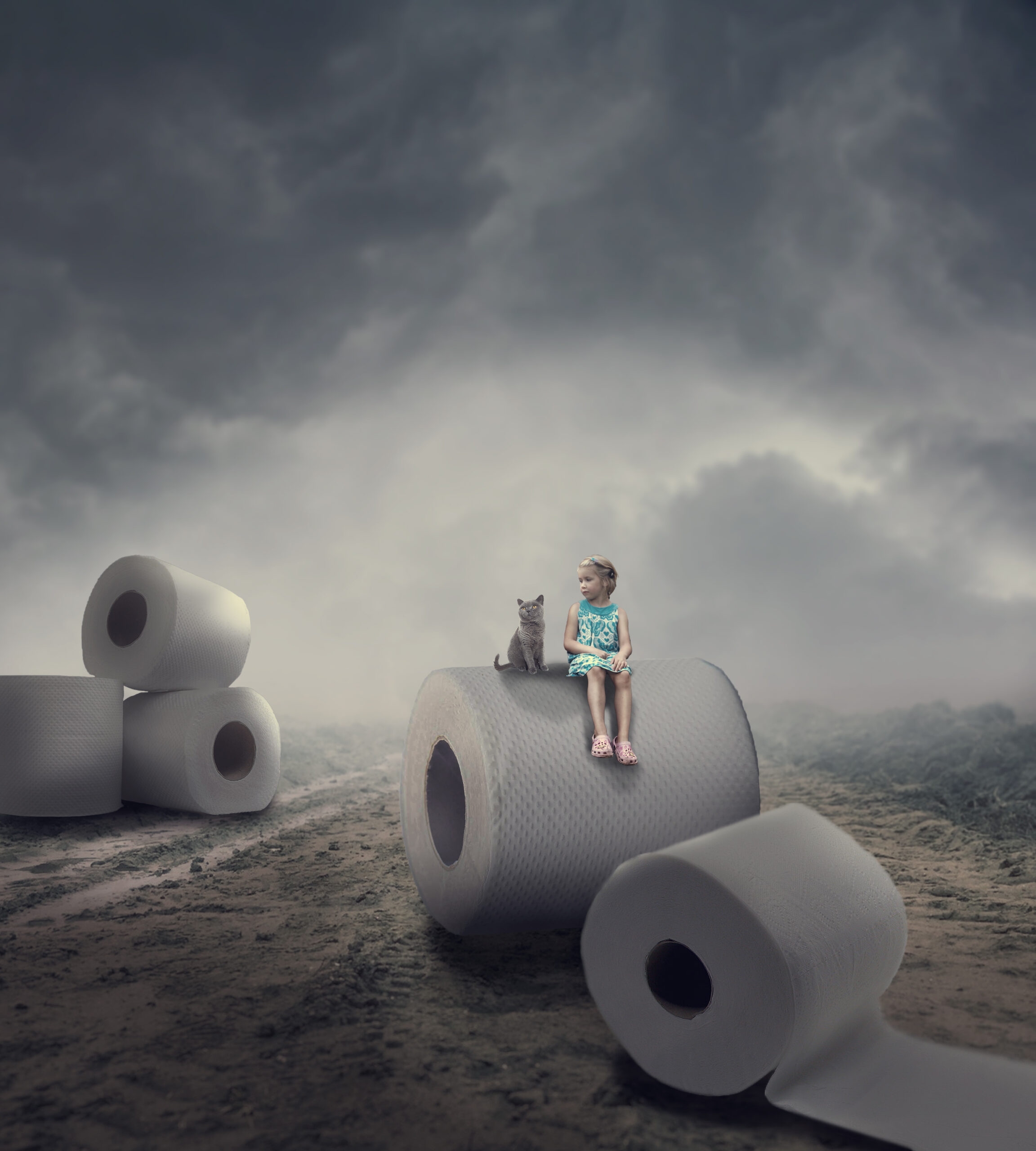
Fantasy Photo Manipulation
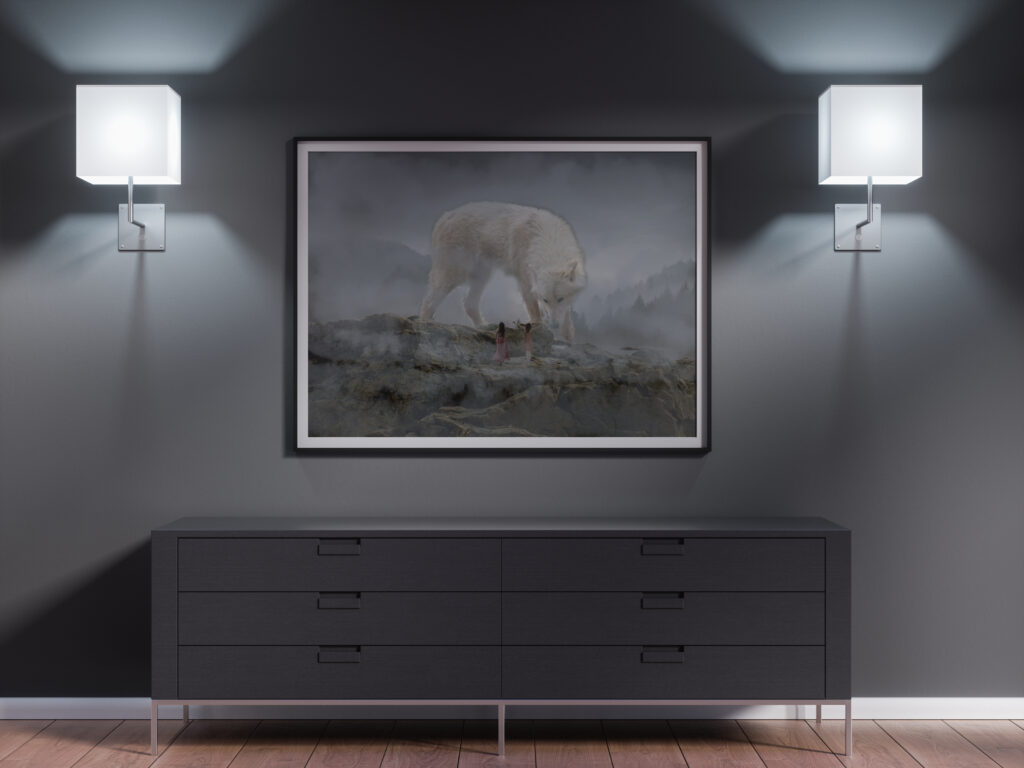
I started by finding all of the images. Then I brought the rock layer in. Then I added the foggy tree background. I shrunk the image down a little so I could add another sky picture. I added the wolf I adjusted the picture so it looks like its walking on the rocks. Then I added the women I positioned them so it looked like the wolf was looking at them. Then I downloaded a cloud brush and covered the picture with more fog. It represents scale by showing the women as smaller than the wolf.
Fanta Orange Advertisement
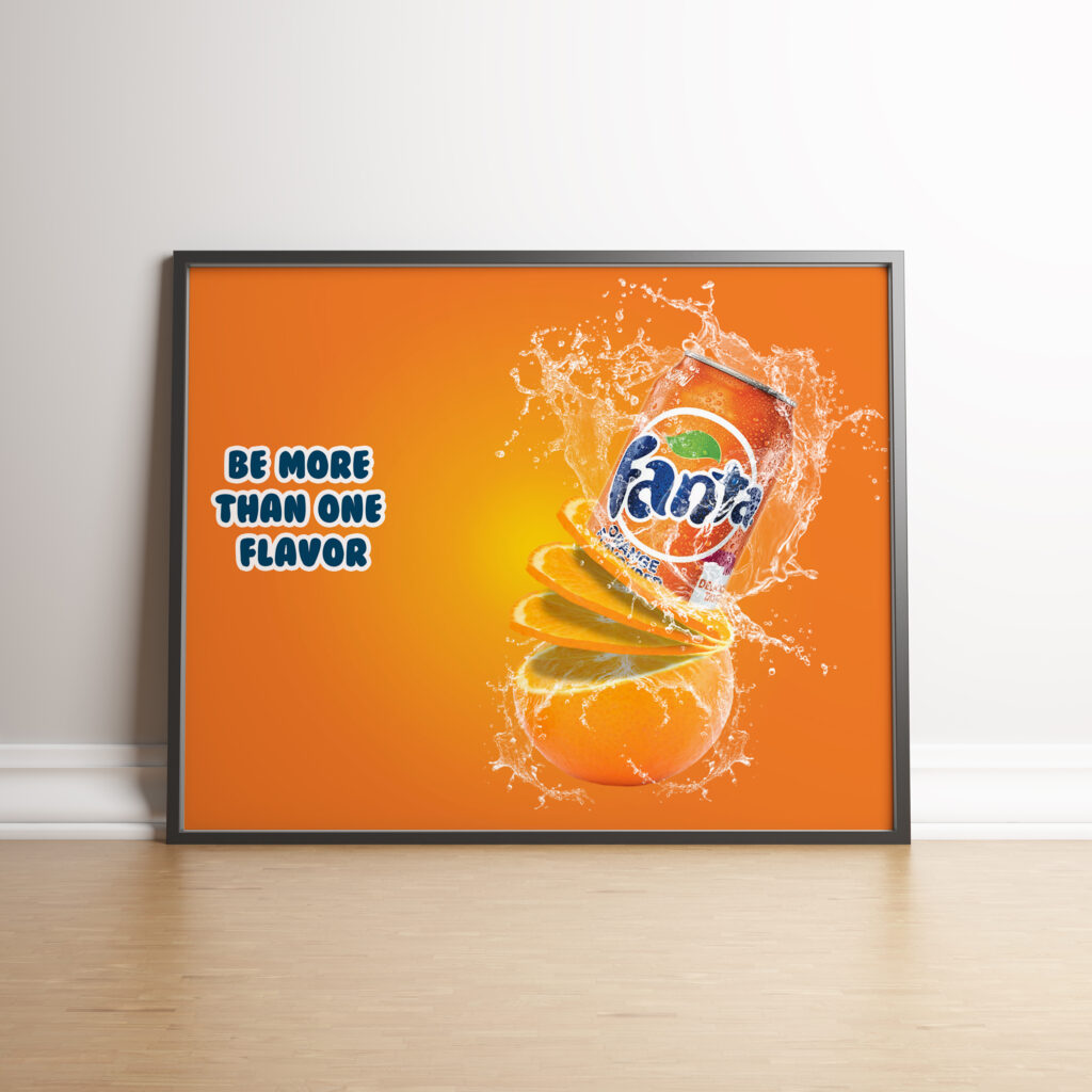
I started by finding the images and I downloaded a few water splash brushes. Then I opened the orange photo up and I used the quick selection tool to select the whole orange. Then I pasted the orange into the photo with the can. I used the lasso tool to select the top portion and cut it out. I went back to the orange picture and used the selection tool to select the slice. Then I pieced the slice on top of the orange using the warp tool. I also used the scale tool to get it just right. I copied the slice to create three more slices and I added a shadow between the slices.
Then I added the can. I positioned the can to the three slices and masked out the bottom portion of the can. So where it blends into the top slice. Then I added a variety of water splashes around the can. Then I put a couple of water splashes in between the bottom of the orange and the first slice to make it look like the water was pouring out. I put an orange radial gradient with the Fanta orange and added a slogan. This represents texture because the can has water droplets on it, the orange has its own texture. And the water makes a texture as well.
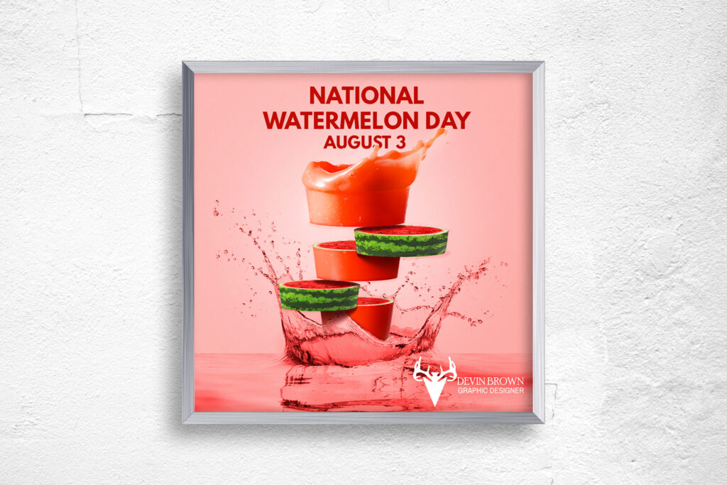
Watermelon Day
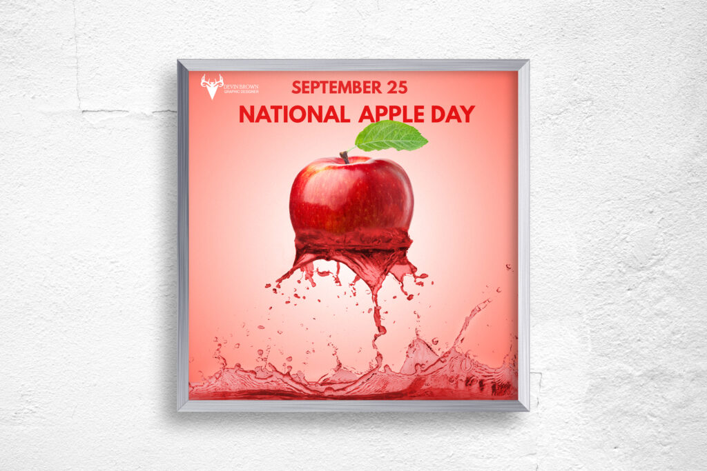
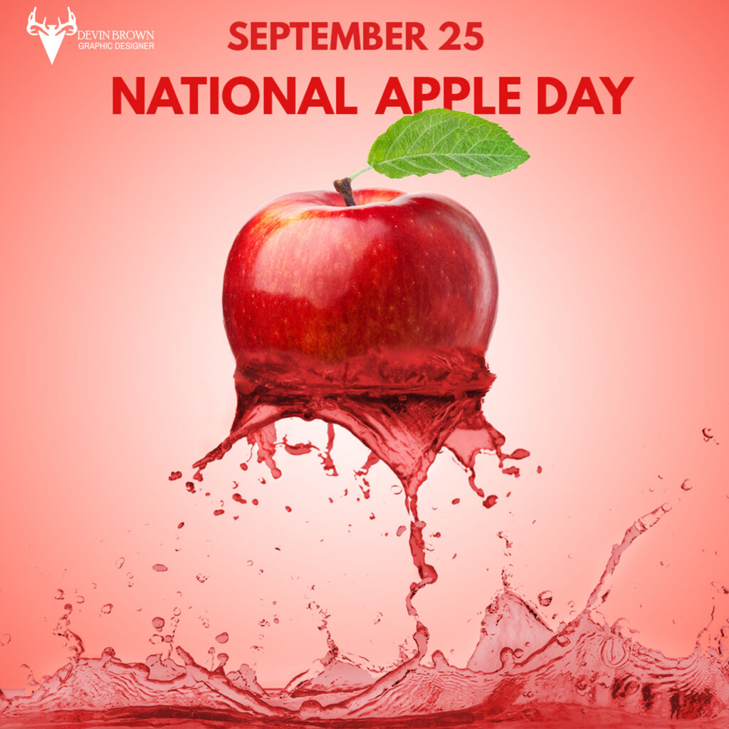
Apple Day
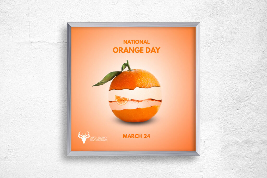
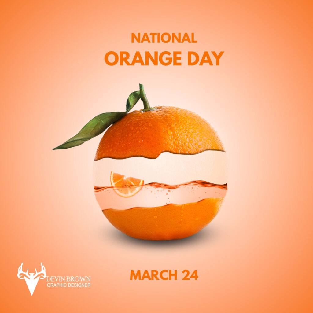
Orange Day
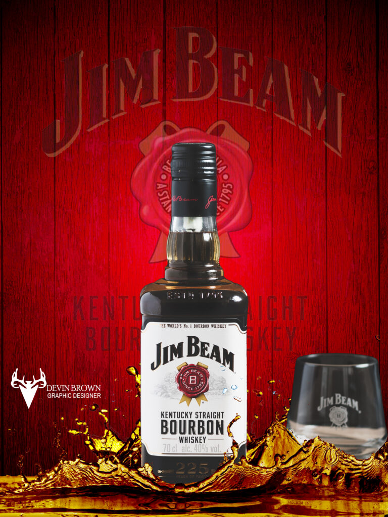
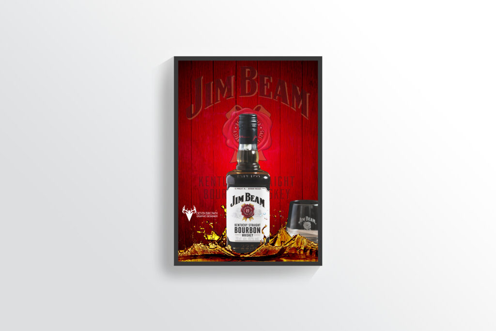
Jim Beam
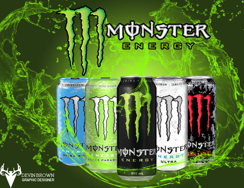
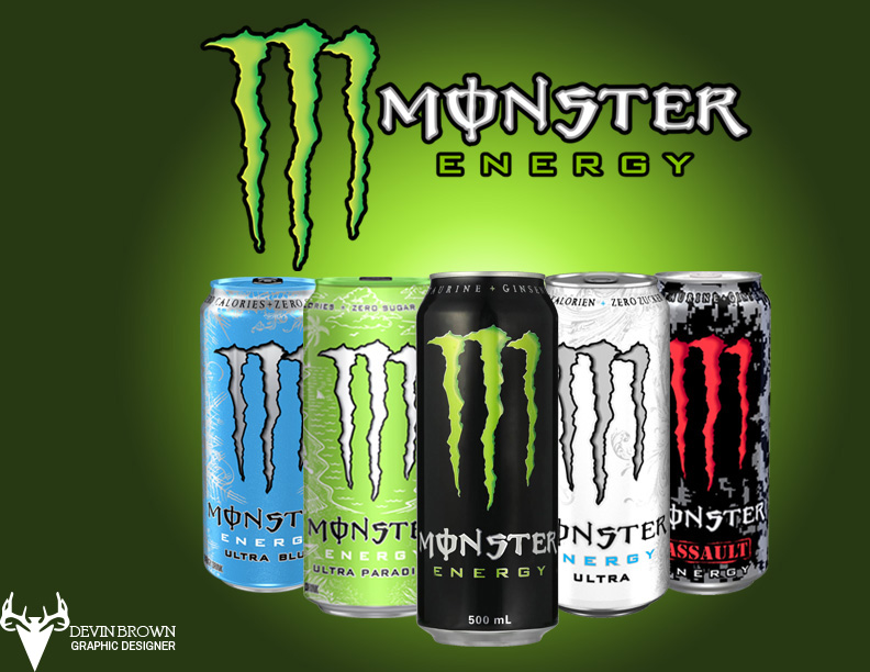
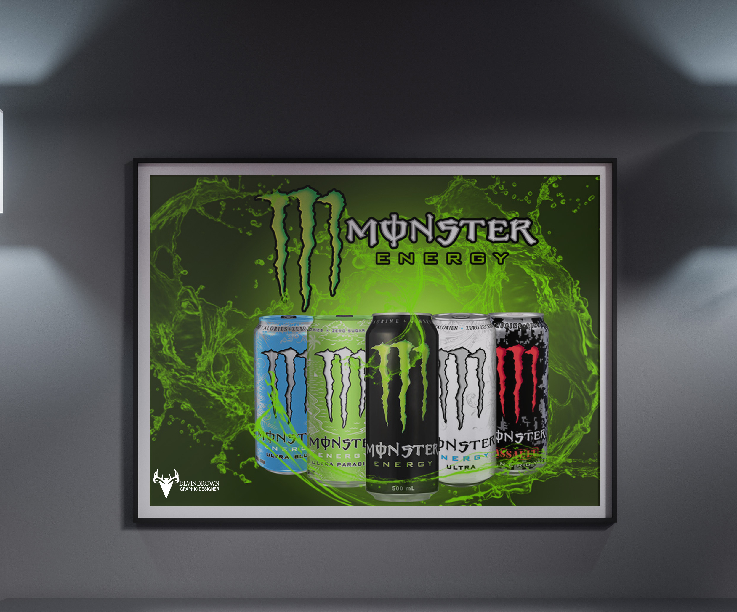
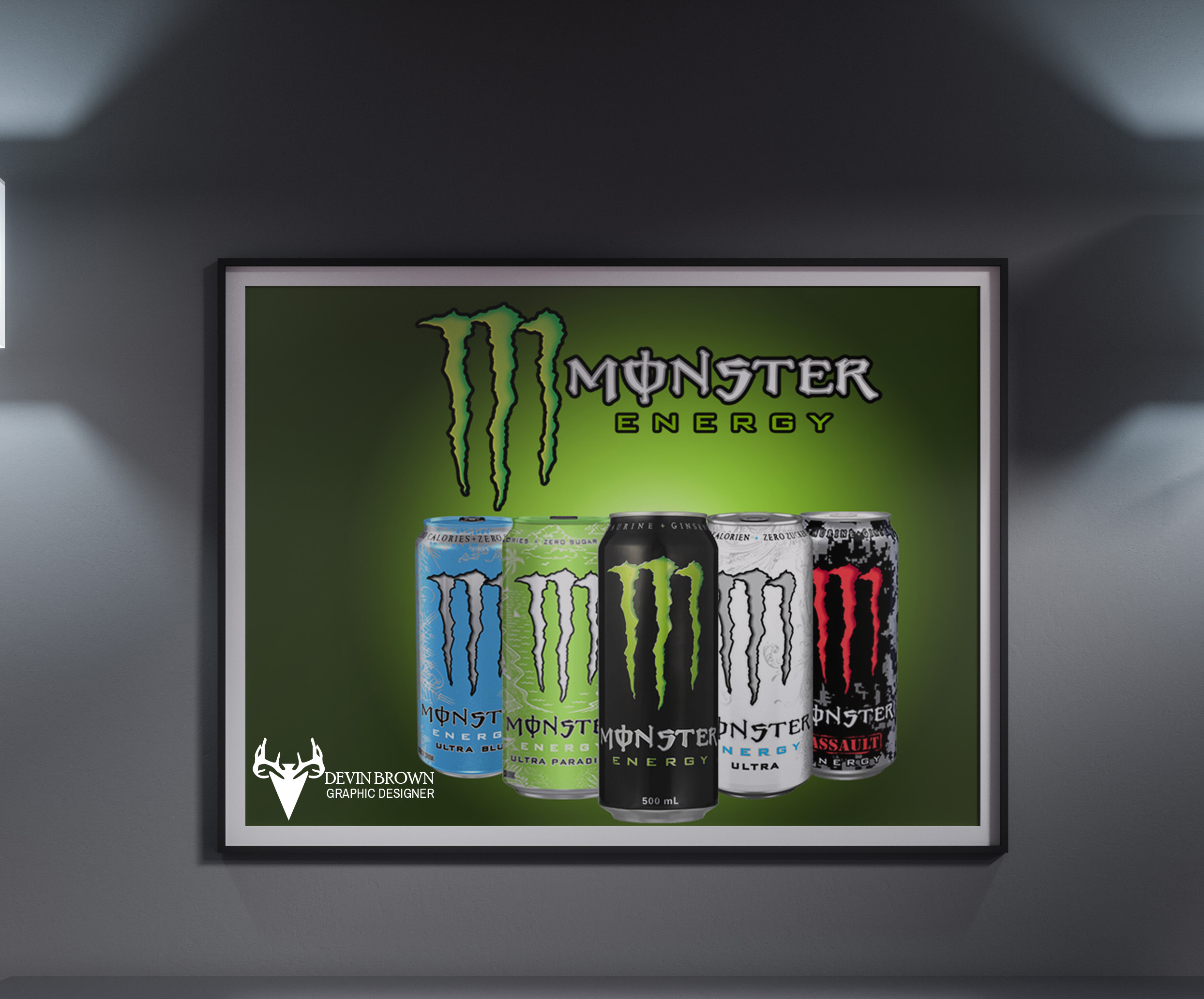
Monster Energy Advertisement
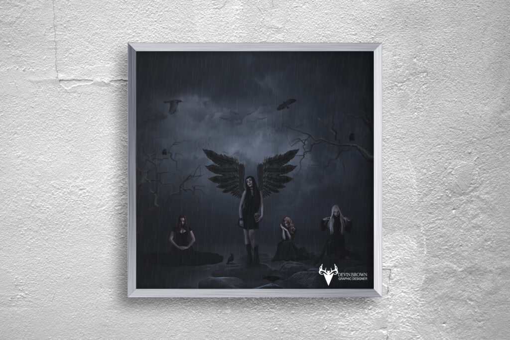
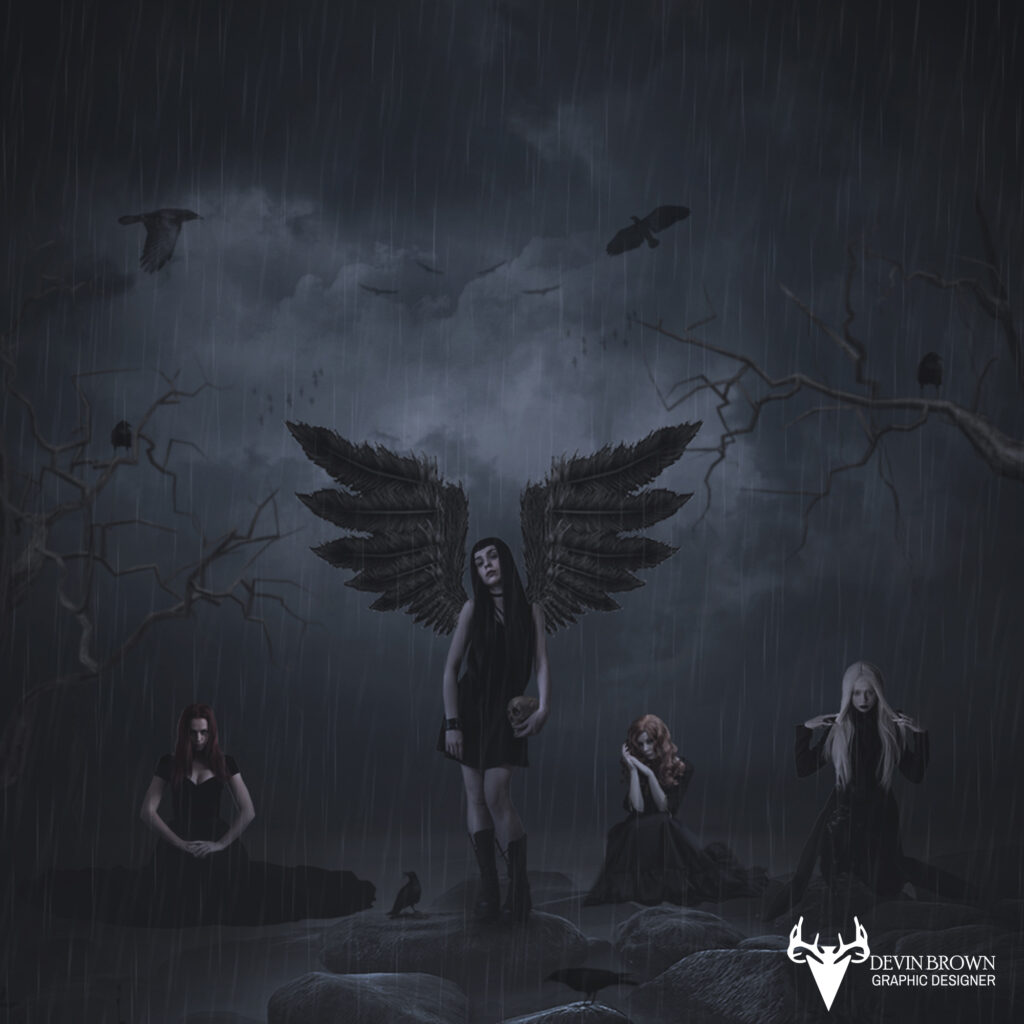
Raven
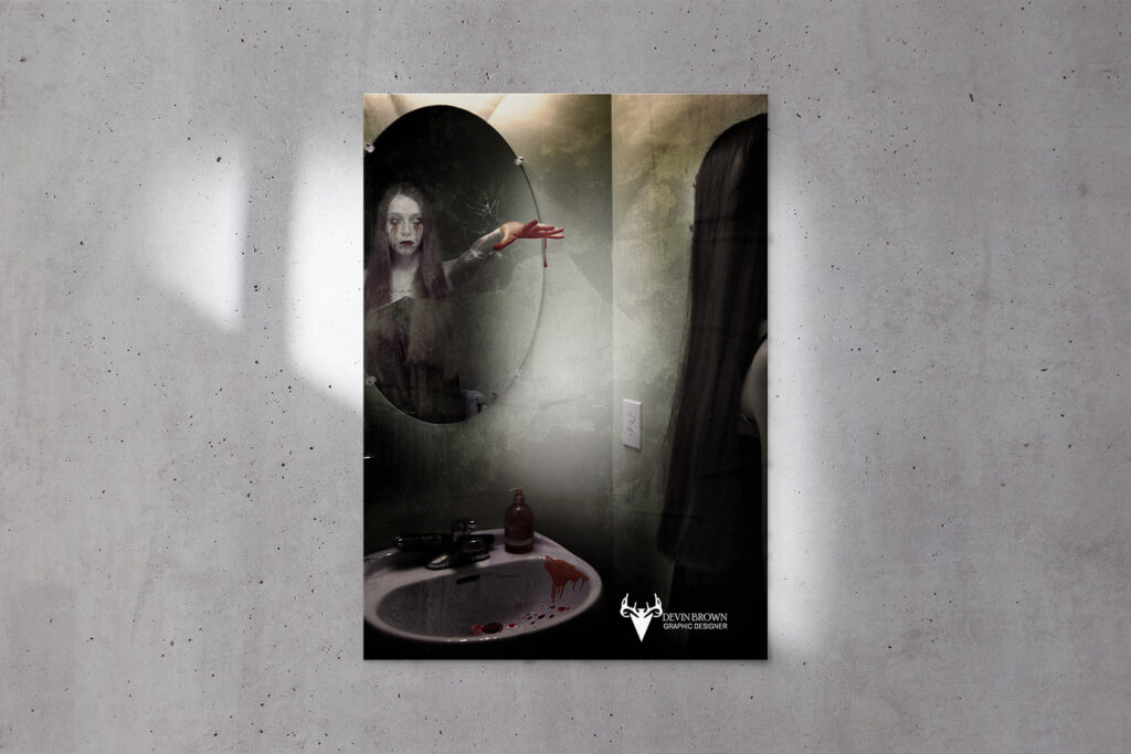
Mirror Zombie
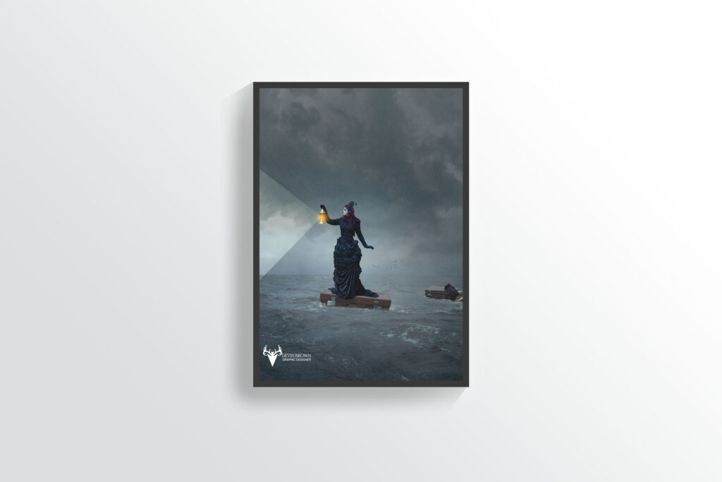
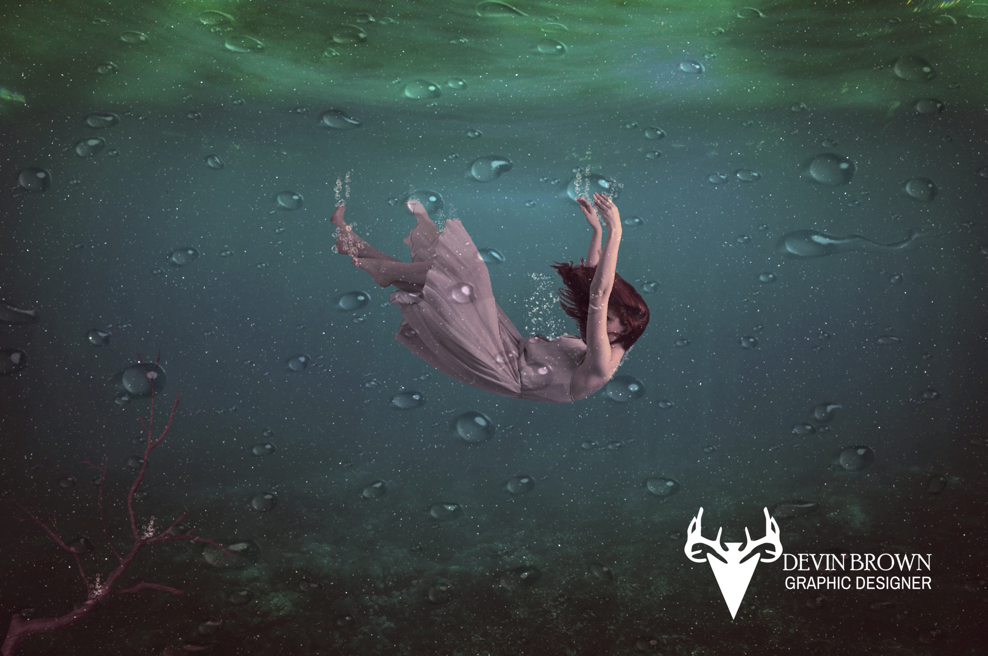
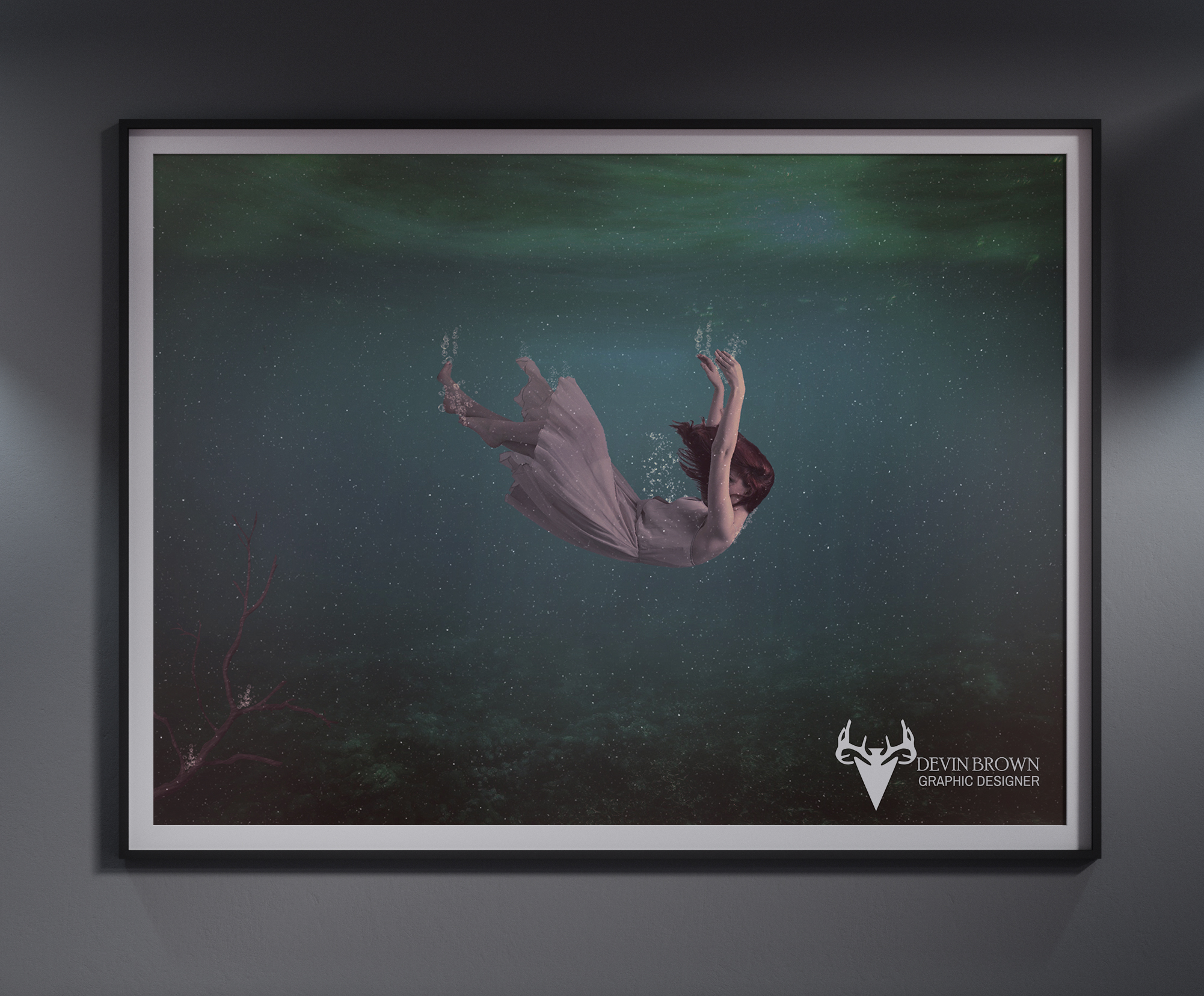
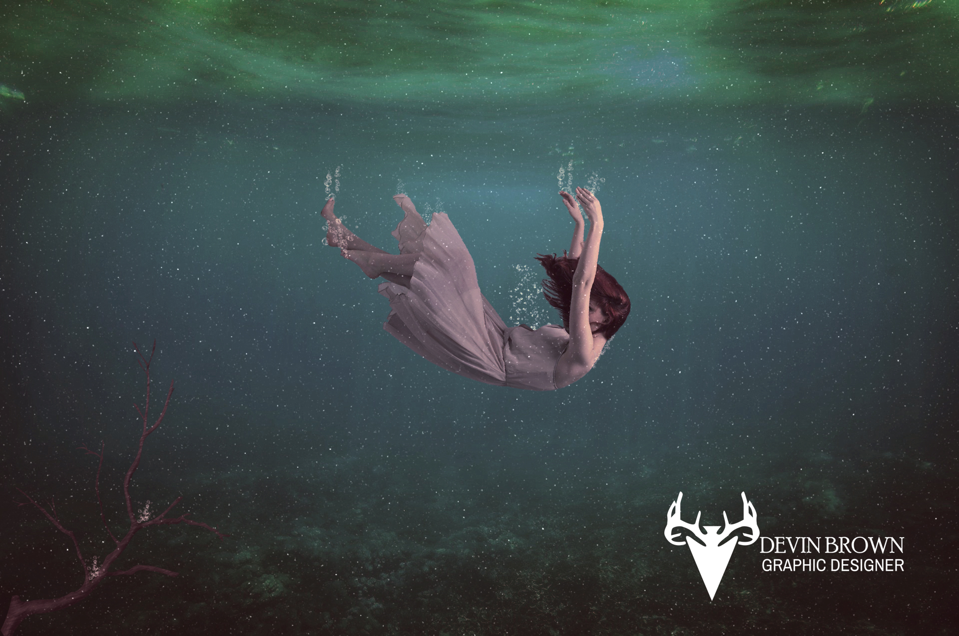
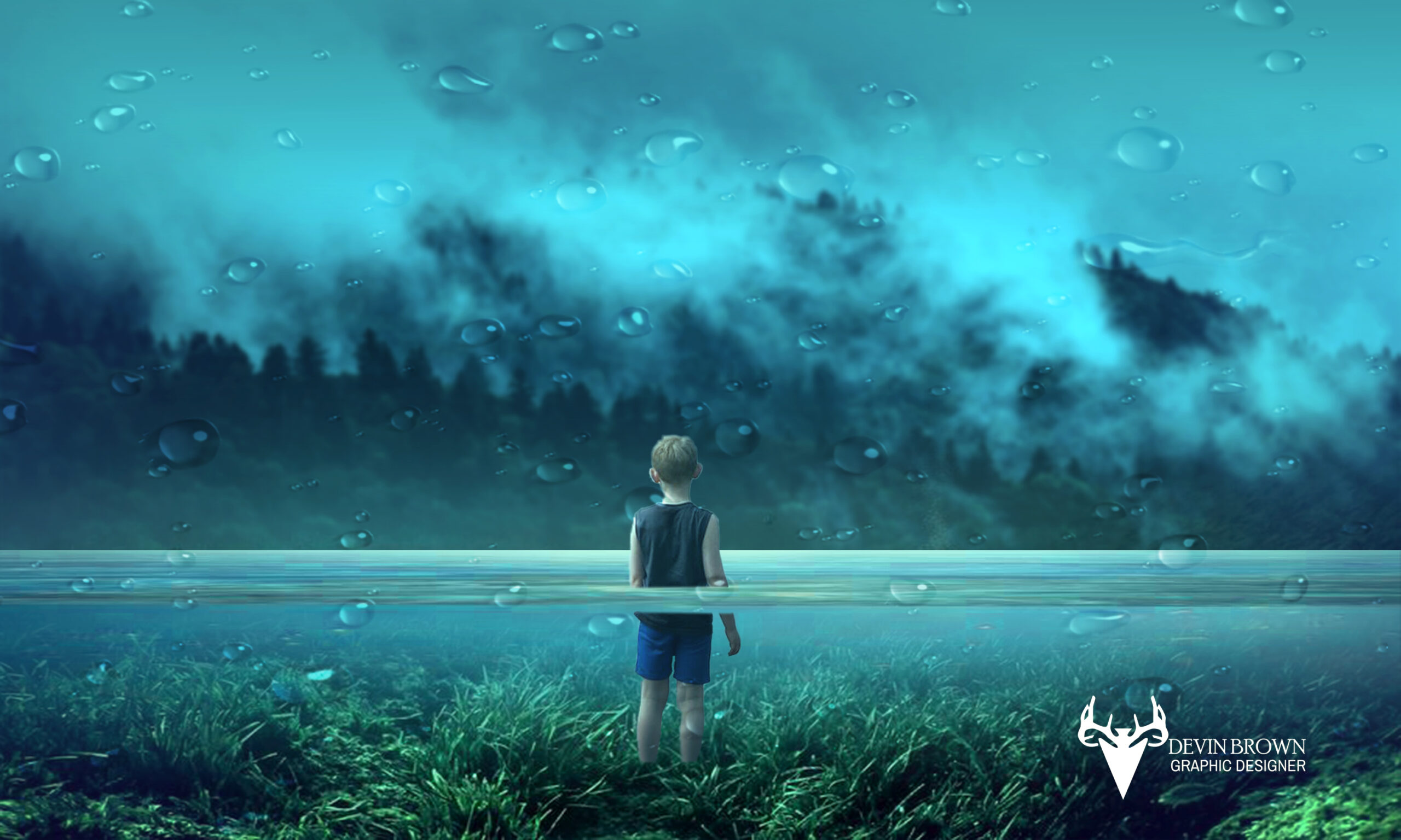
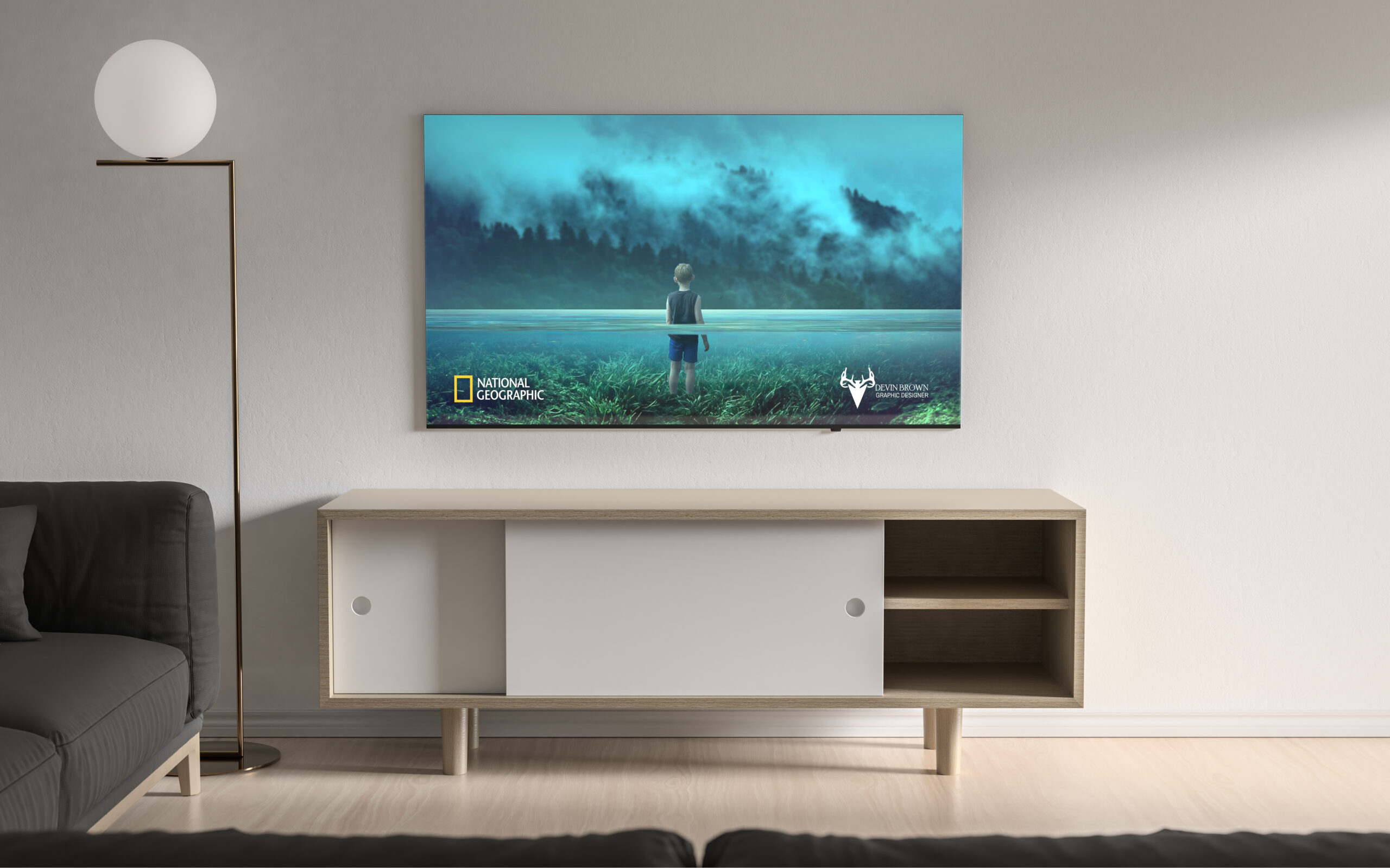
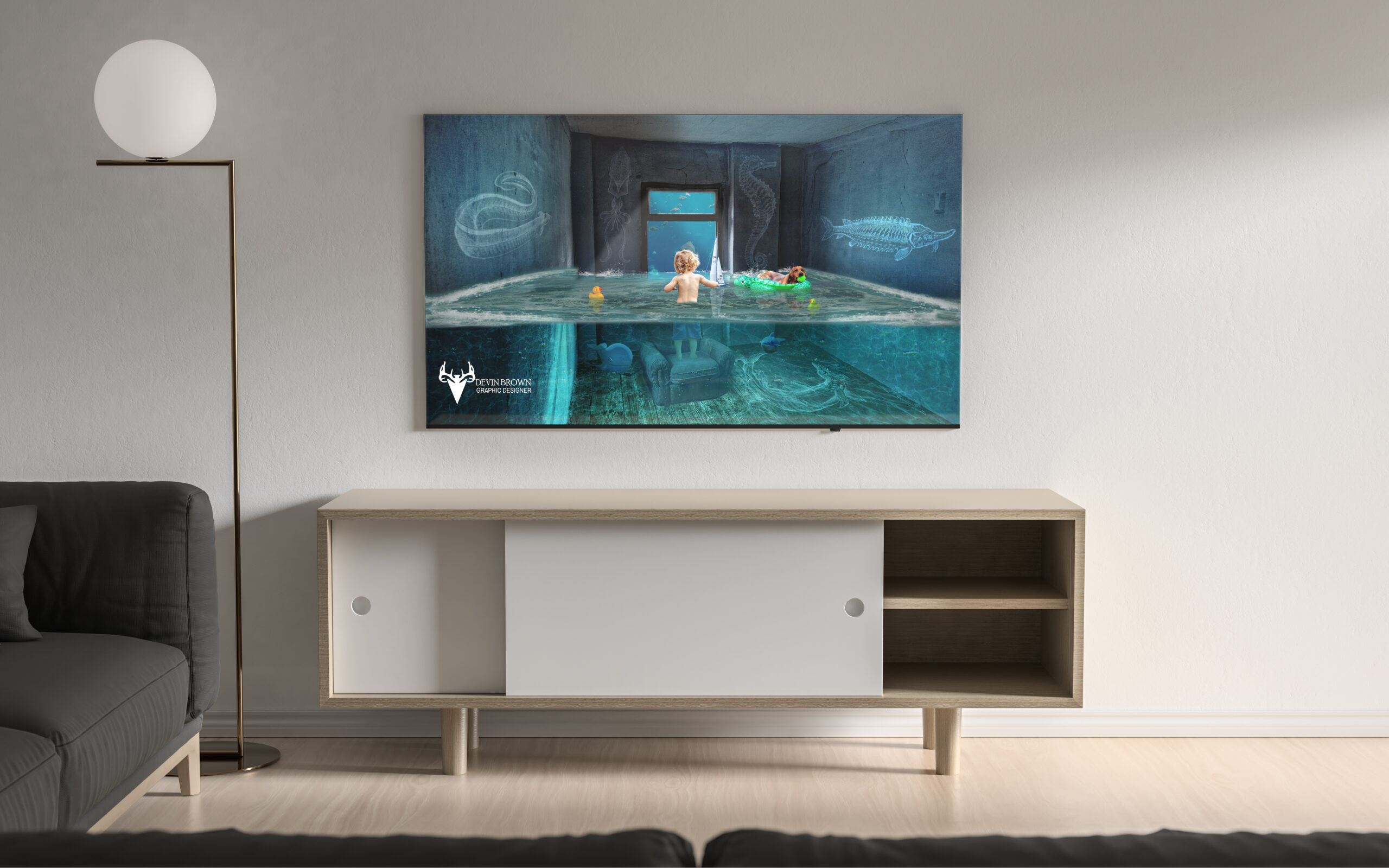
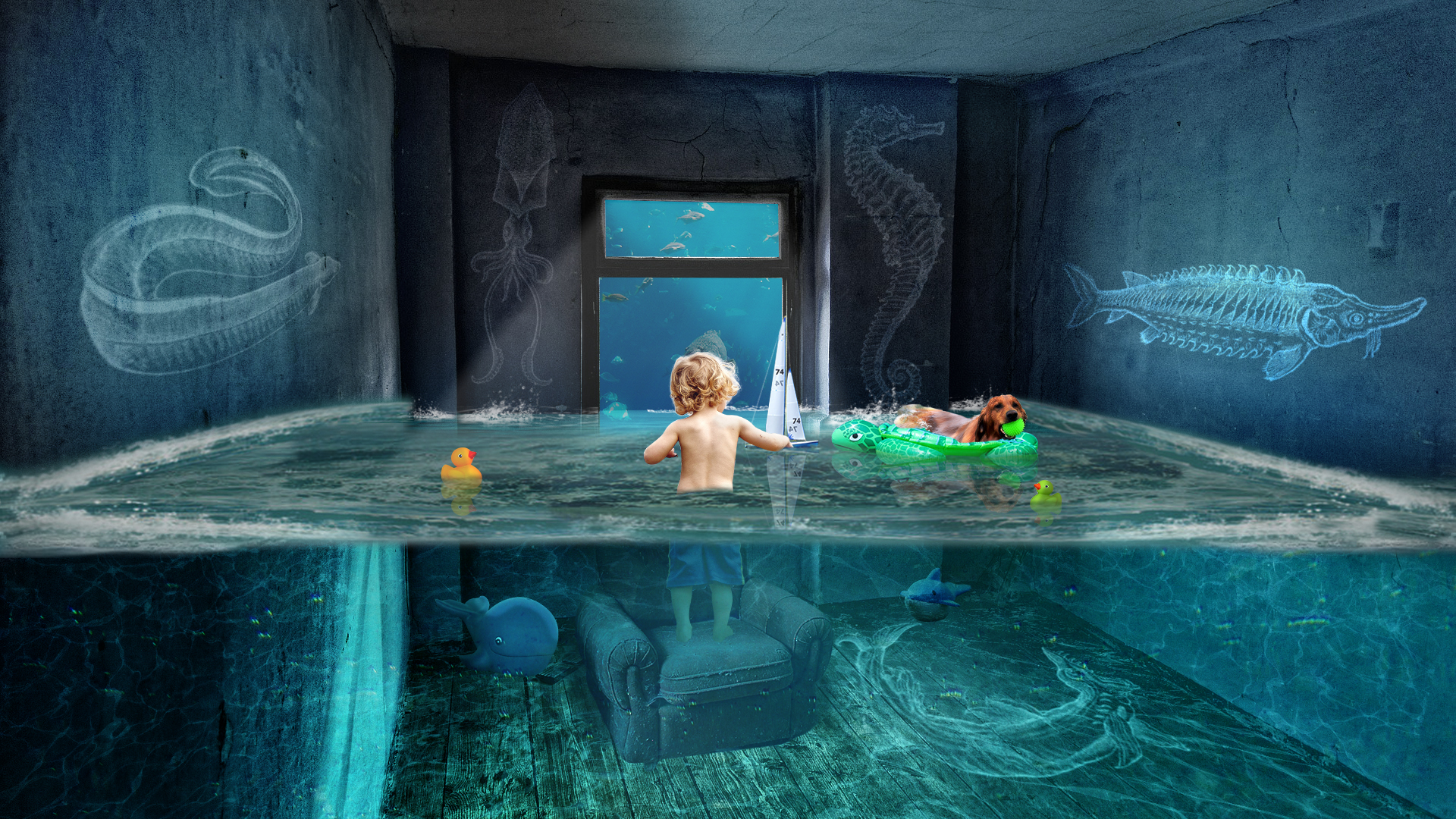
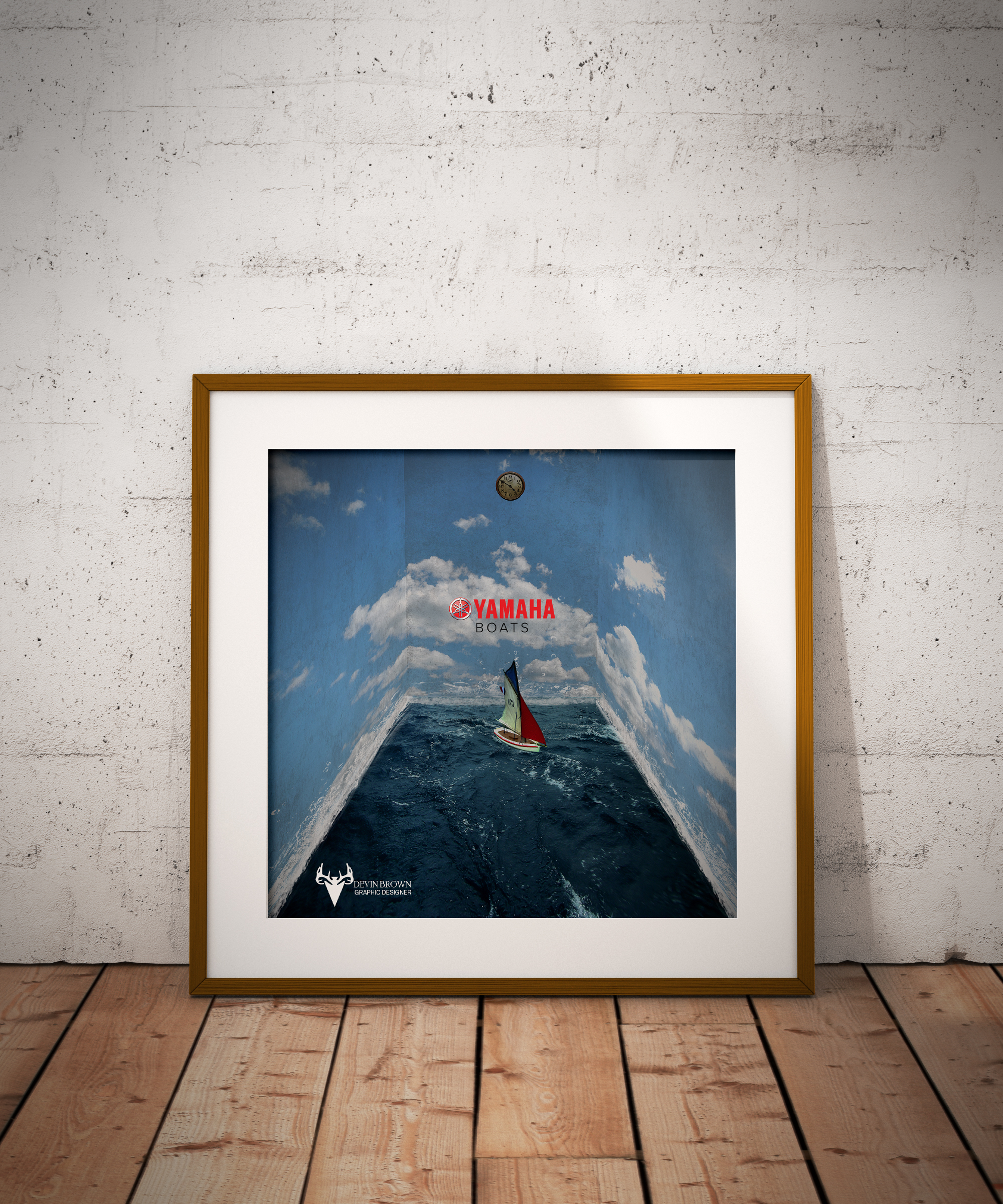
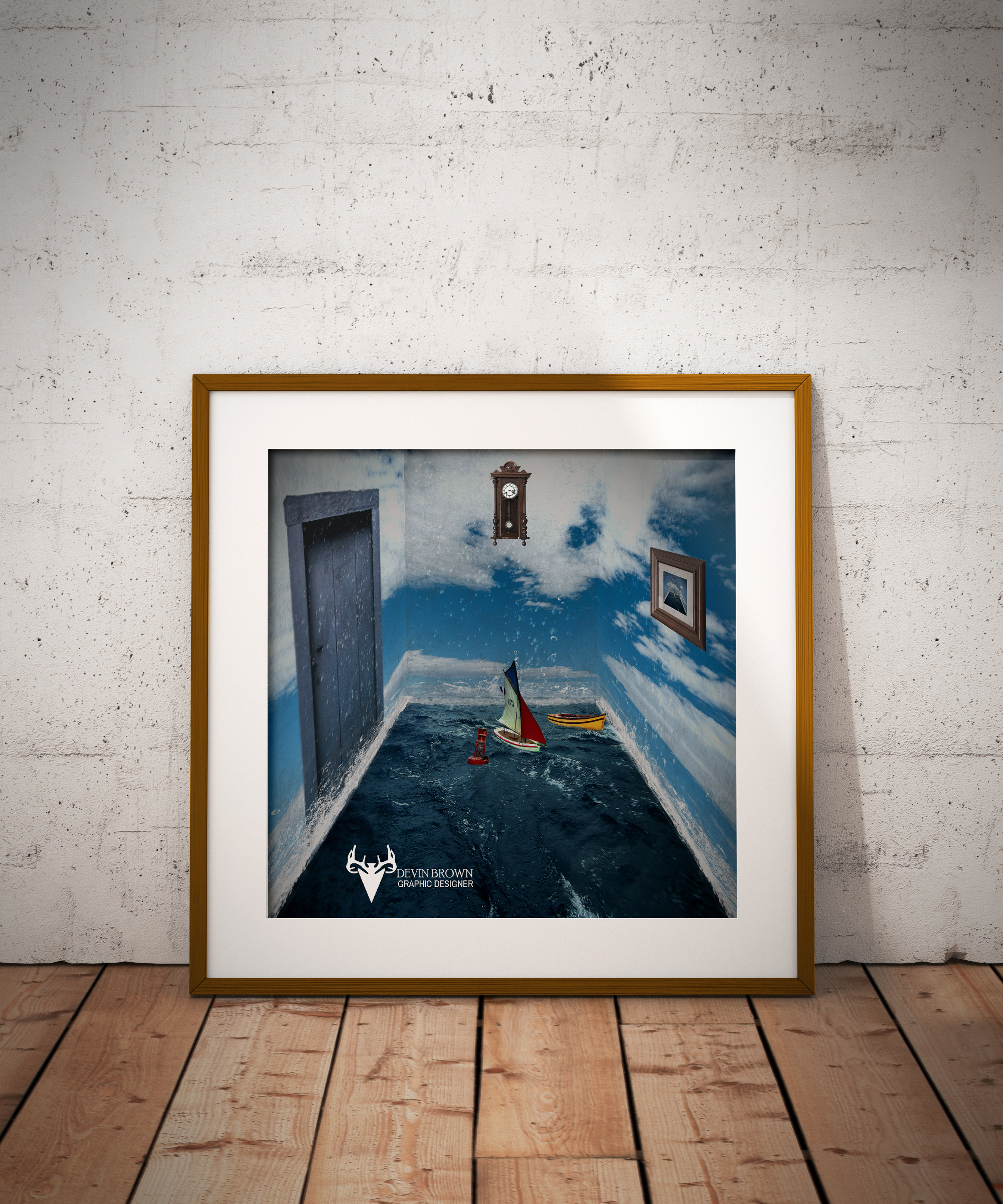
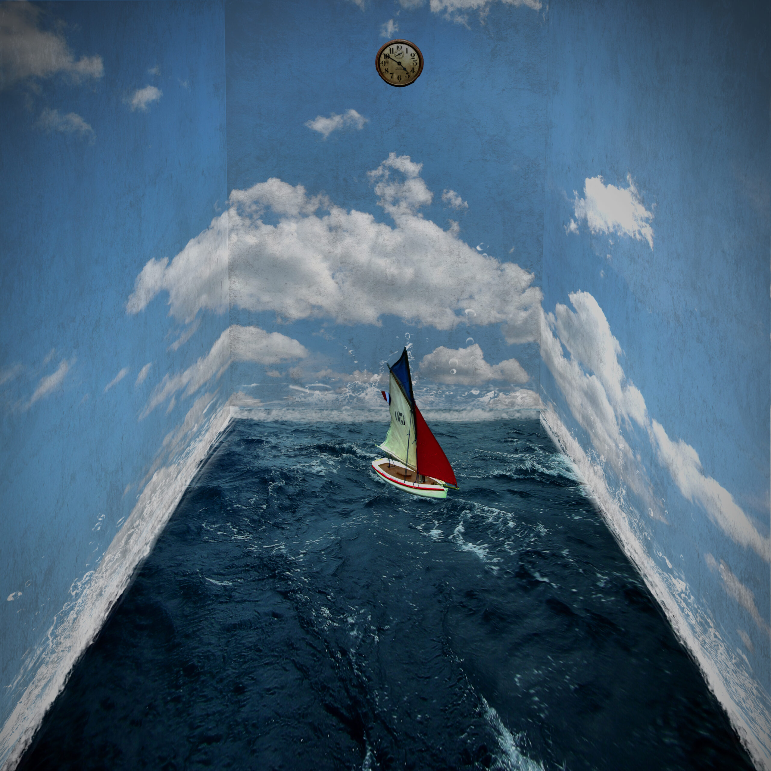
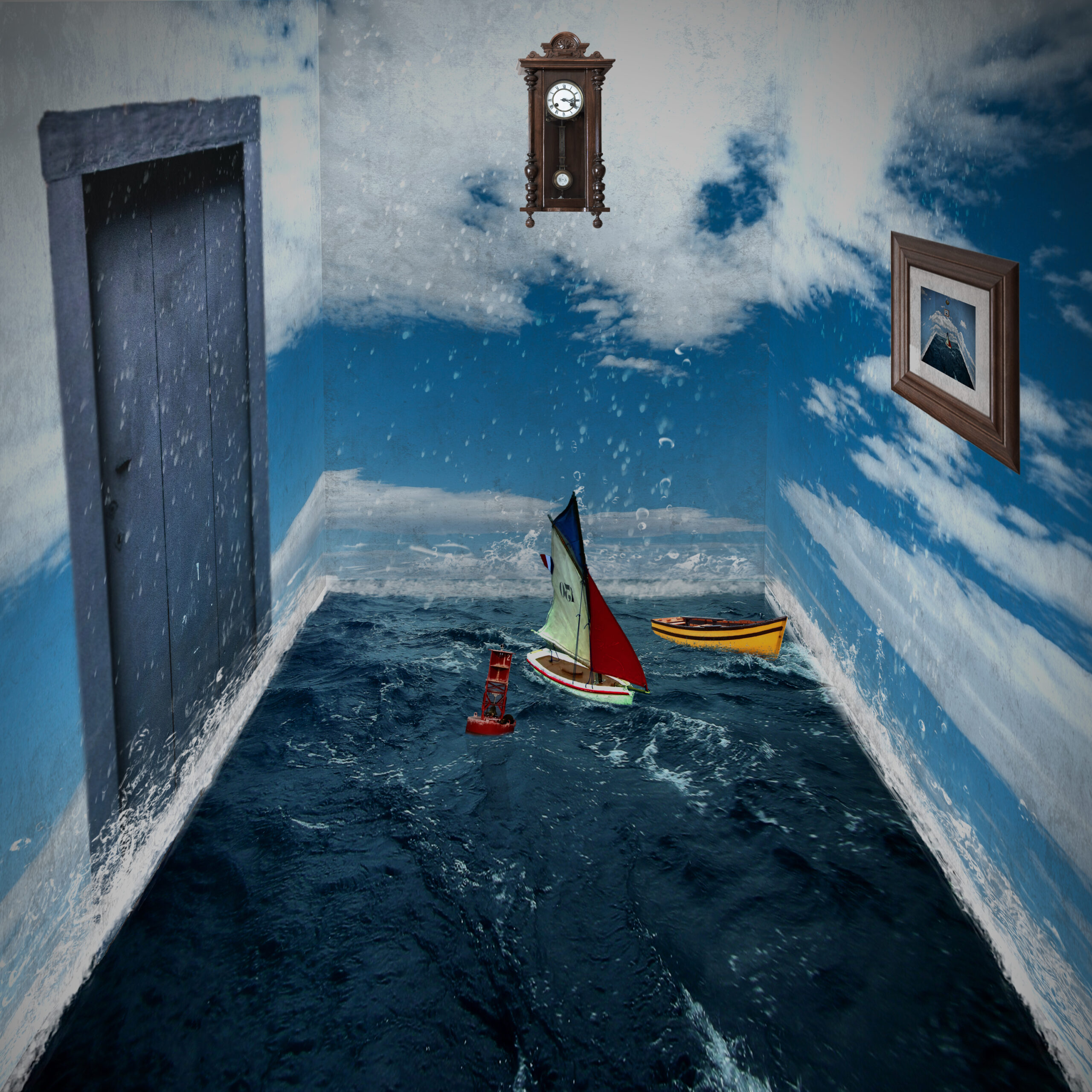
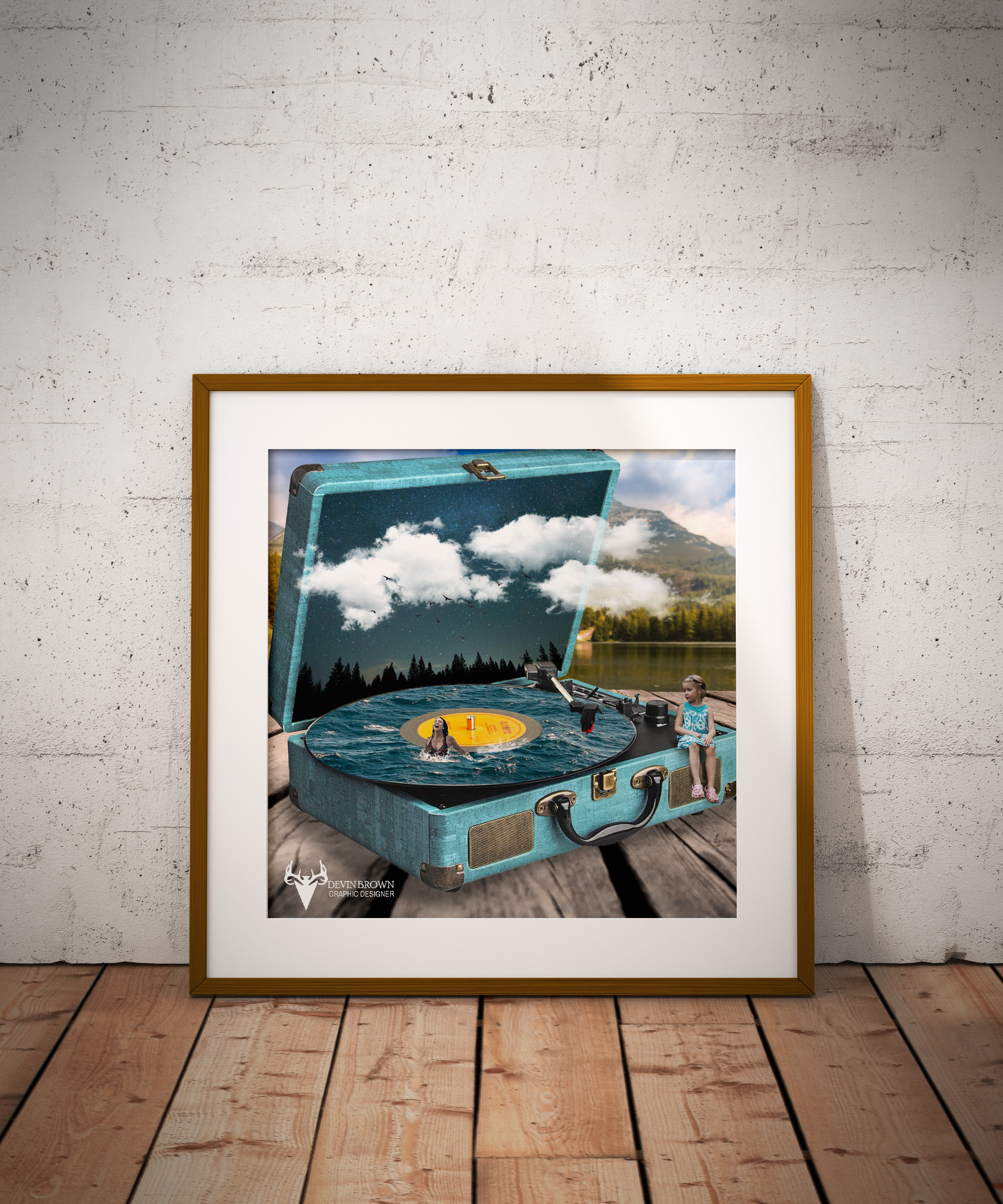
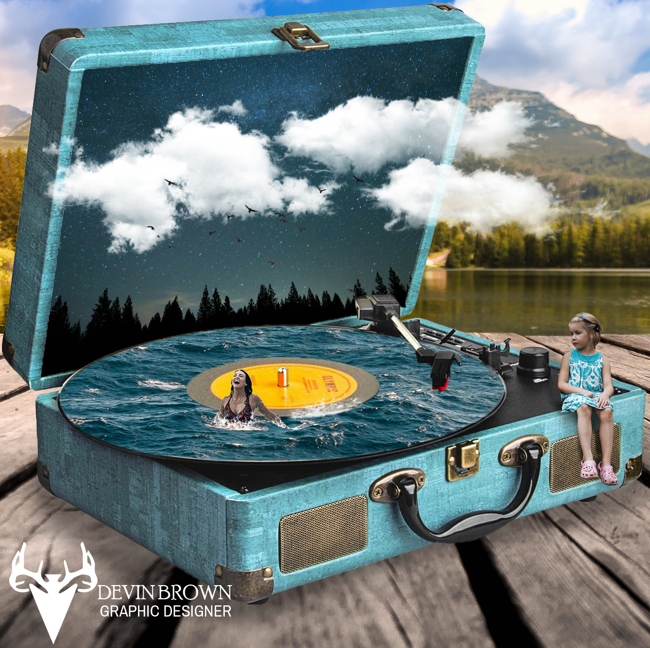
Ocean
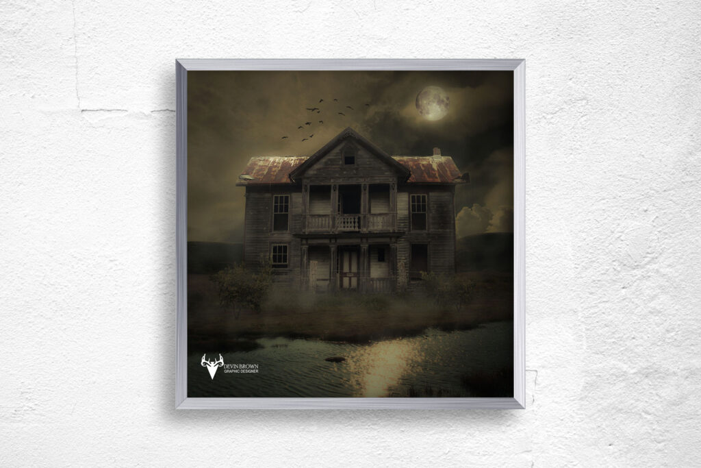
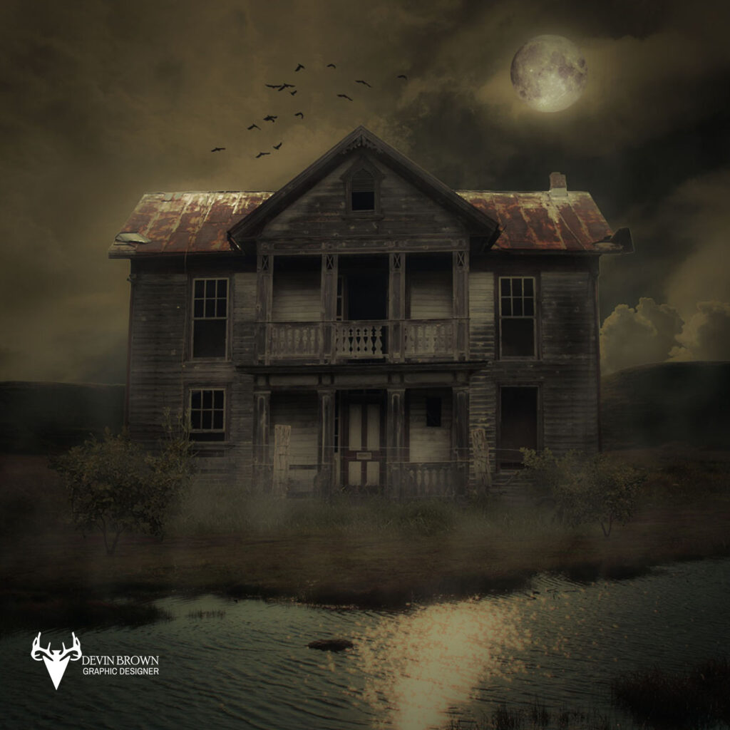
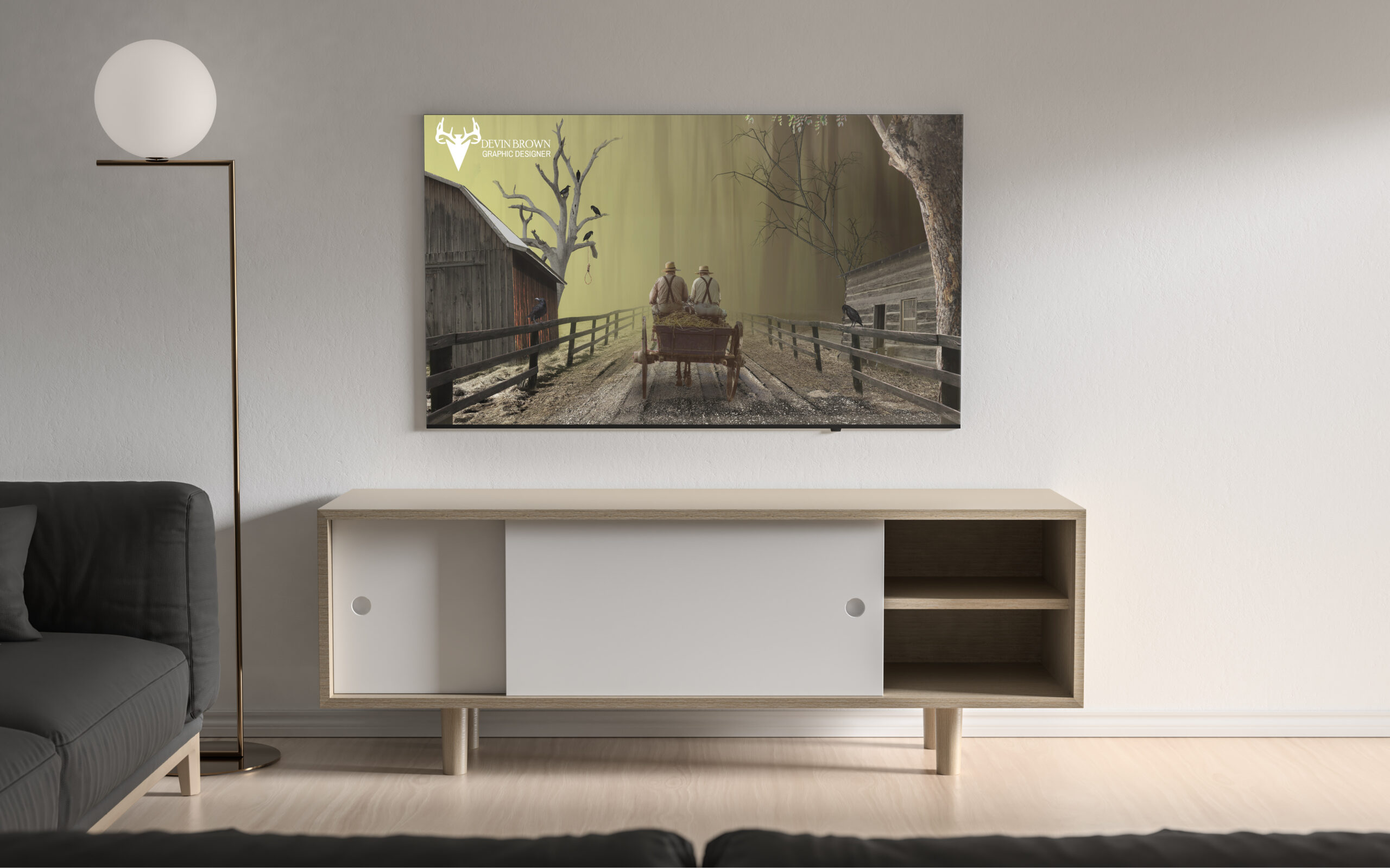
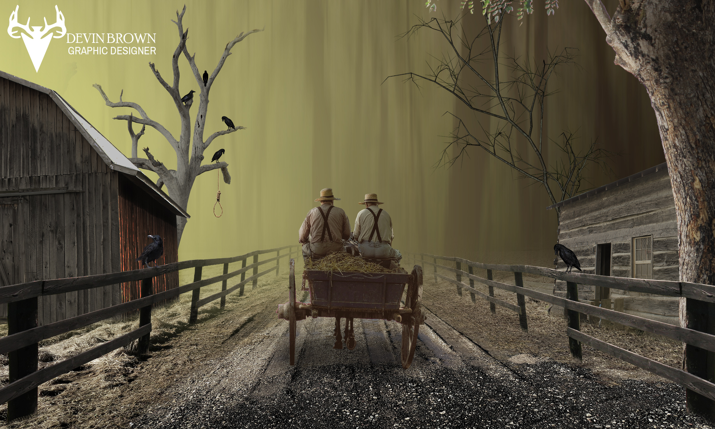
Old House
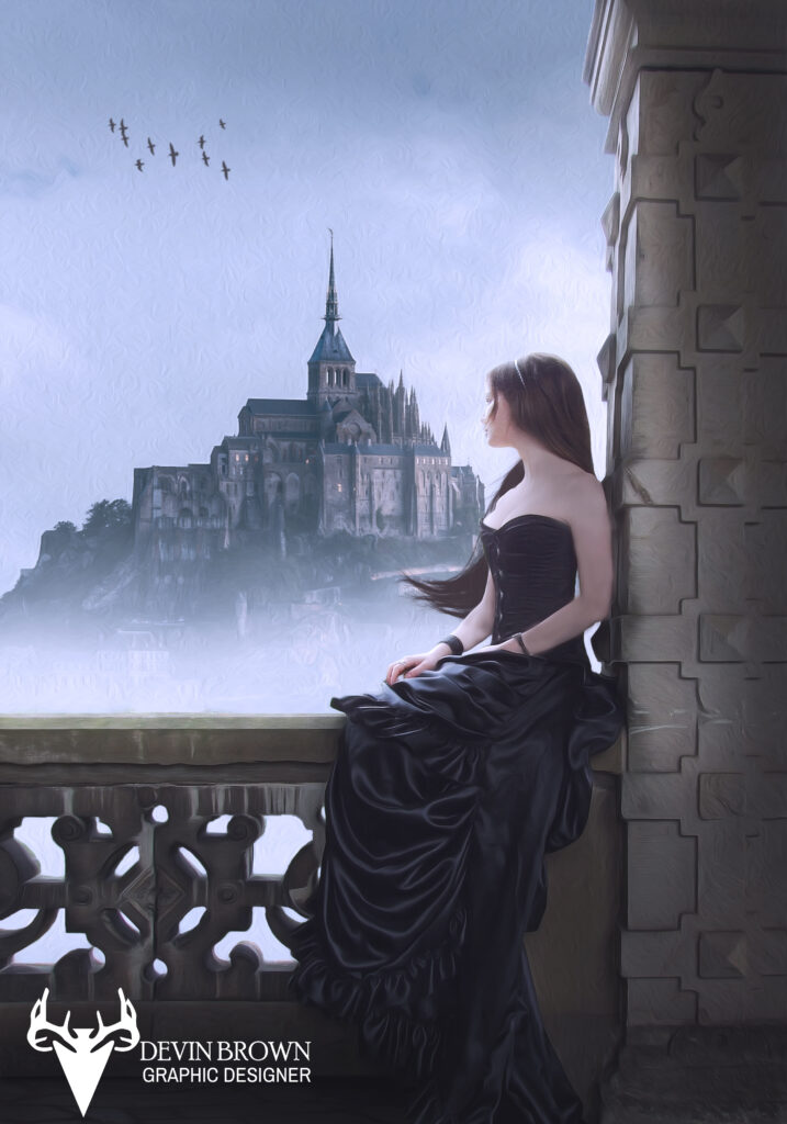
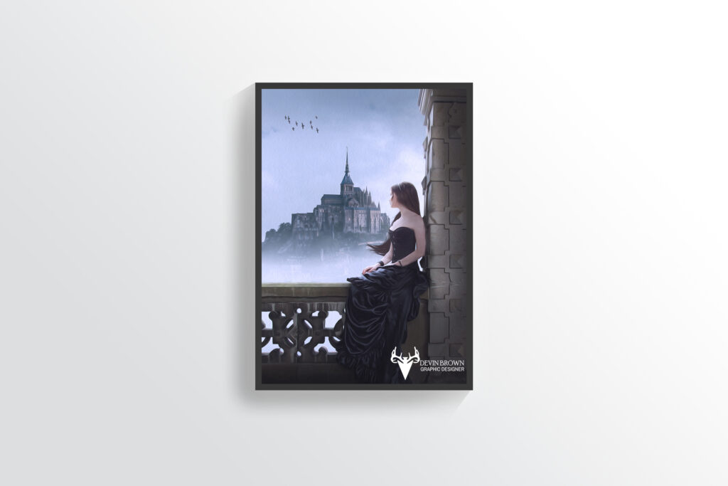
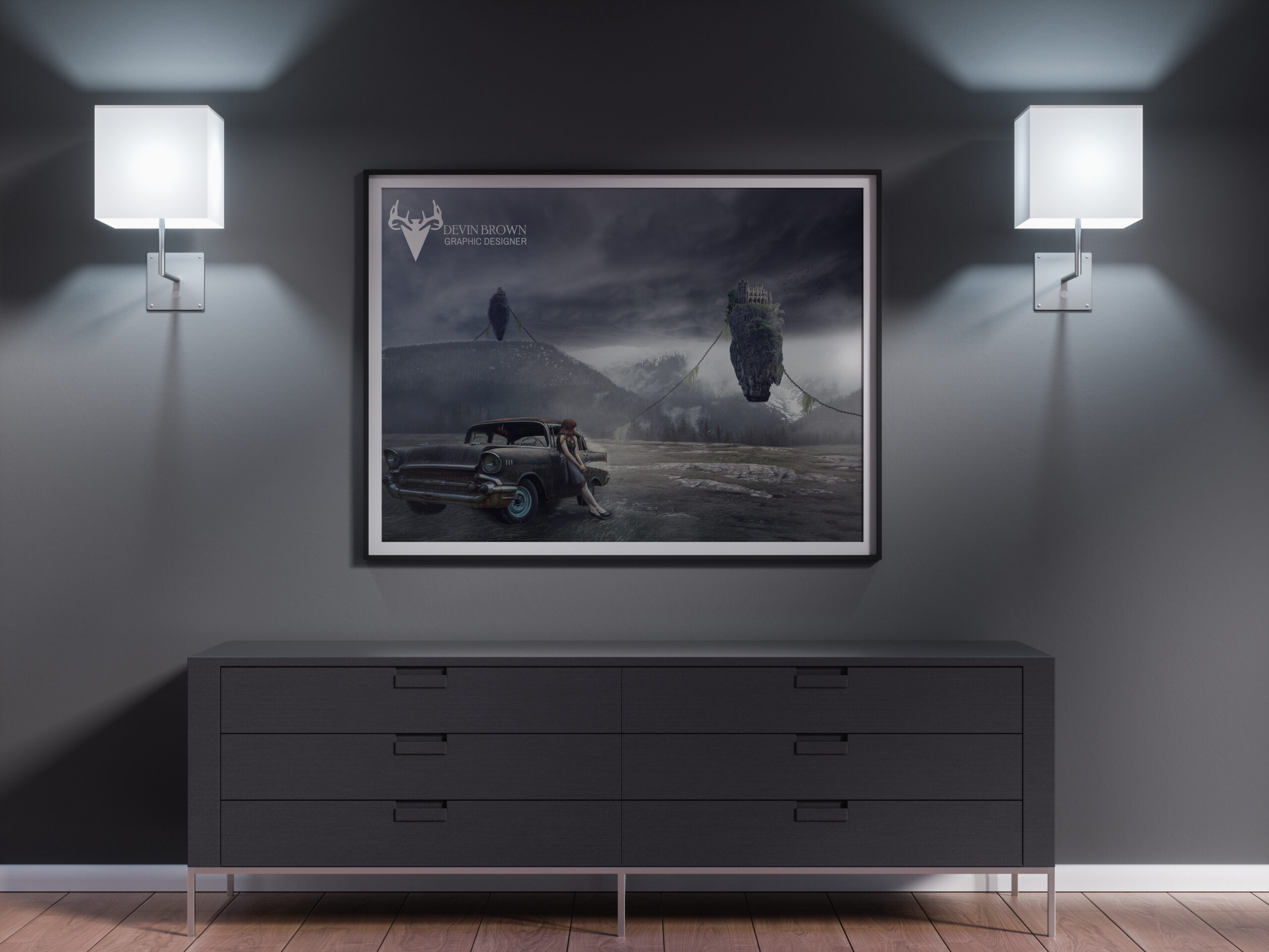
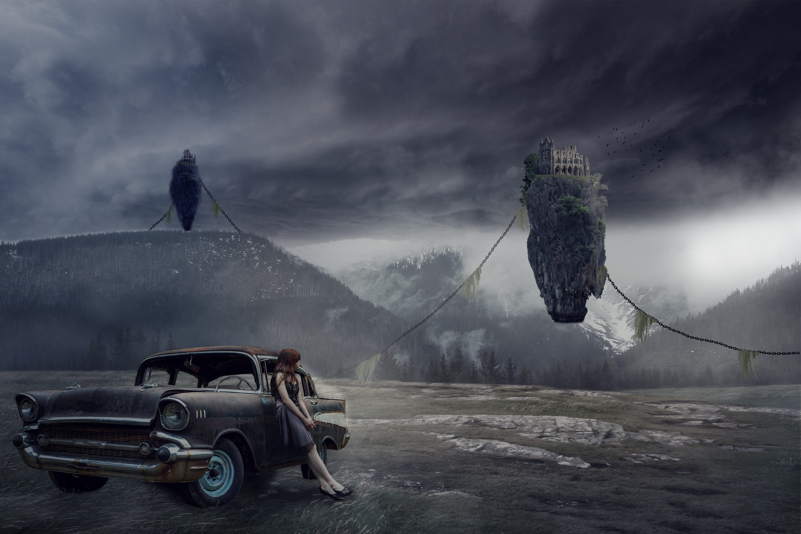
Waiting
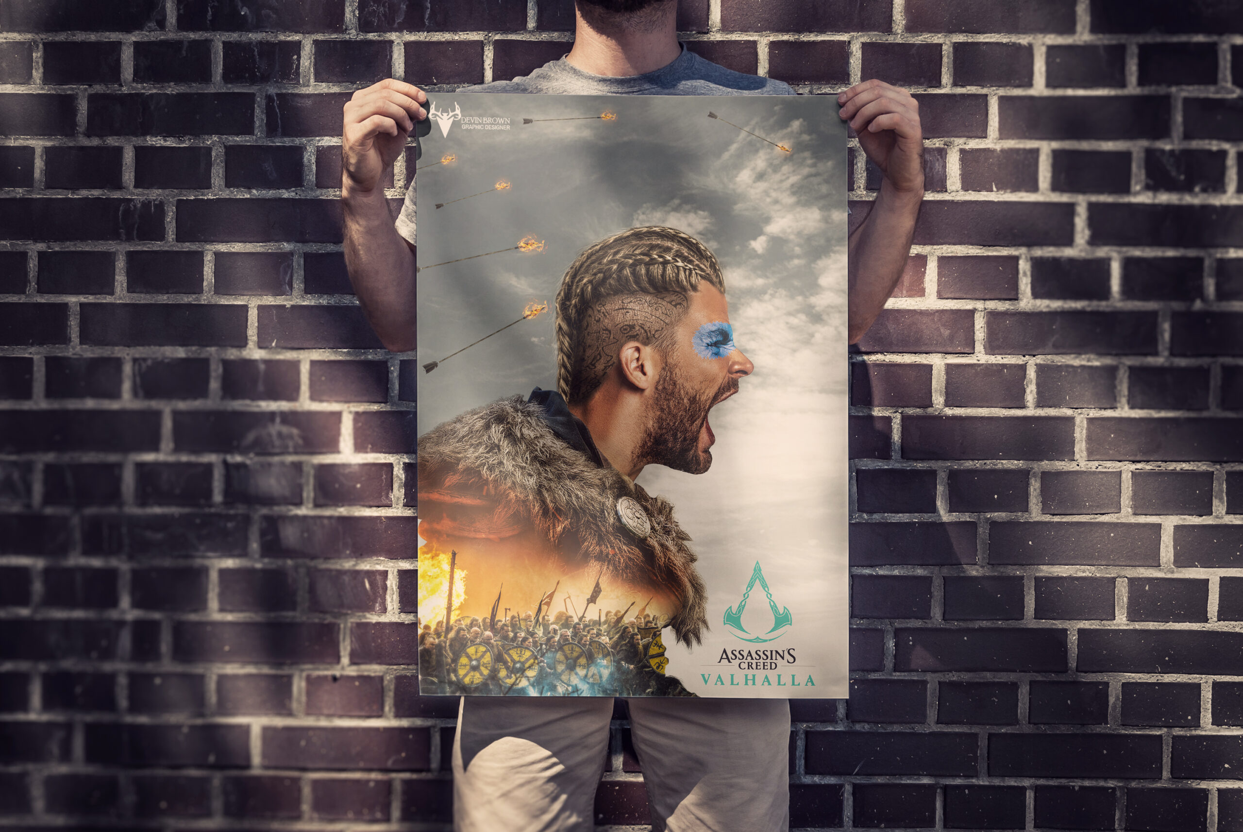
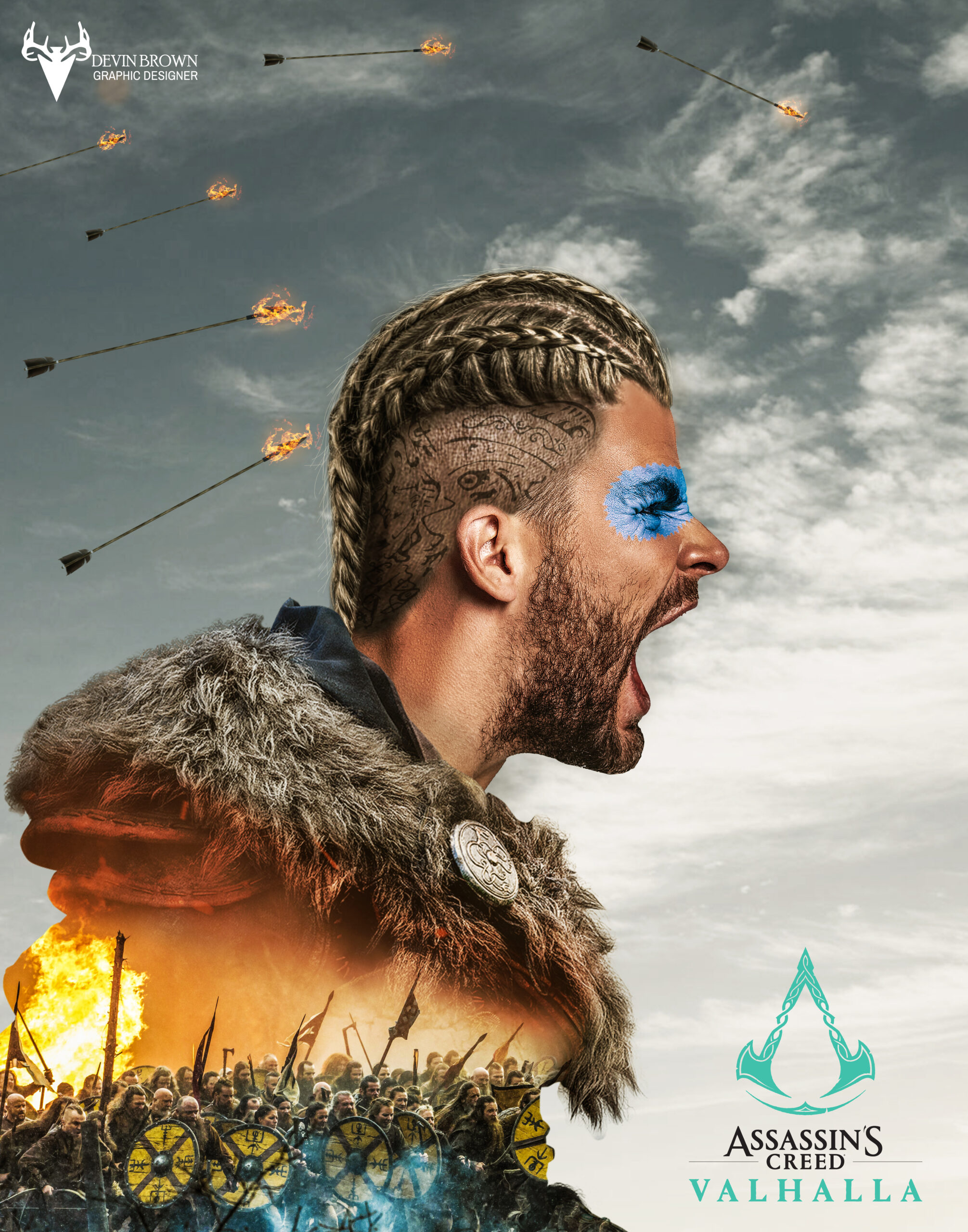
Assassins Creed Valhalla
Peace Magazine
I started by finding the text to fill the background. I had to fix the hard returns and I justified the text. And I typed each letter out and added text wrap and made it an outline. Then I pulled it into photoshop and warped it to fit the magazine. And I found a cool picture to put next to it. And I warped it to make it look like part of the magazine.
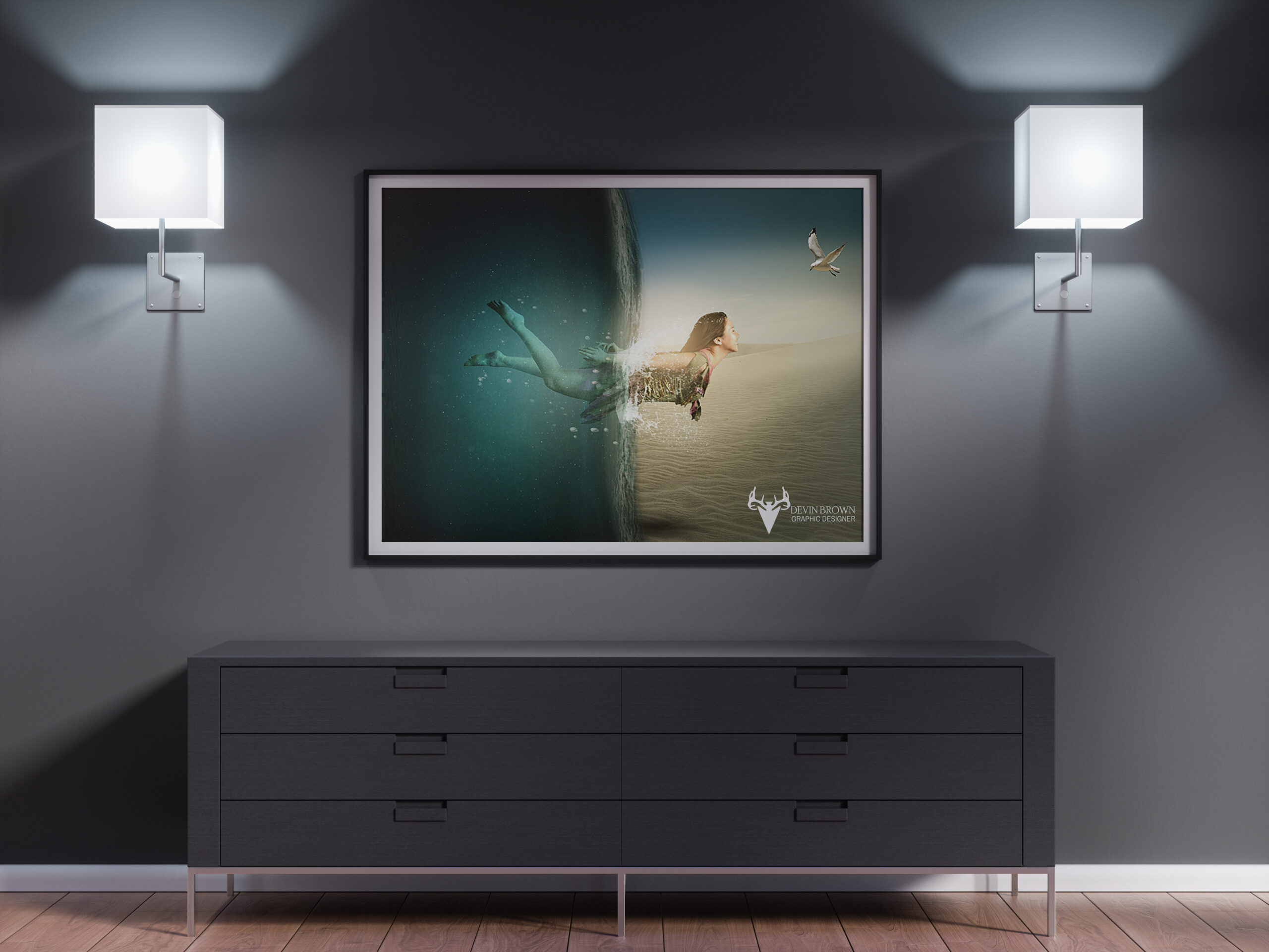
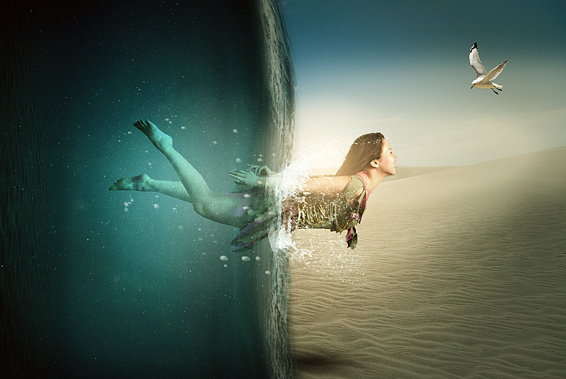
Dispersion
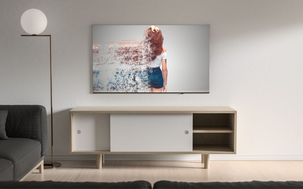
This tutorial is called Dispersion. I started by finding an image of a model. Then I made a selection on her and cut her out of her background. I created a new layer and layer a gradient on it, I set it to radial reverse. Then I copied the model layer. And went to filter – liquify and pulled the left side of the model to the end of the document. I put a layer mask on the liquified layer. Then I downloaded a dispersion brush and painted it on the model layer. Then I went to the liquified layer and used different brushes of varying sizes to create the dispersion. It represents texture because the model is fading away and particles are blowing away.
Out of Bounds Jeep
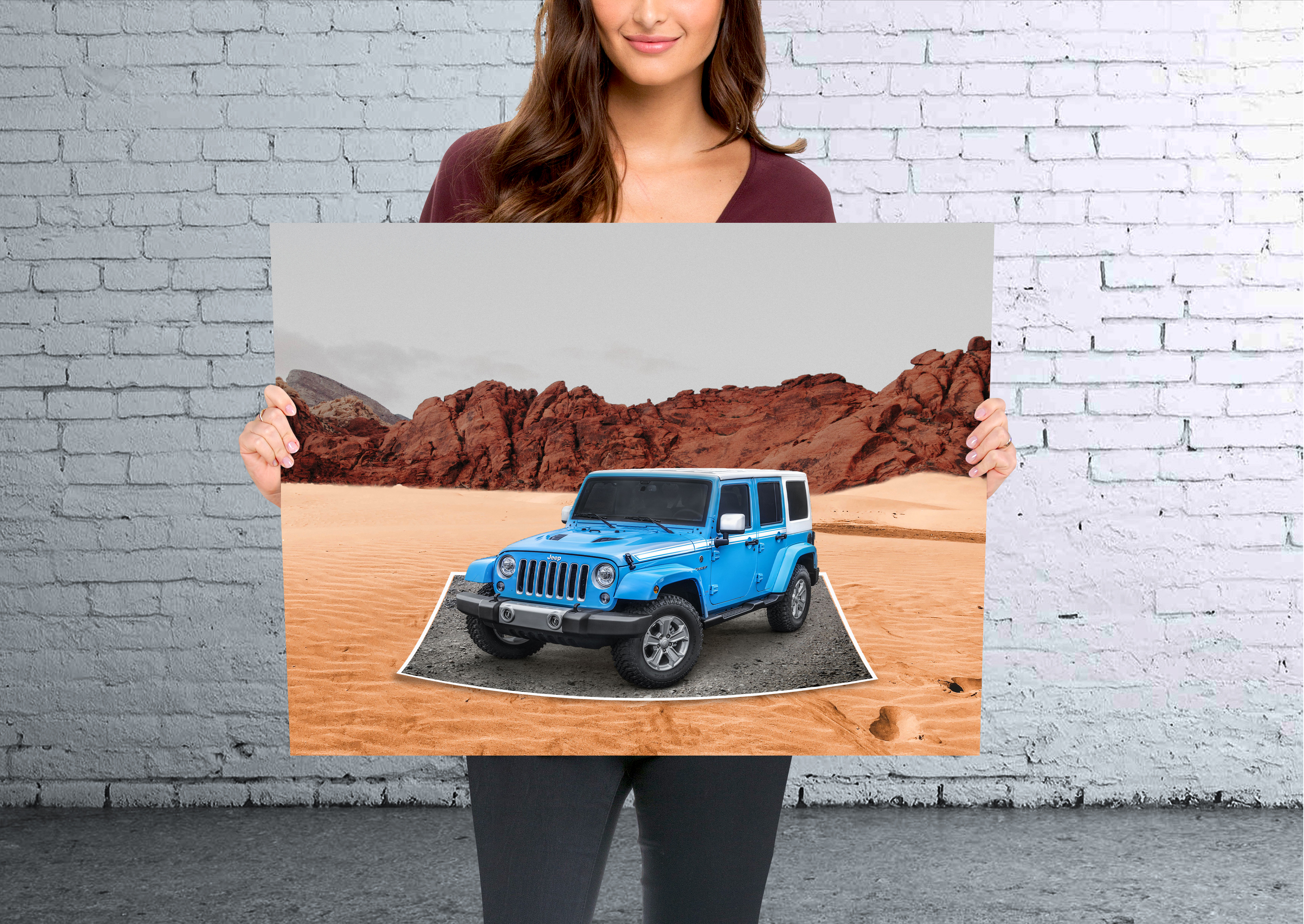
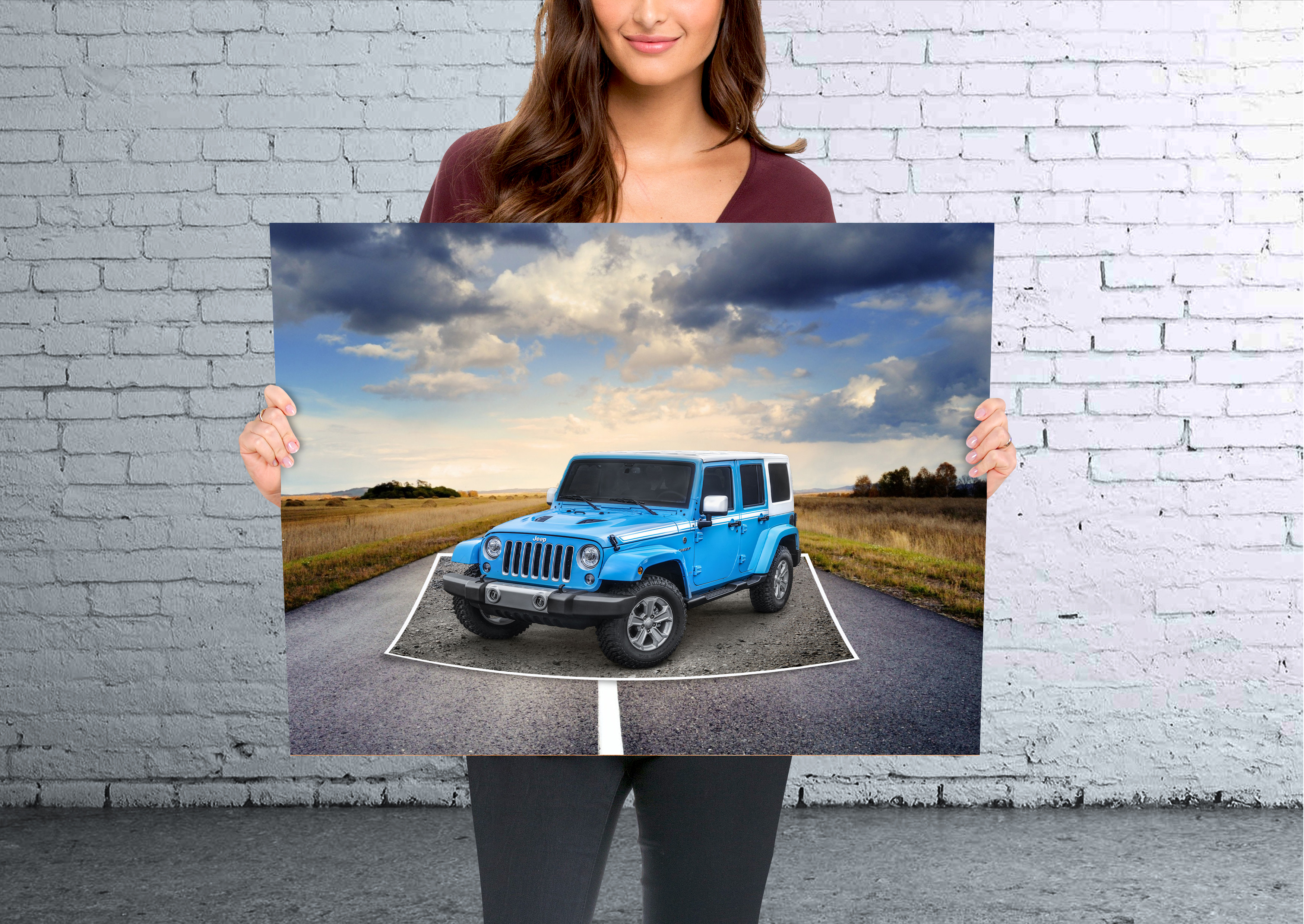
I started by using the rectangle marquee tool and selected the bottom half of the jeep. Then I went to select -transform select then I right-clicked the selected area and went to perspective. I pulled the top corners in and the bottom corners out. Then I made a mask. Then I used the quick selection tool and selected the top half of the jeep and masked it out. I added a white border to the image and shrunk it down a little. And I added a nice background for the contrast between both images. This represents framing because the jeep is being framed by the border around it. Also, the whole image is being framed.
Out of Bounds Waterfall
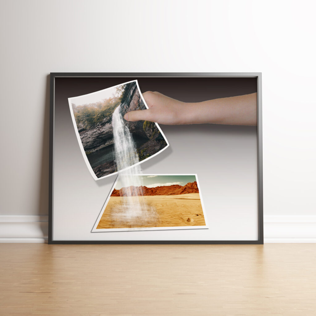
I started by finding my images and downloading the waterfall brush. Then I took my desert images. And I took the rocks from one and put them on the other. I had to edit a couple of signs and people out. Then I put a red/orange color to the image to give it a More of a desert feel. I took the image created a small border around it and added a shadow. I transformed the picture to where it looks like it’s laying flat.
Next, I cut the hand out and added it to the picture. I added a black and white gradient background as well. Then I took the waterfall added a border and warped it to the hand. And masked the thumb so it would be visible. Then through different brushes, I added the waterfall effect. And I built the puddle and the wet area around it by using more brushes.
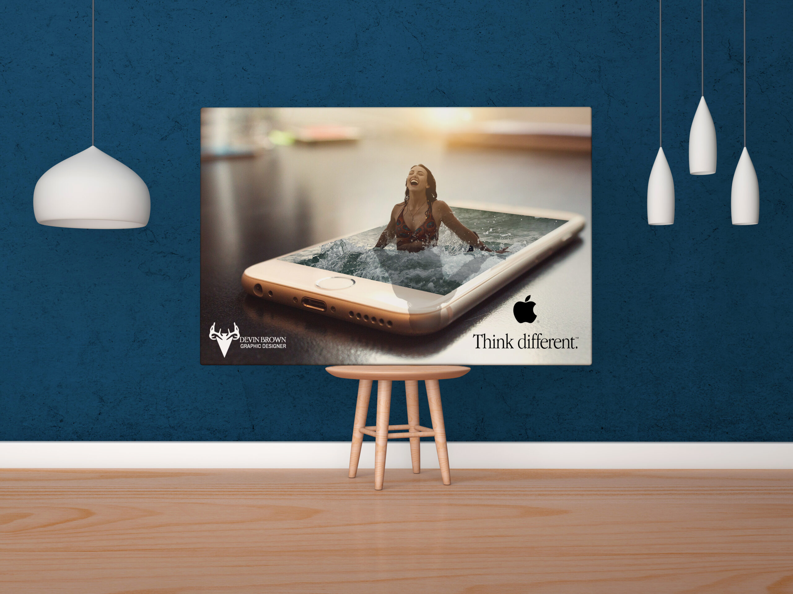
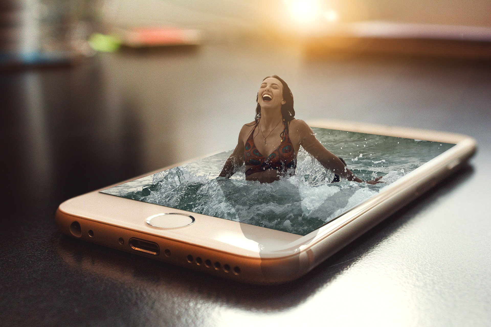
Out of Bounds Phone
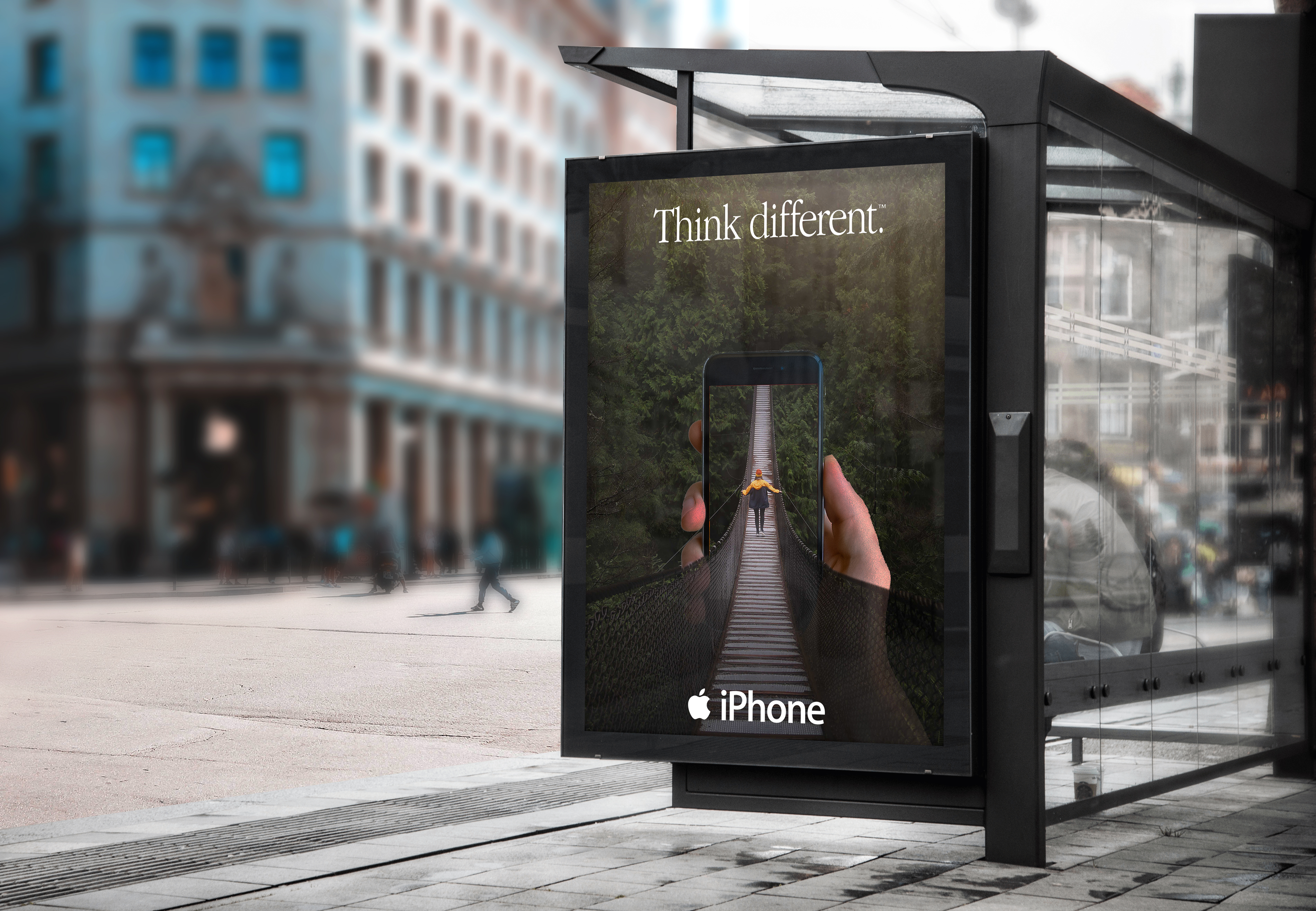
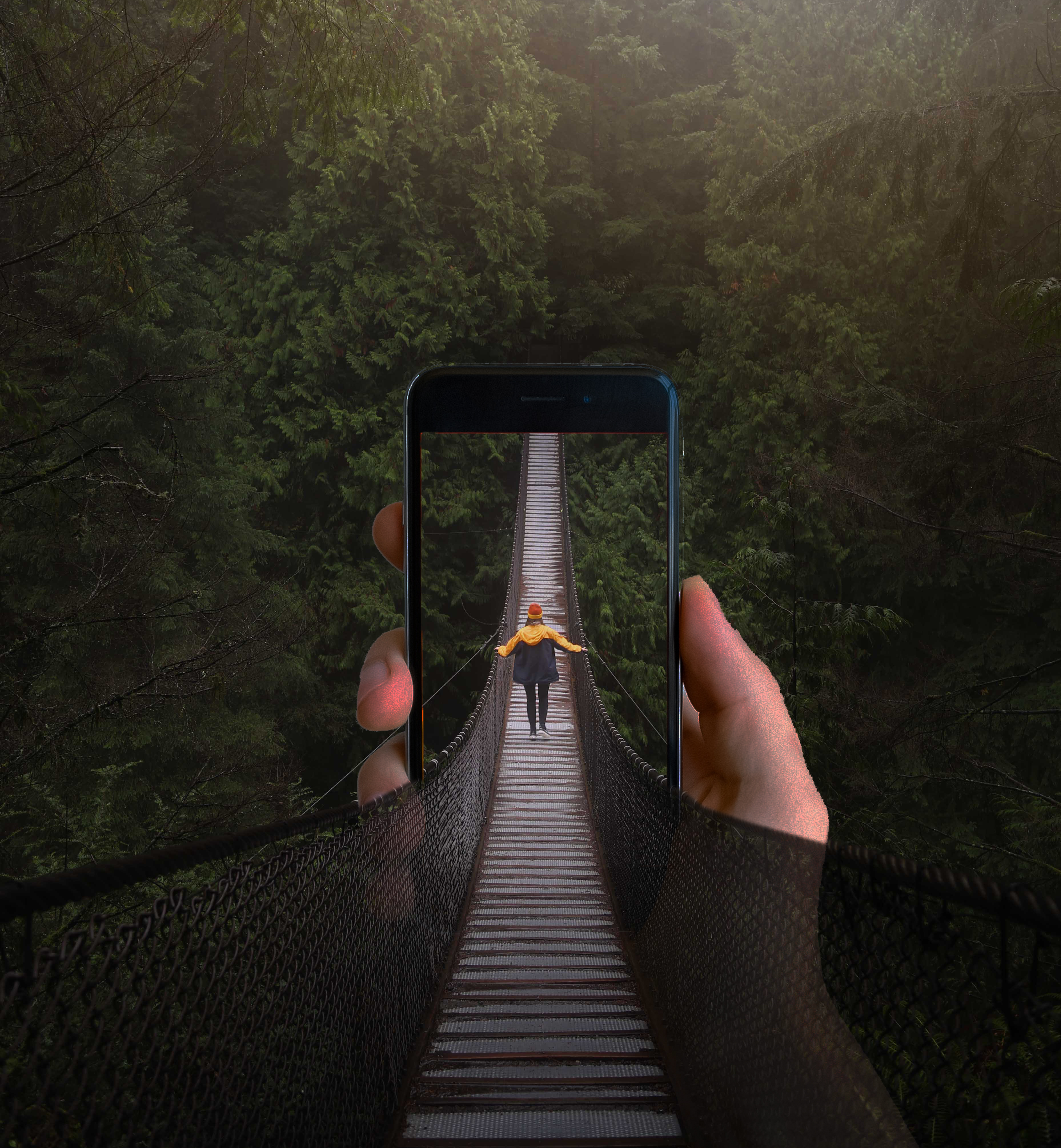
I started by finding the images. Then I took the phone cut it out of its background then cut the screen out. I placed the phone with the bridge background. I made a copy of the phone and put a mask on both phone layers. The bottom layer I masked out the top half of the phone. And turned the opacity down to where the rail of the bridge shows through. So the hand appears to be behind the bridge. The top layer I masked the bottom half of the phone and adjusted the brightness. I masked out the bottom of the phone. So the bridge shows through and appears to be coming out of the screen. This represents framing because the phone is framing the bridge. The person whereas the overall image is being framed and framing the phone.
Coca Cola Package Design
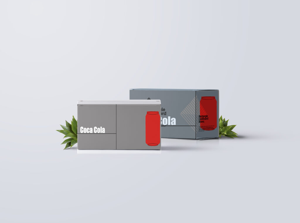
This Project is to strip down the design of well-known brands to the bare minimum. I found a picture of a coca-cola can and traced the image. Then I added circles to represent the top and bottom of the can and I made it coca-cola red. Then I created a simple gray background and added the text. I was trying to go for the 12pk case. But I couldn’t find any mockups so I found this one. This represents hierarchy because I took the coca-cola packaging and simplified it down to the bare minimum. The can is meant to be seen first and the logo second.
Quote By Leonardo Da Vinci
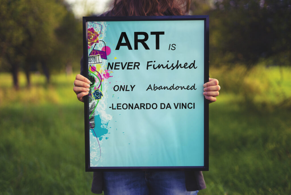
I chose to make a poster because posters always use some type of grid. I started by finding the background image which is unfinished art. Then I found one of my favorite quotes. I put each word on its own layer. So I could move it individually. I used a variety of fonts most of it is Arial ( Bold, Italic, Regular) and Segoe Script. Then I applied it all to a mock-up of a poster.
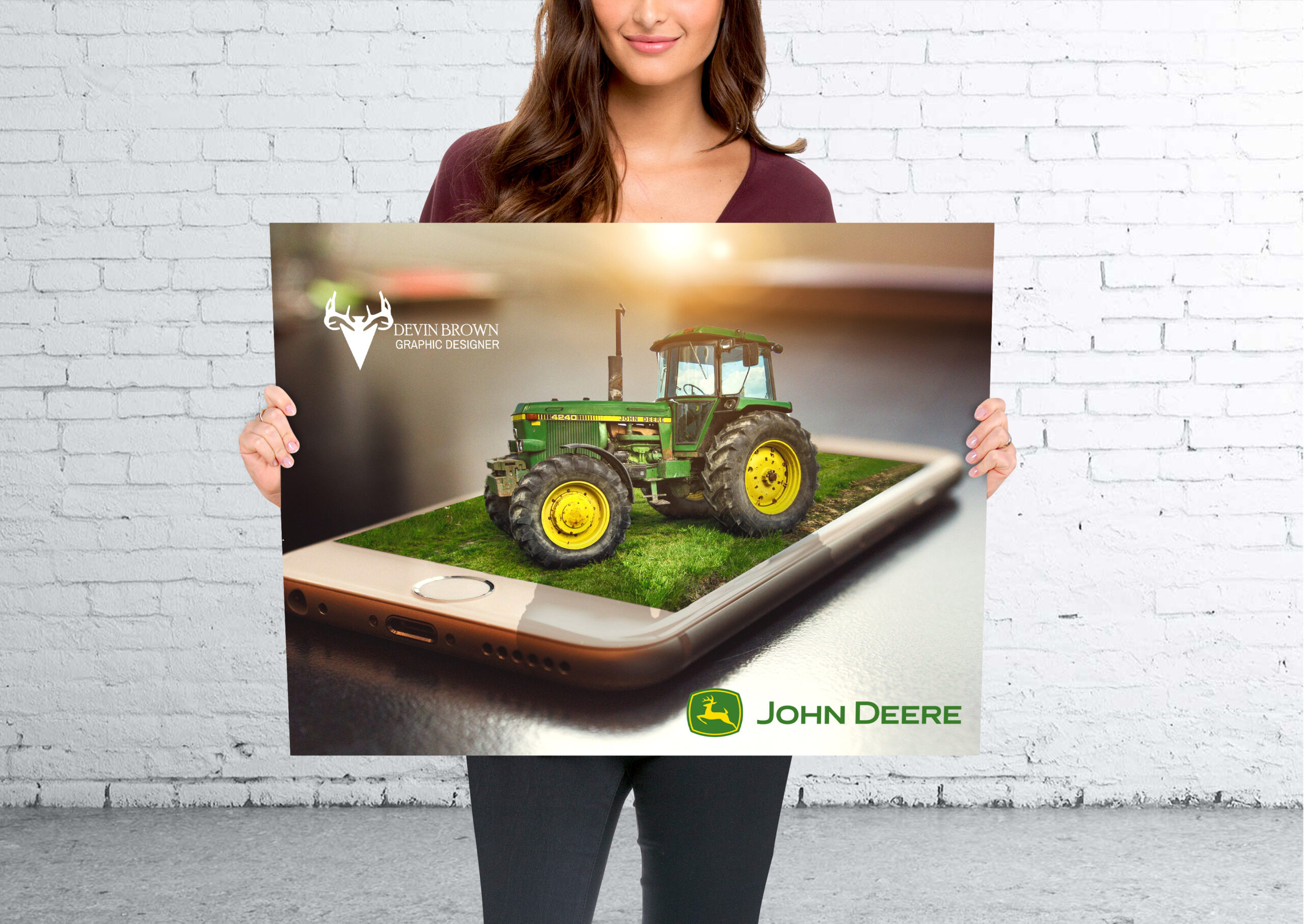
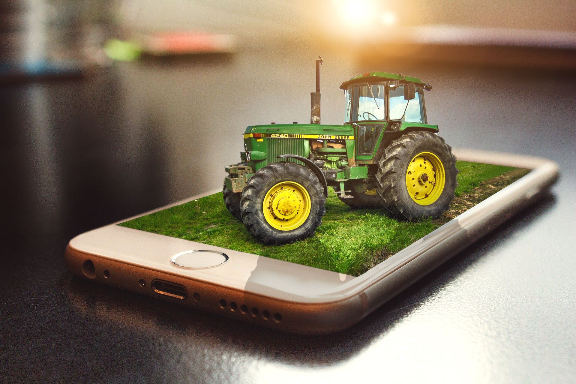
John Deere Magazine
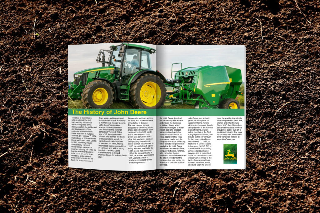
This one I chose a magazine layout. This time I made the picture cover the top half of the spread. I decided to make the text three columns instead of two. this one took me the longest. I had to tweak it a lot. And had to put the pages separately. So it took a while to get the pages to line up correctly at the crease. This represents a grid because magazines use a variety of grids and columns within the grids
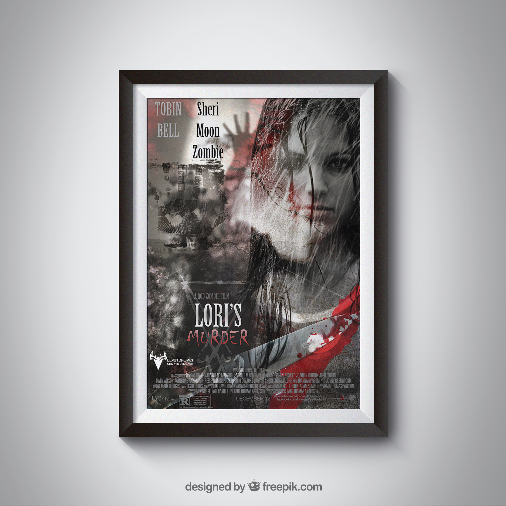
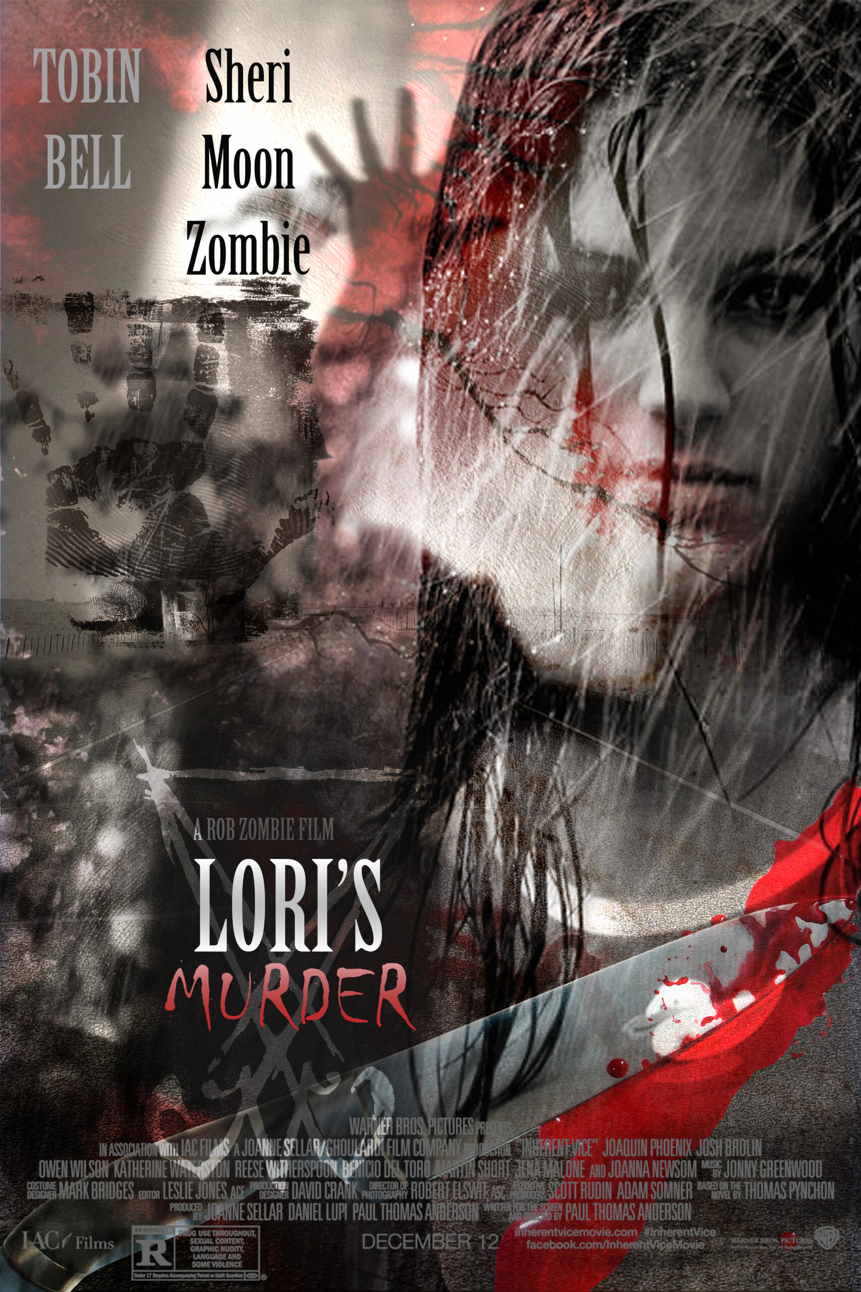
Movie Poster
Movie Poster
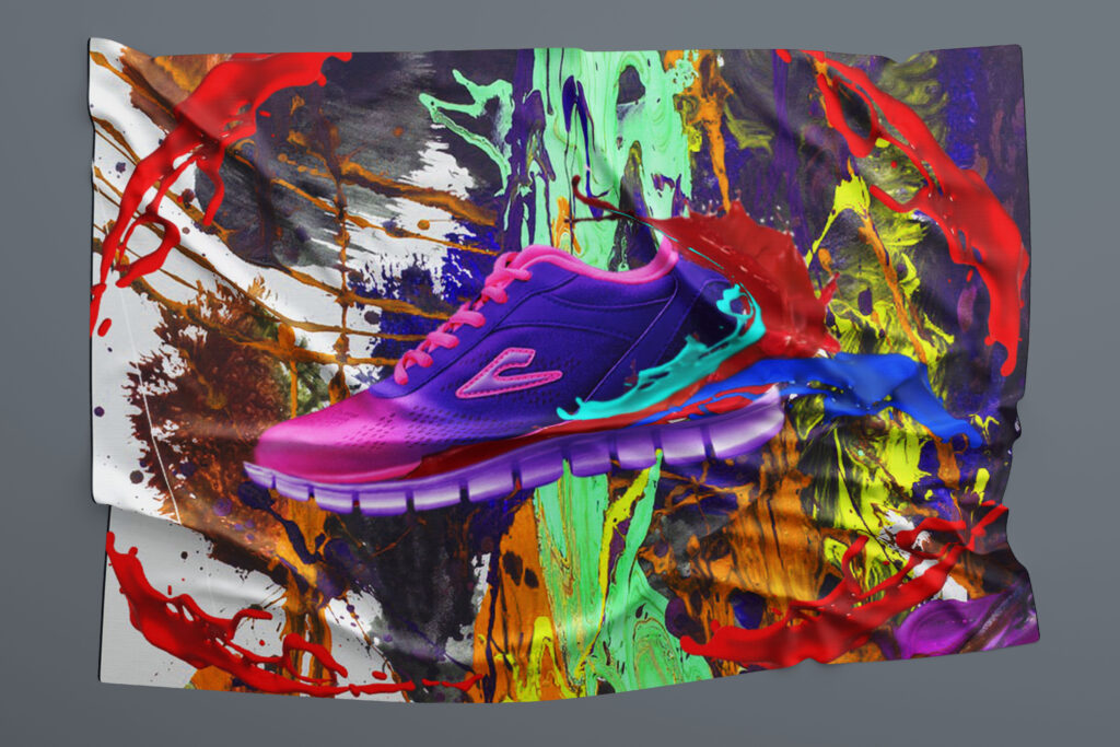
Blanket
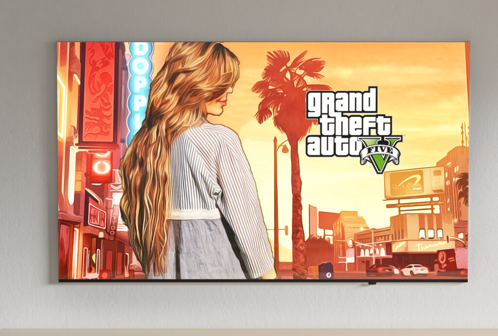
Grand Theft Auto Poster
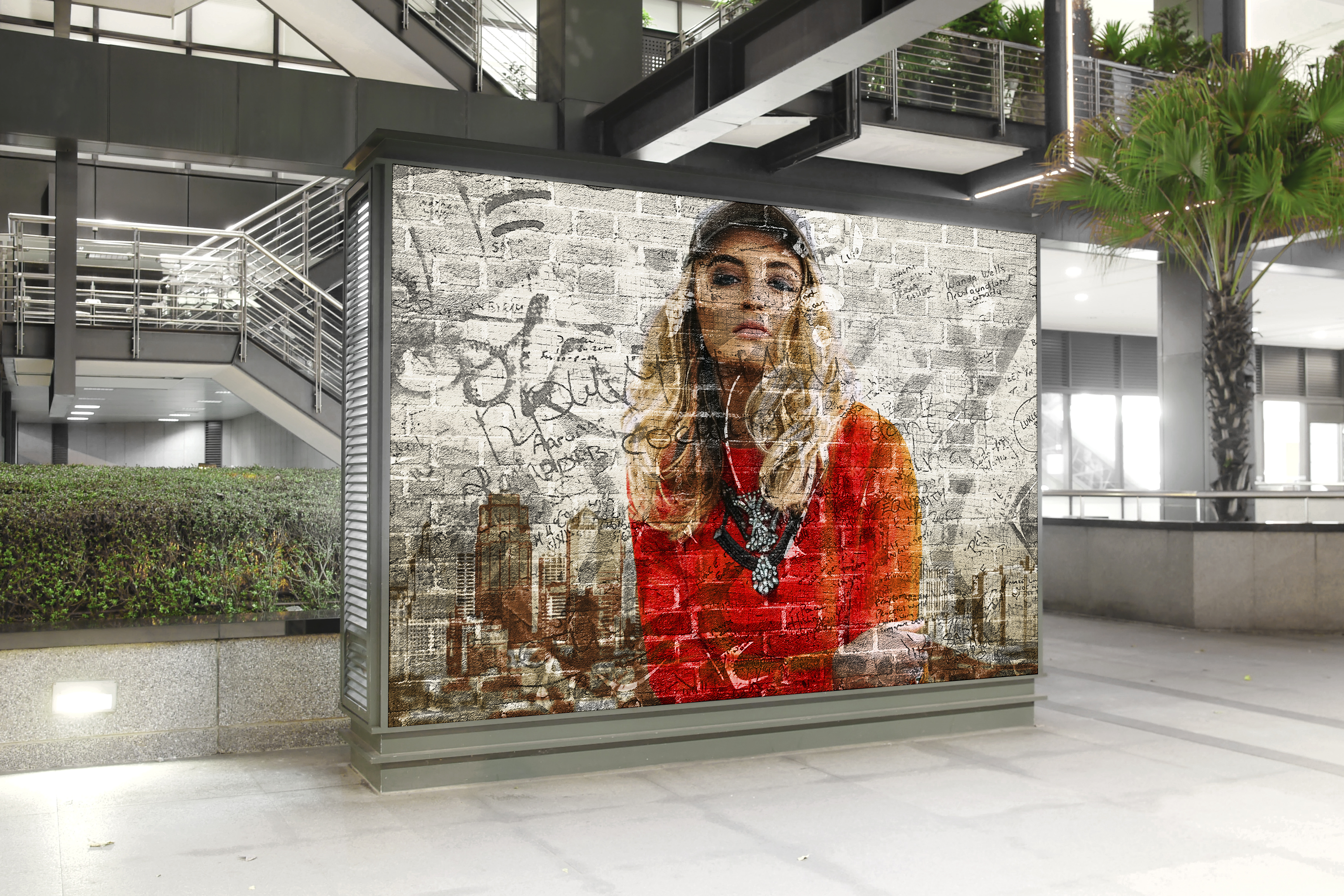
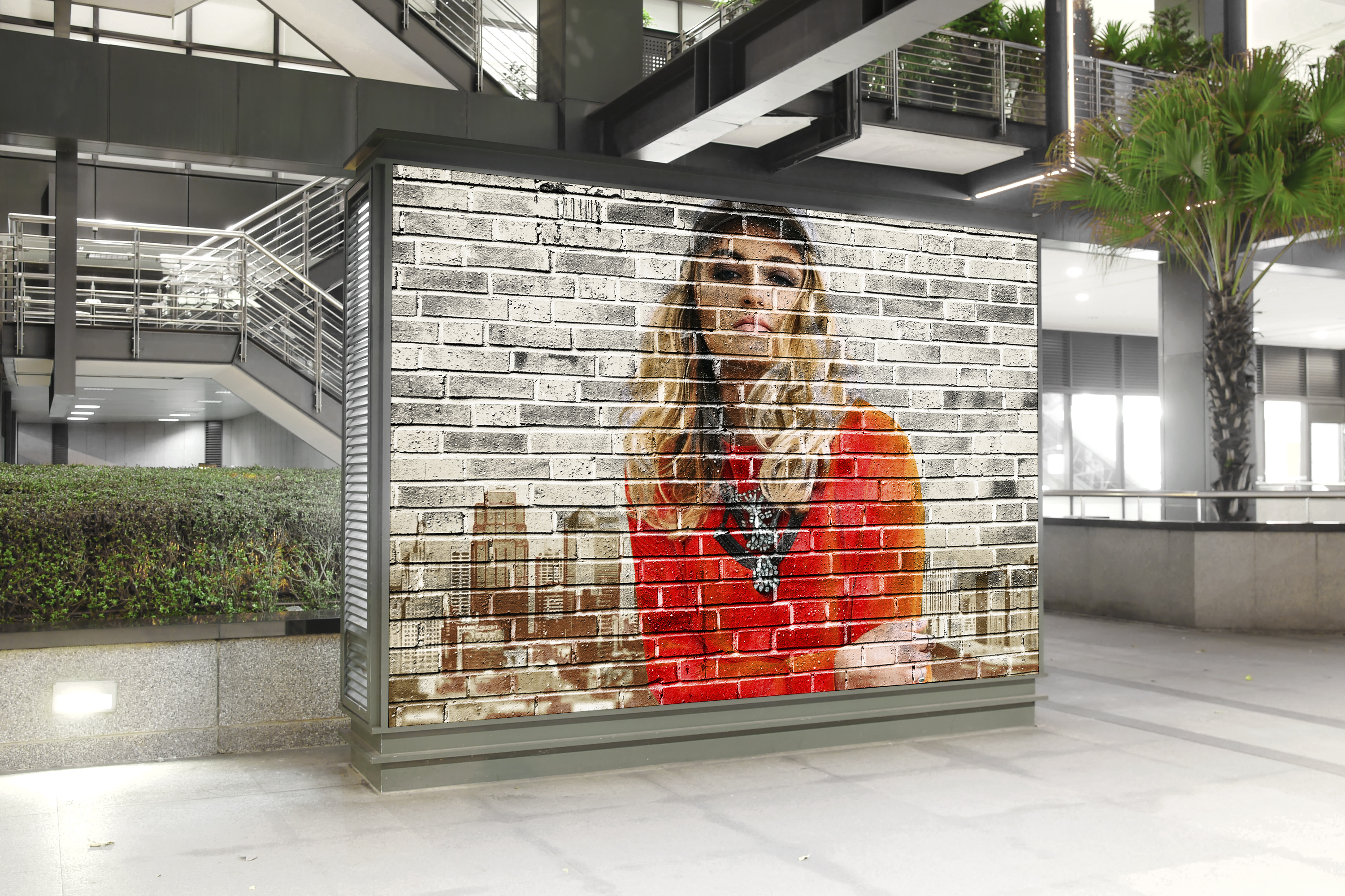
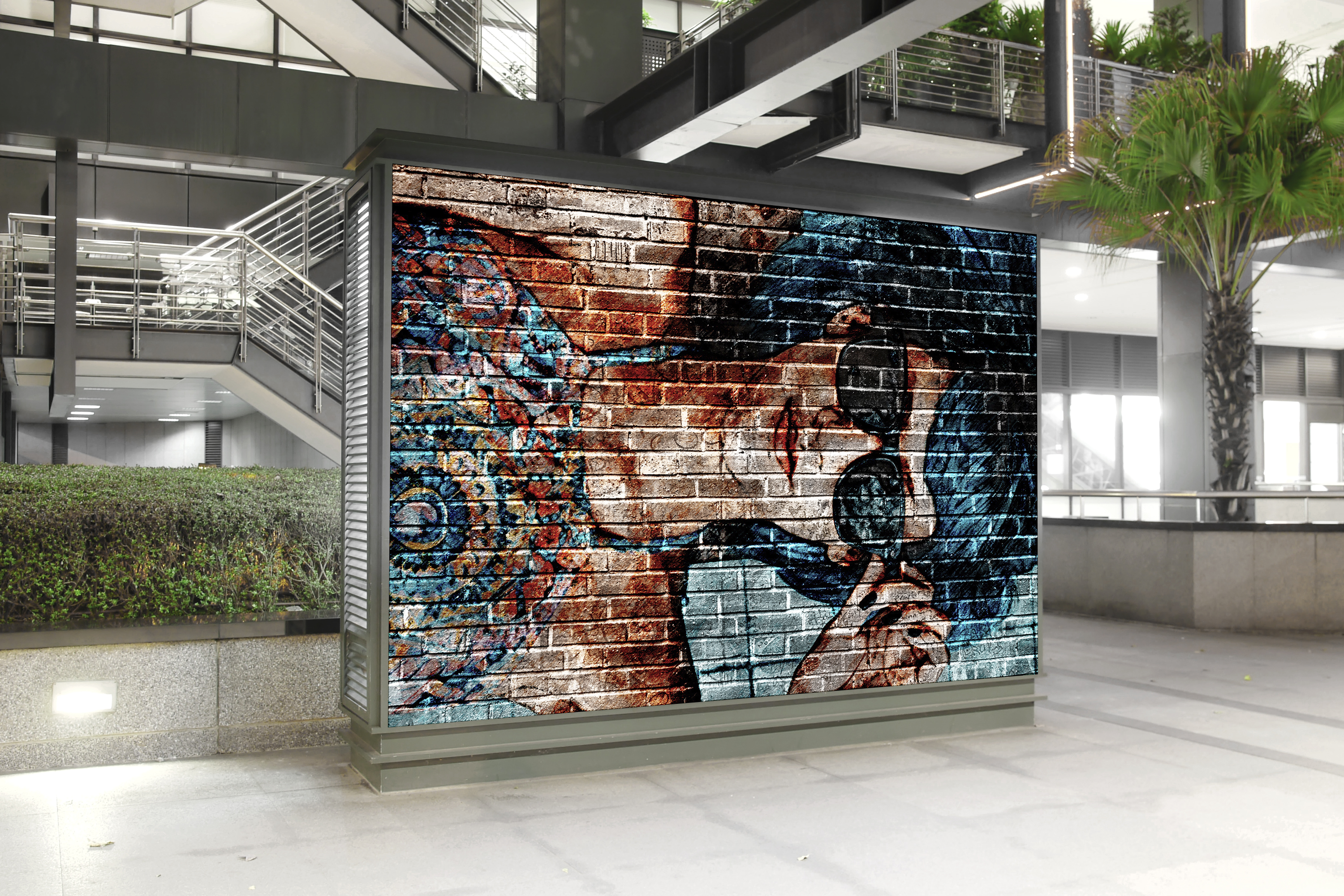
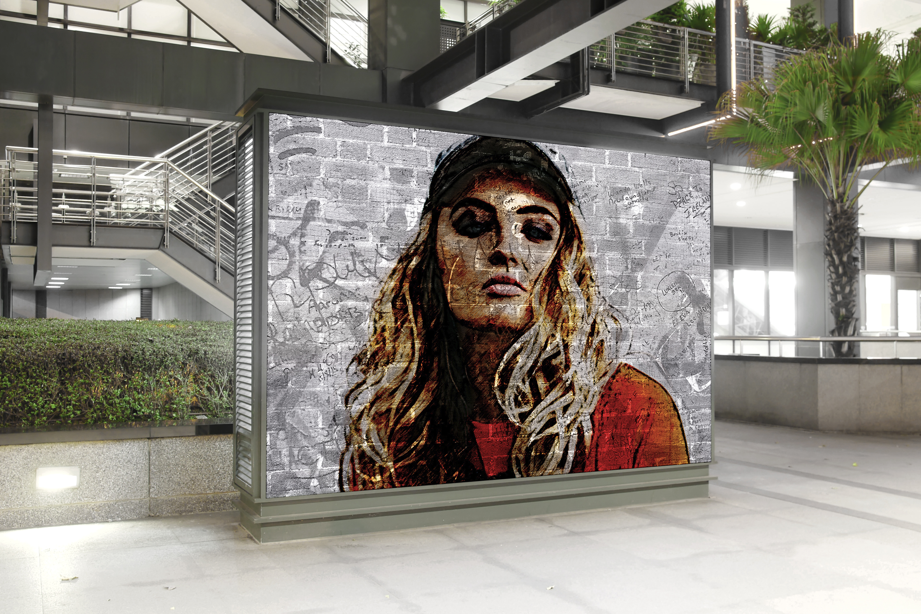
Graffiti Art
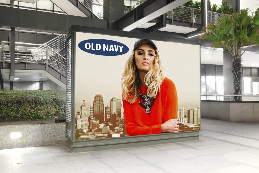
Old Navy Ad
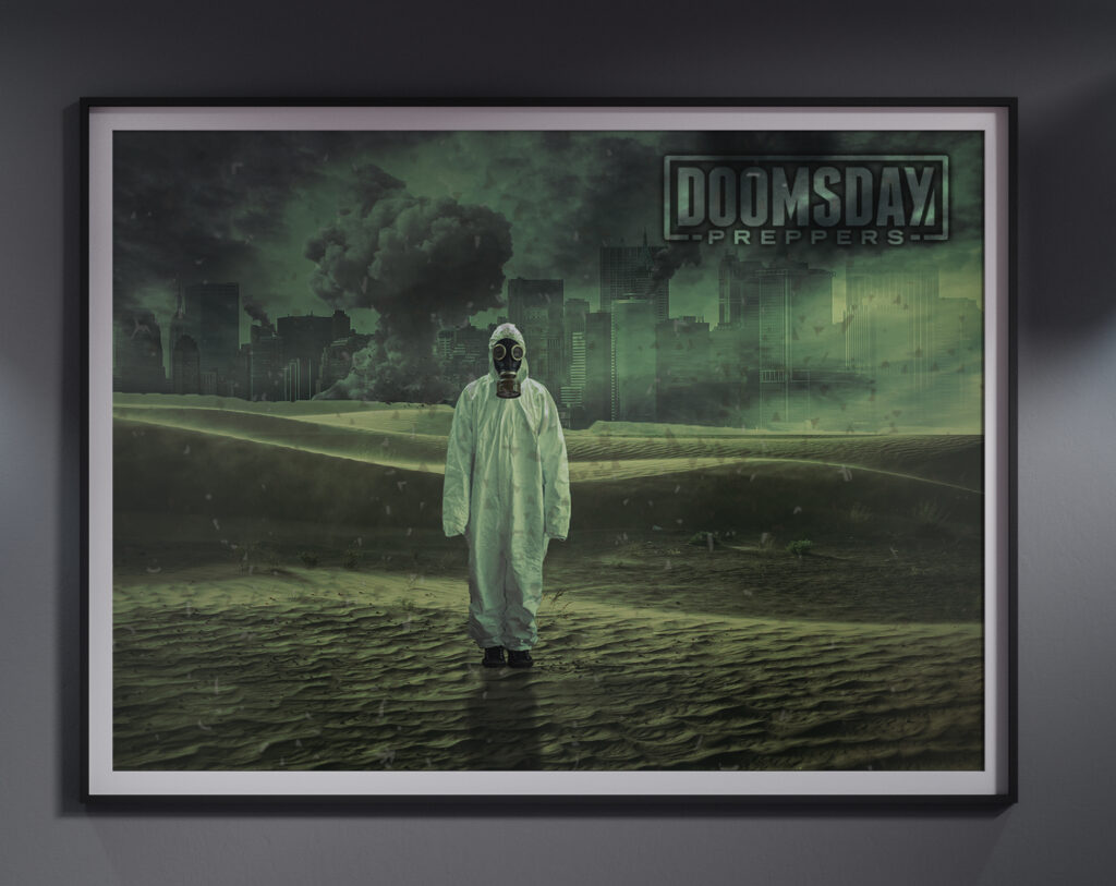
Doomsday Preppers Poster
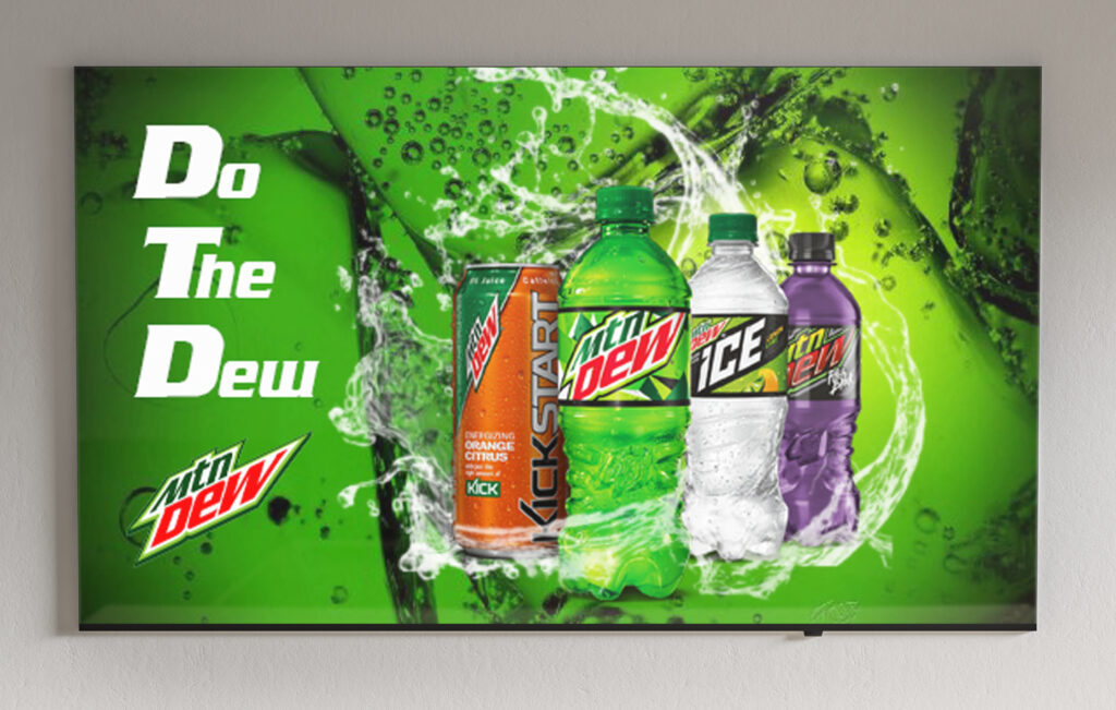
Mountain Dew Advertisement
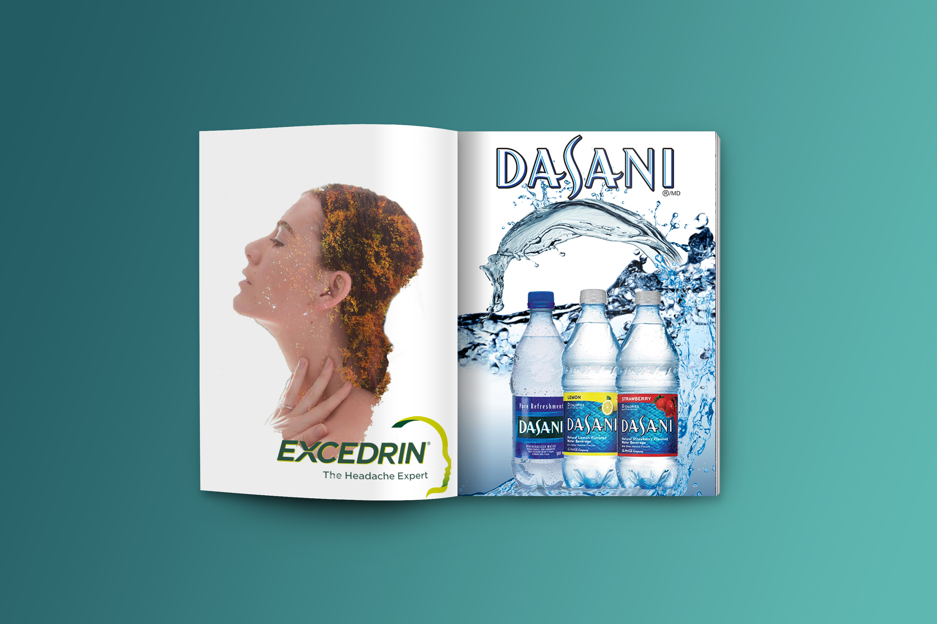
EXCEDRIN AD
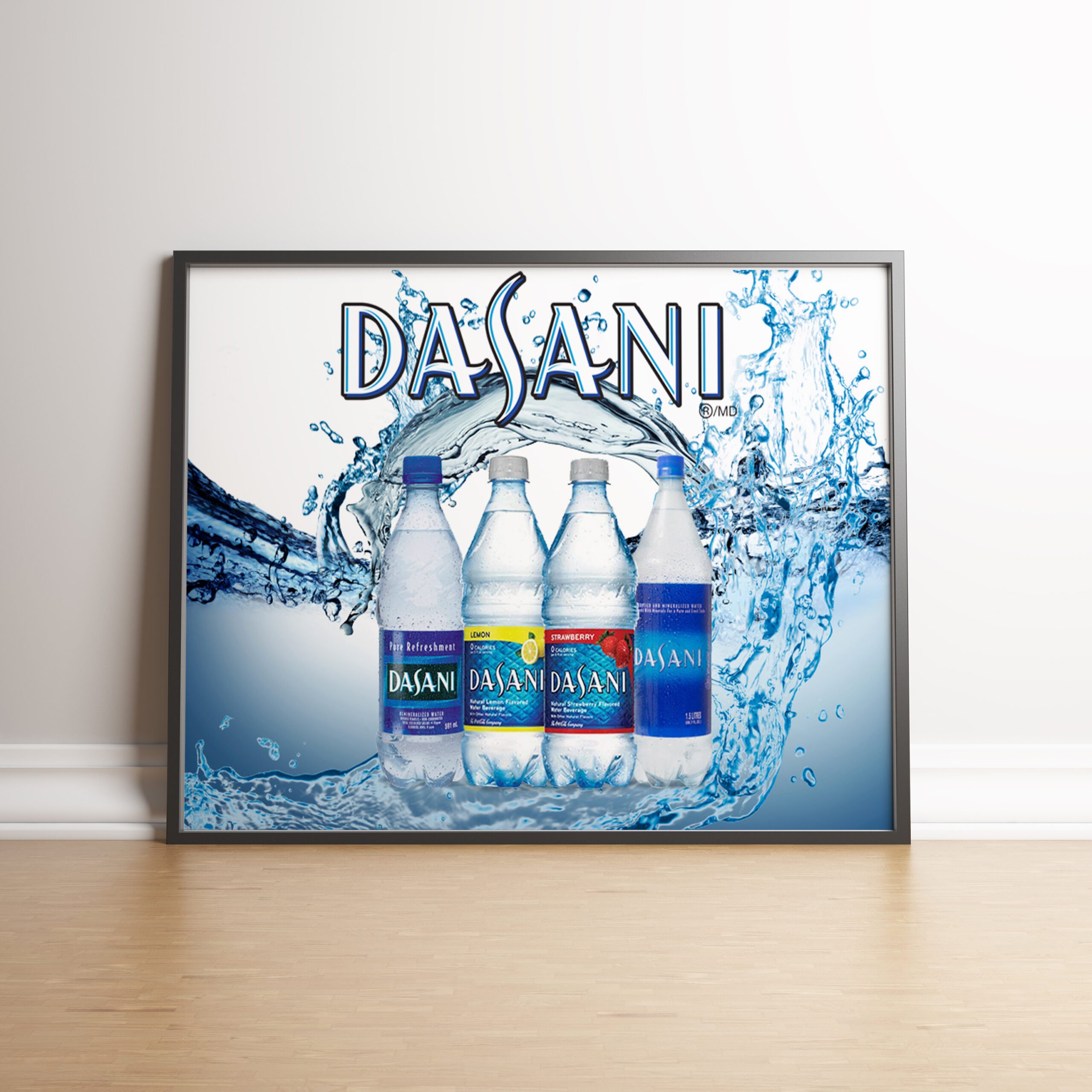
Dasani Ad
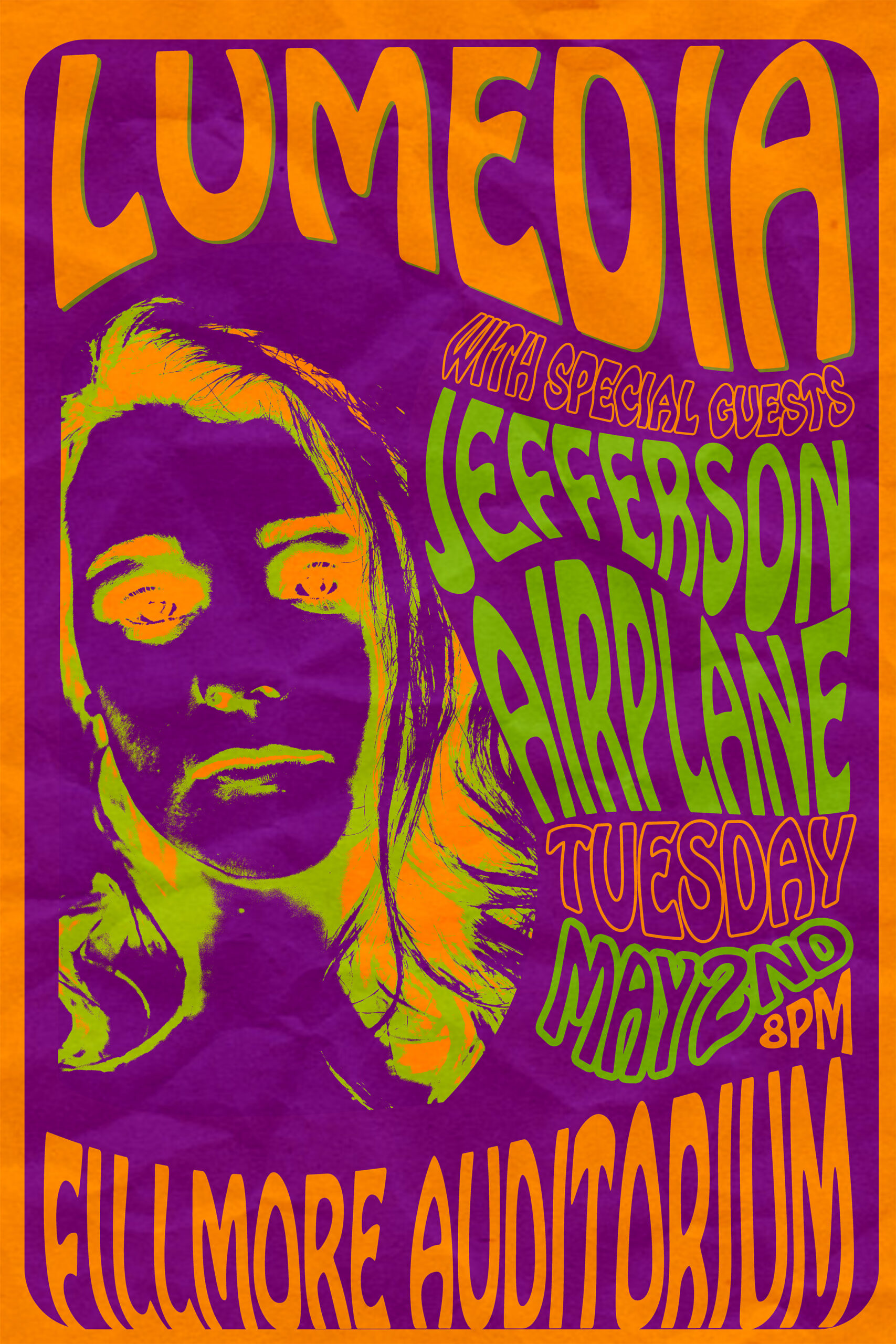
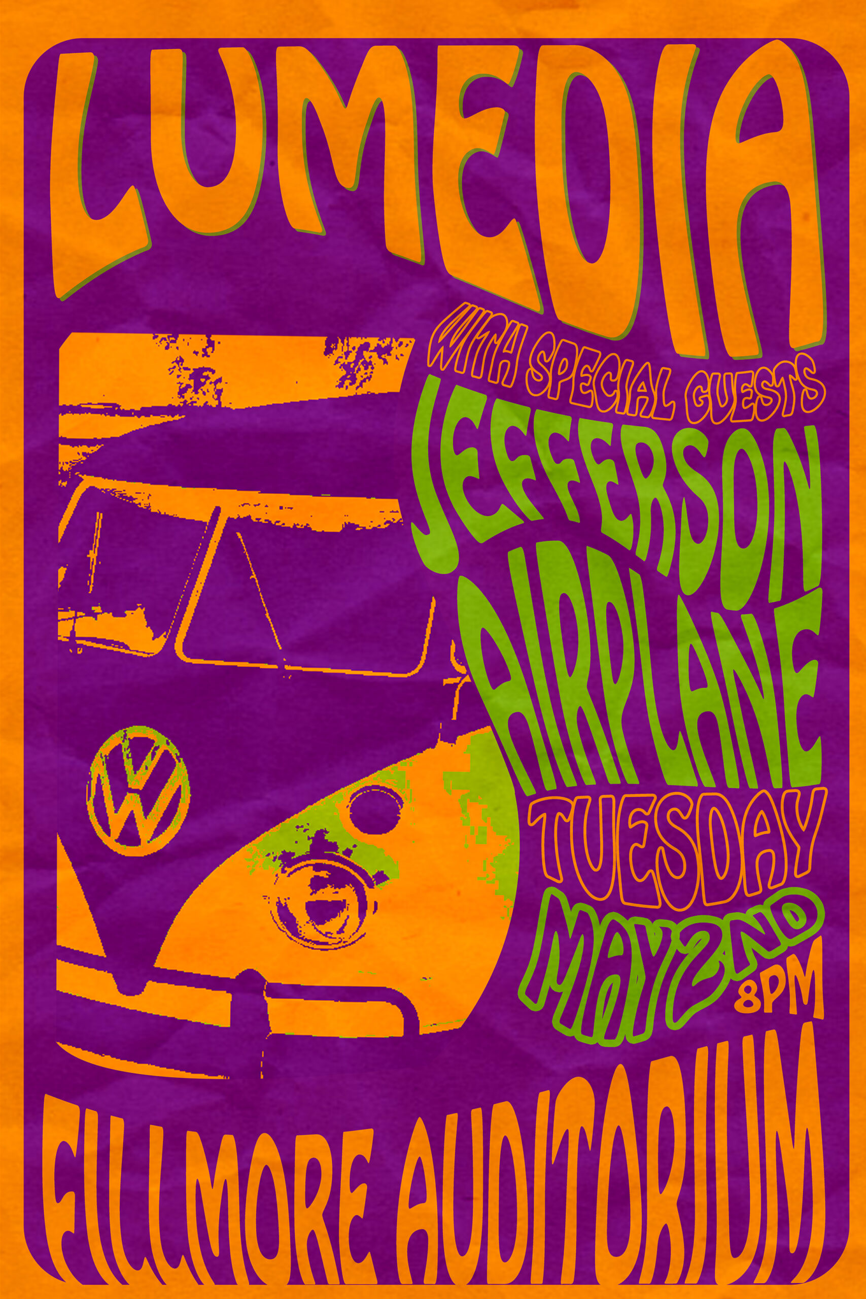
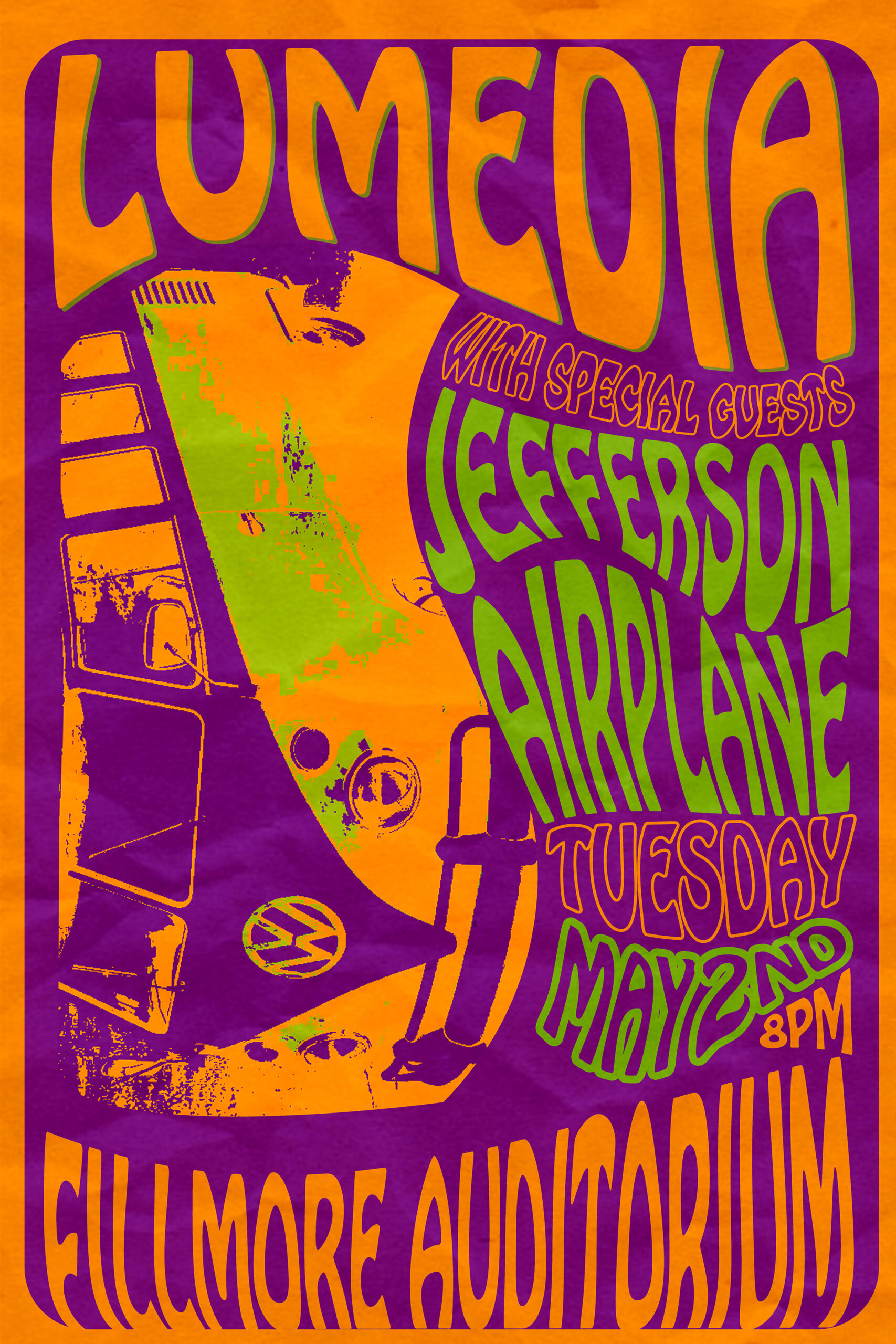
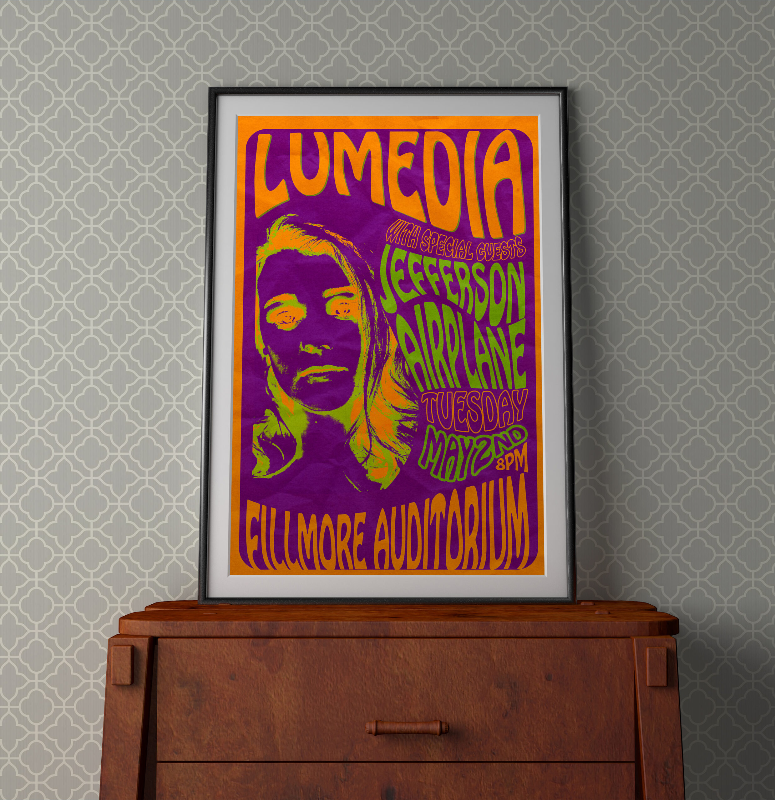
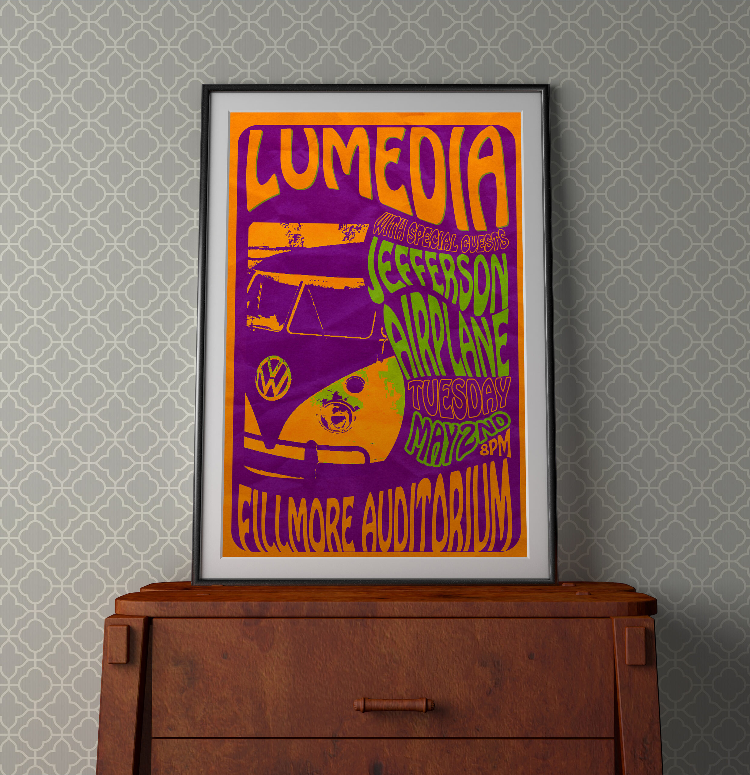
60’s Style Concert Poster
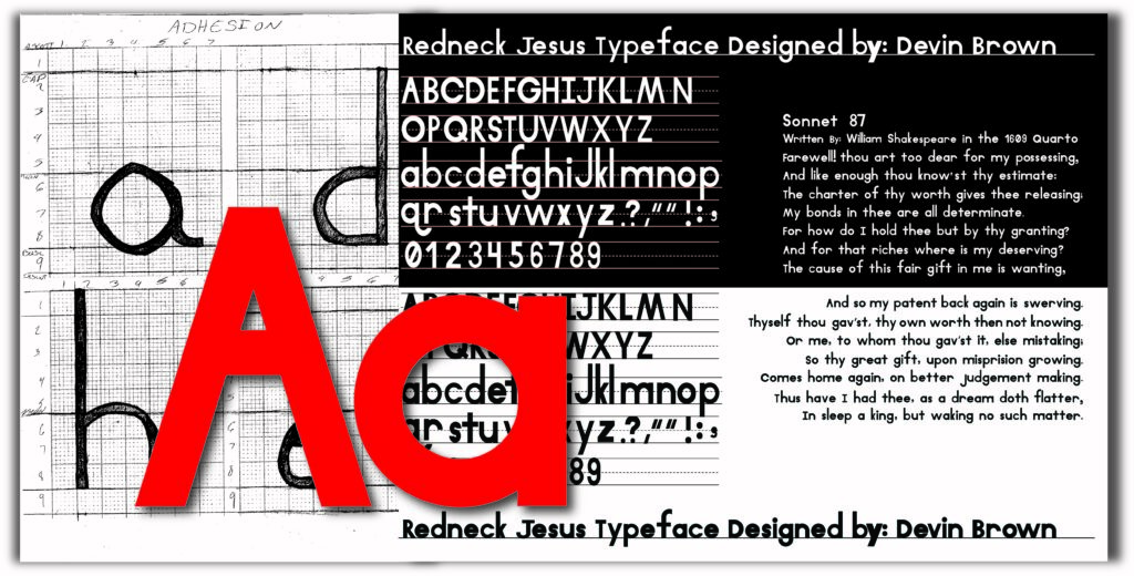
Typography Project
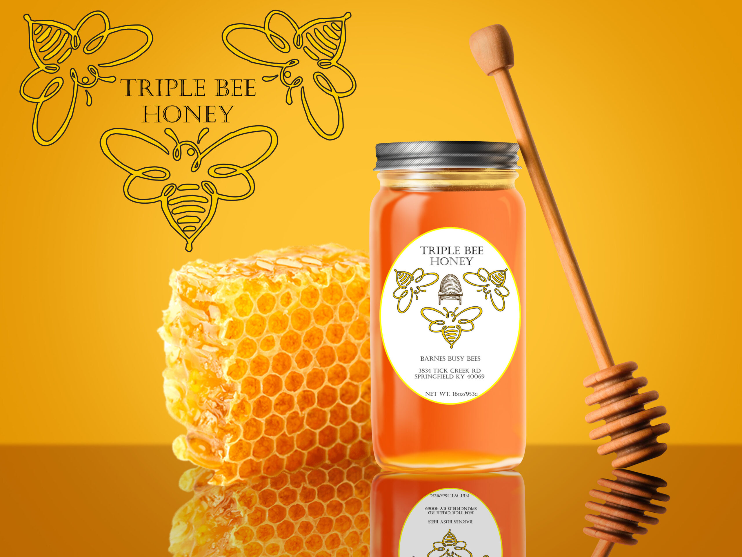
Honey Lable
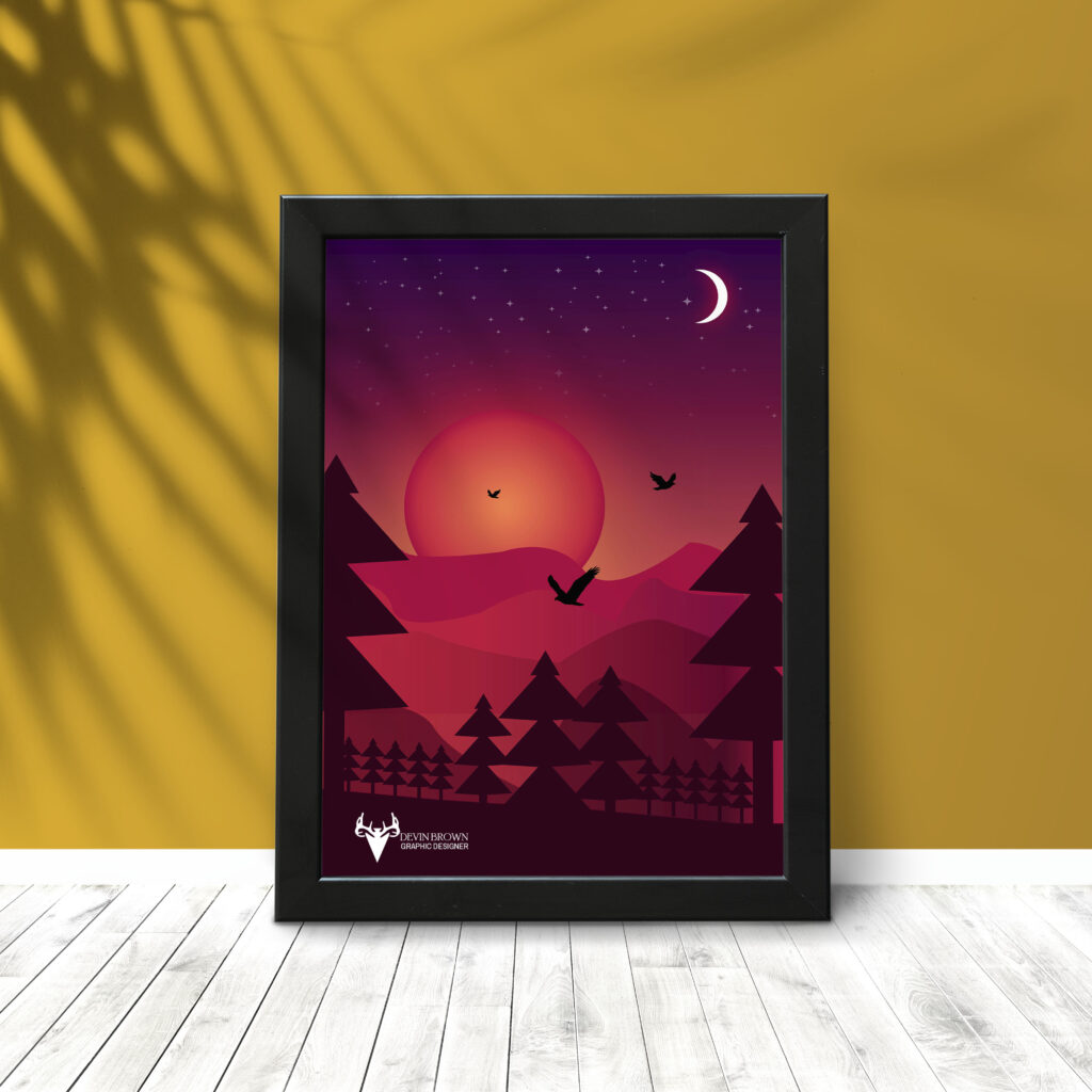
Sunset
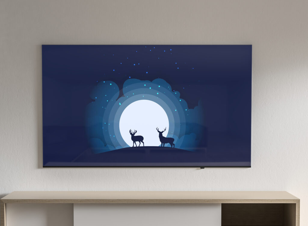
Deer in Moonlight
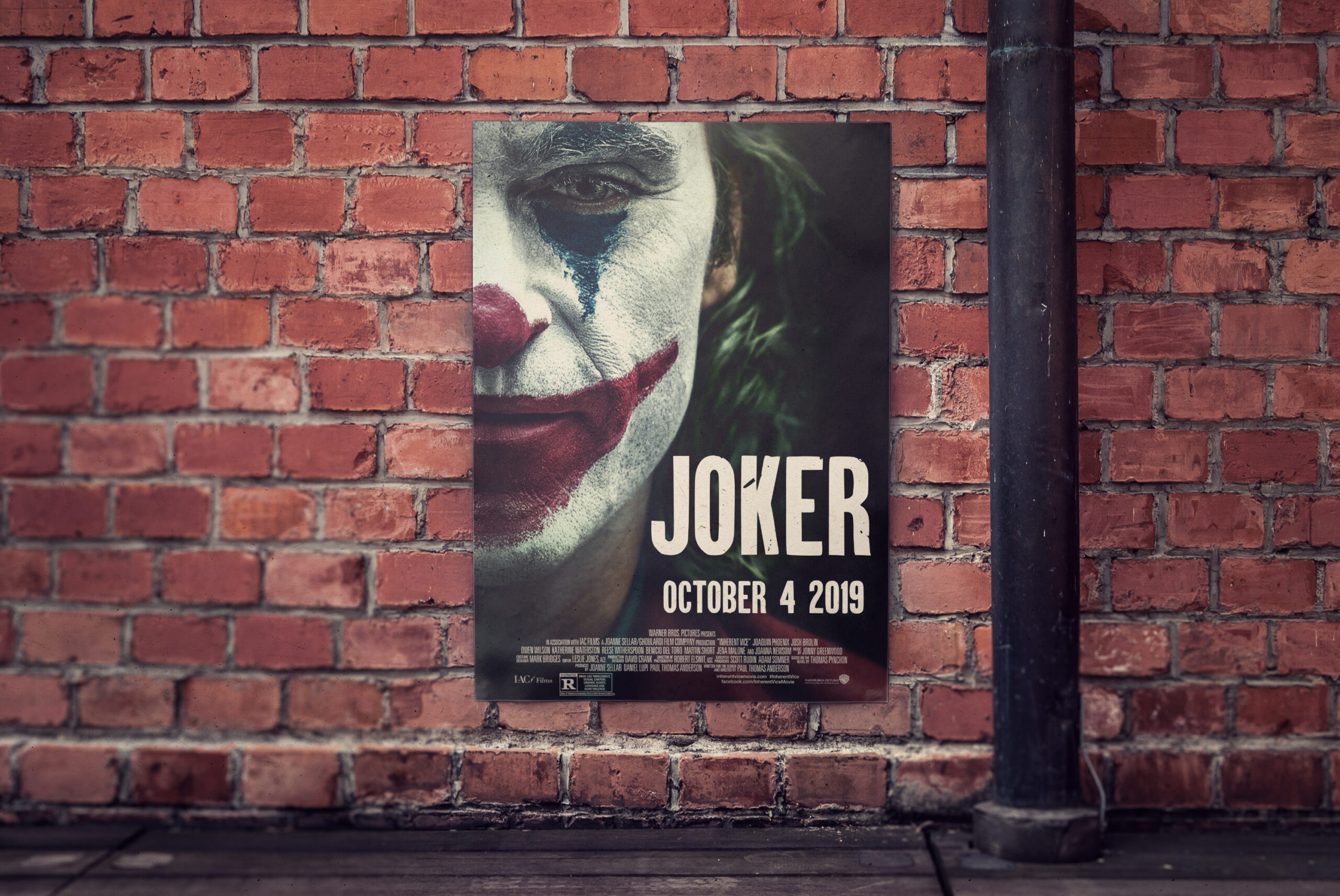
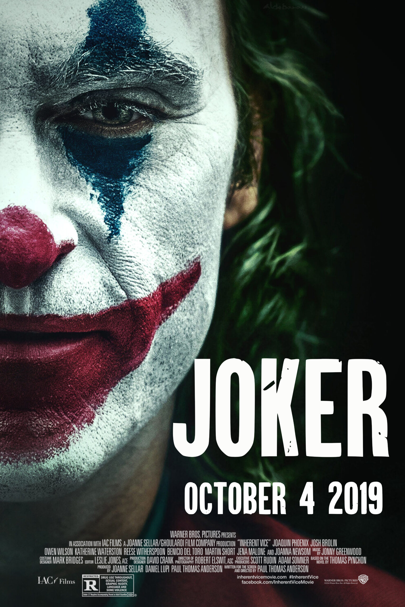
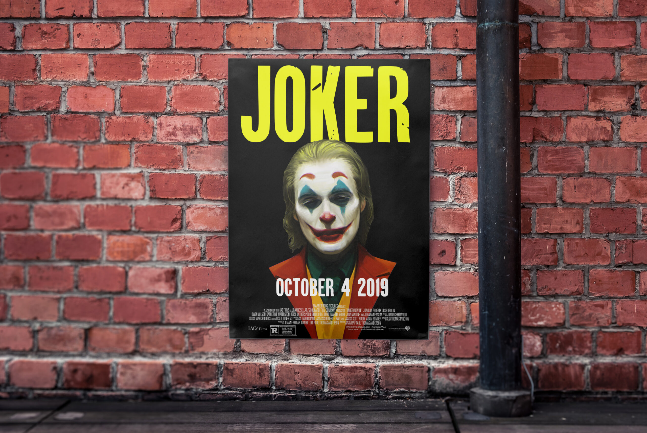
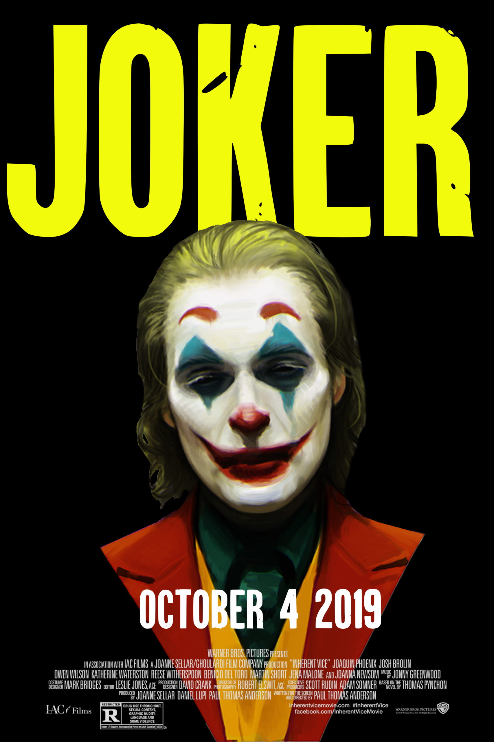
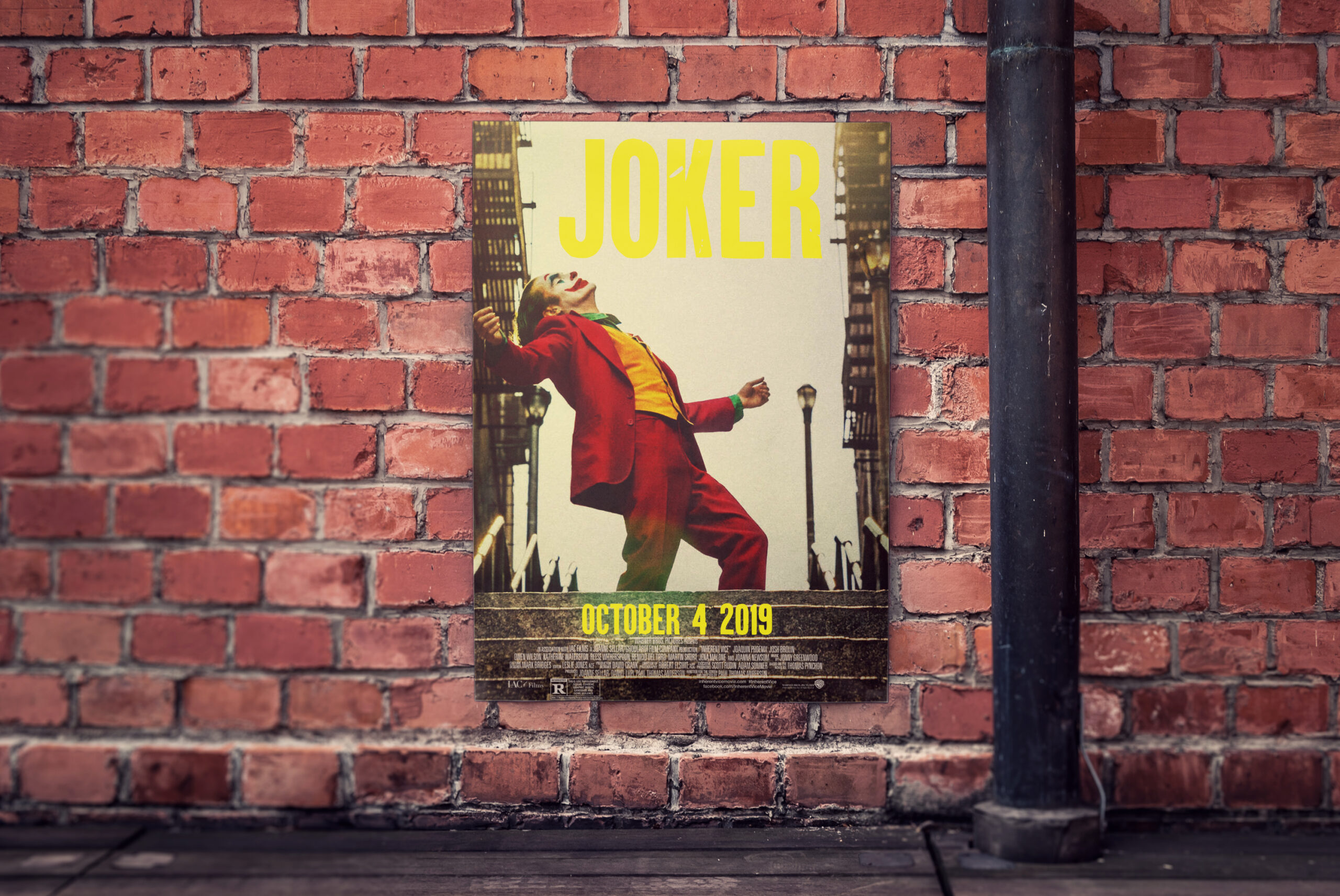
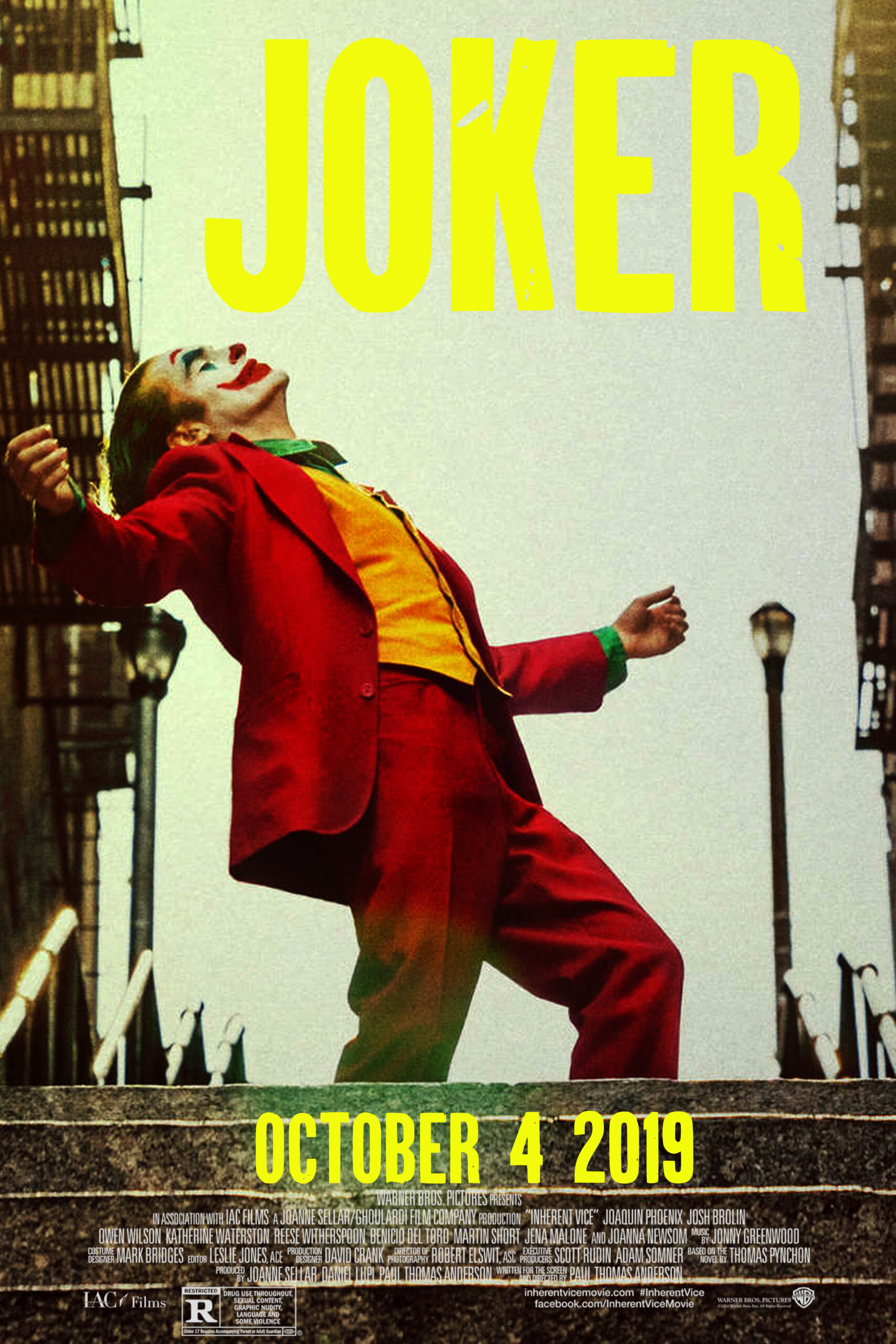
JOKER Movie Poster
The Walking Dead Poster
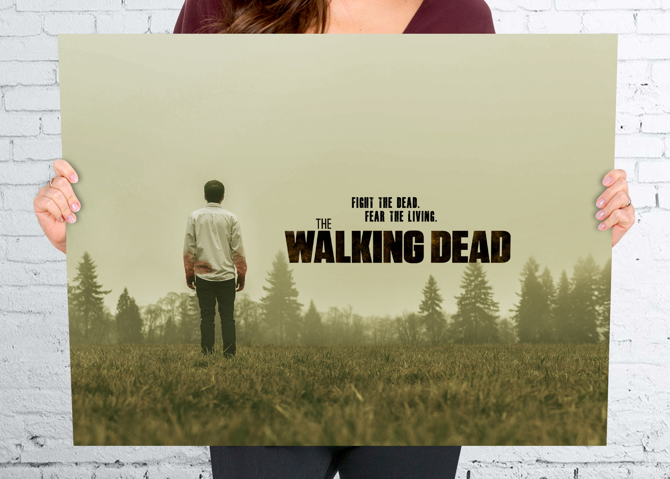
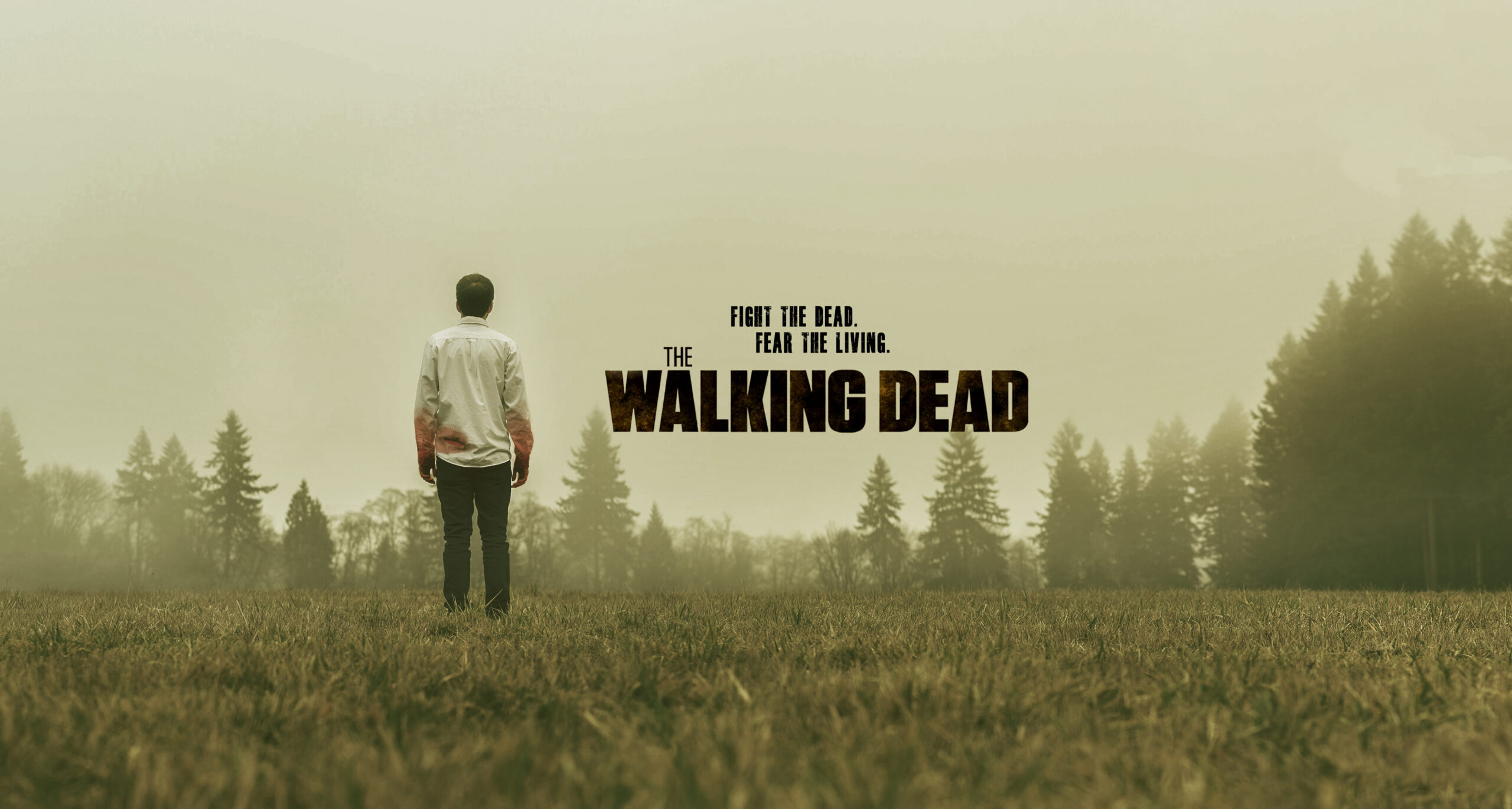
Photo Manipulation


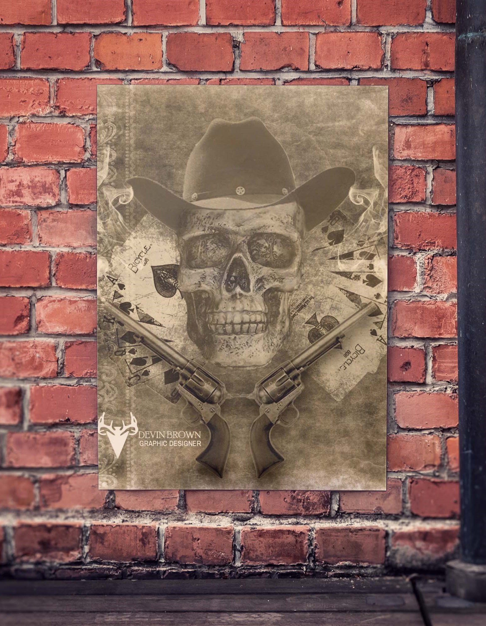
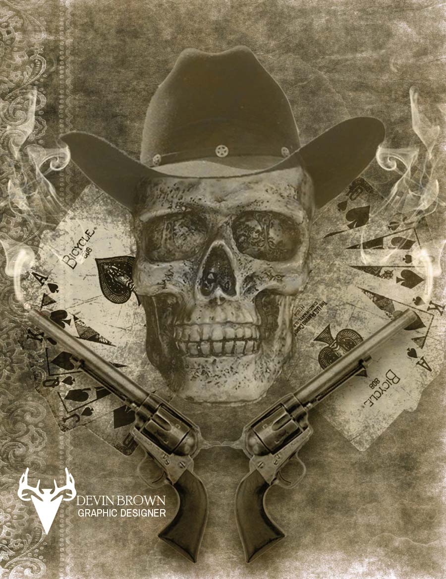
Western Poster
Movie Poster
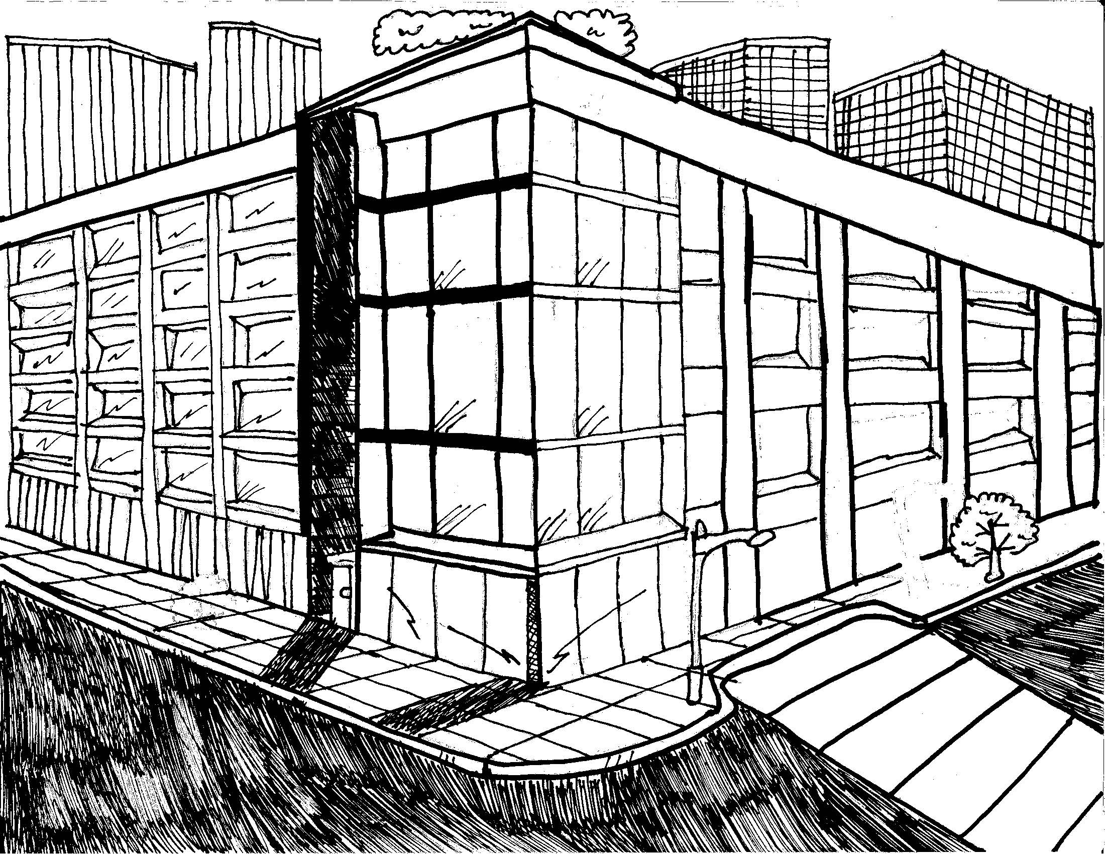
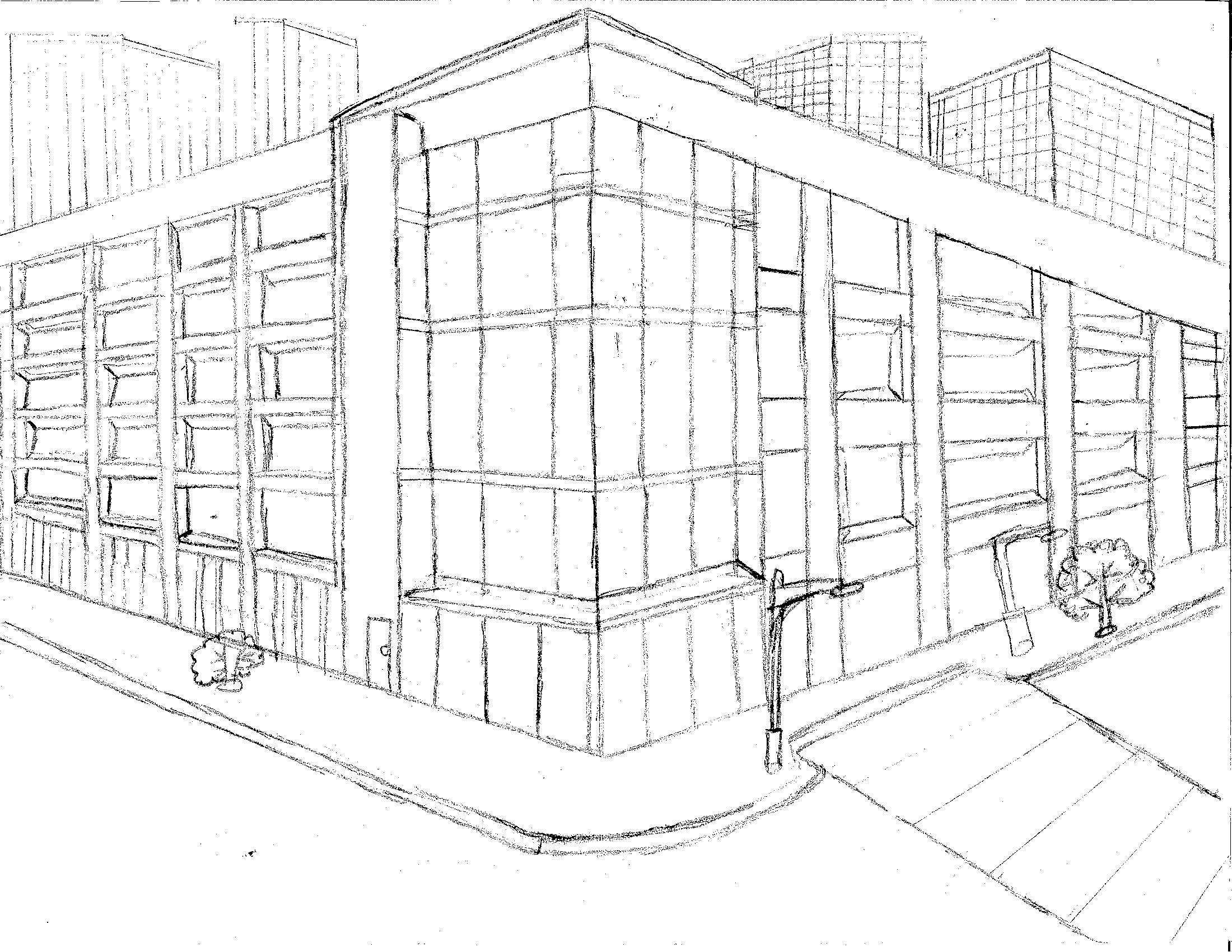
Sketches
Newsletter
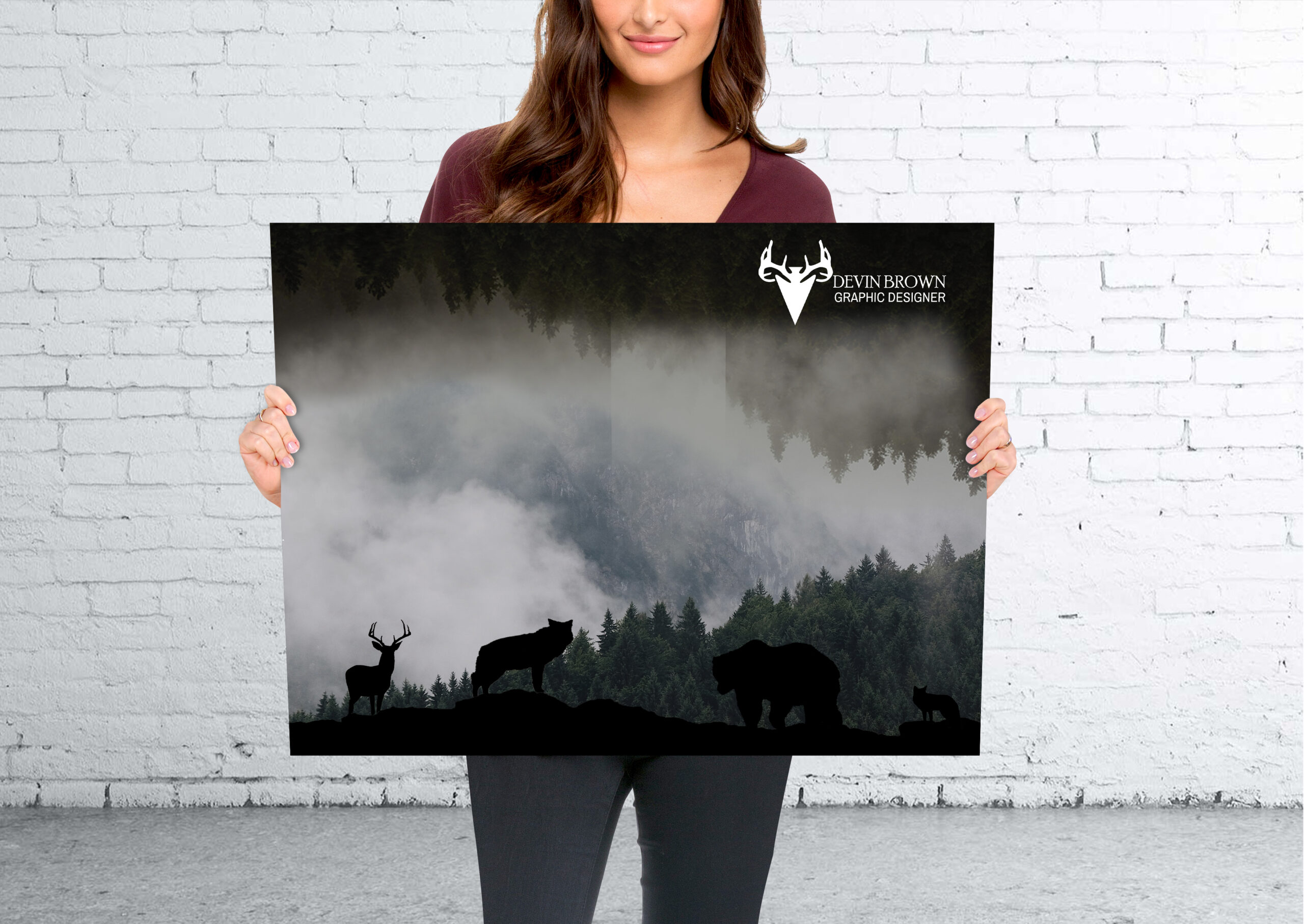
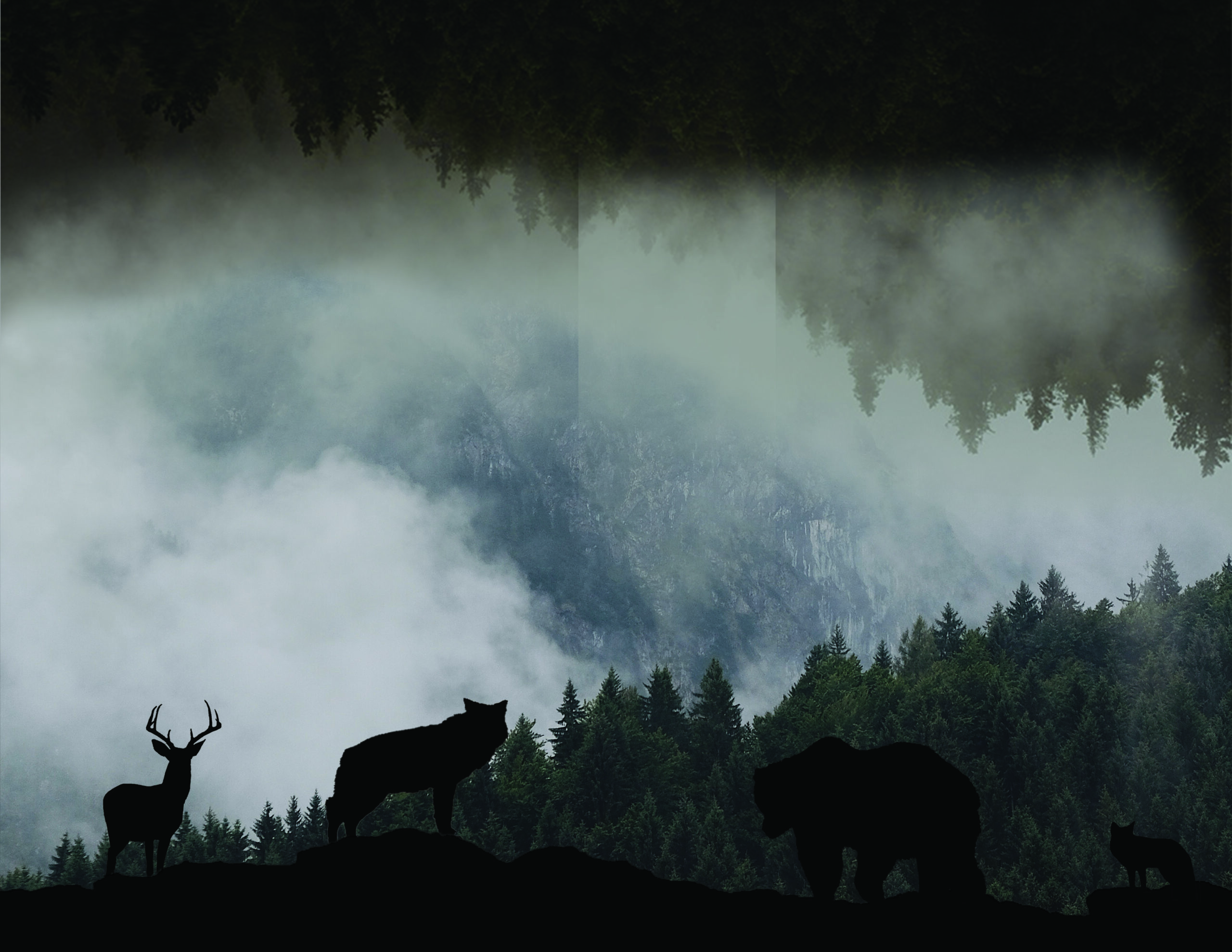
National Wildlife Federation Brochure
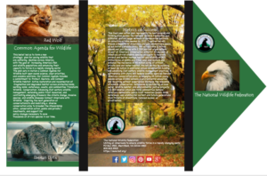
National Wildlife Federation Brochure 2